Bravo Package Customer Case Study
How BravoPackage Revealed the Natural Beauty of Greyboard
- ProductCreative Studio Materials
- Box TypeFoldable Lid-and-Base Box
- MaterialNatural Greyboard
- FinishMinimal White Printing
- ClientWhy in Design
- IndustryDesign and Creative
- StyleRaw and Minimal
- ServiceStructure, Printing and Production
Background
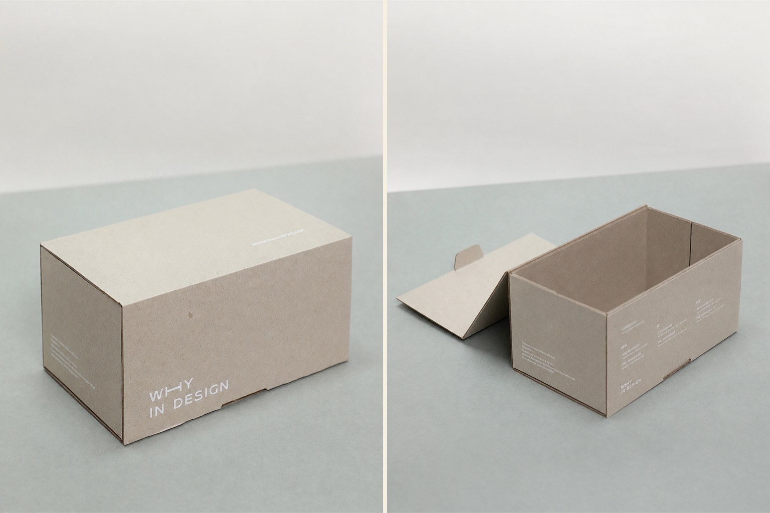
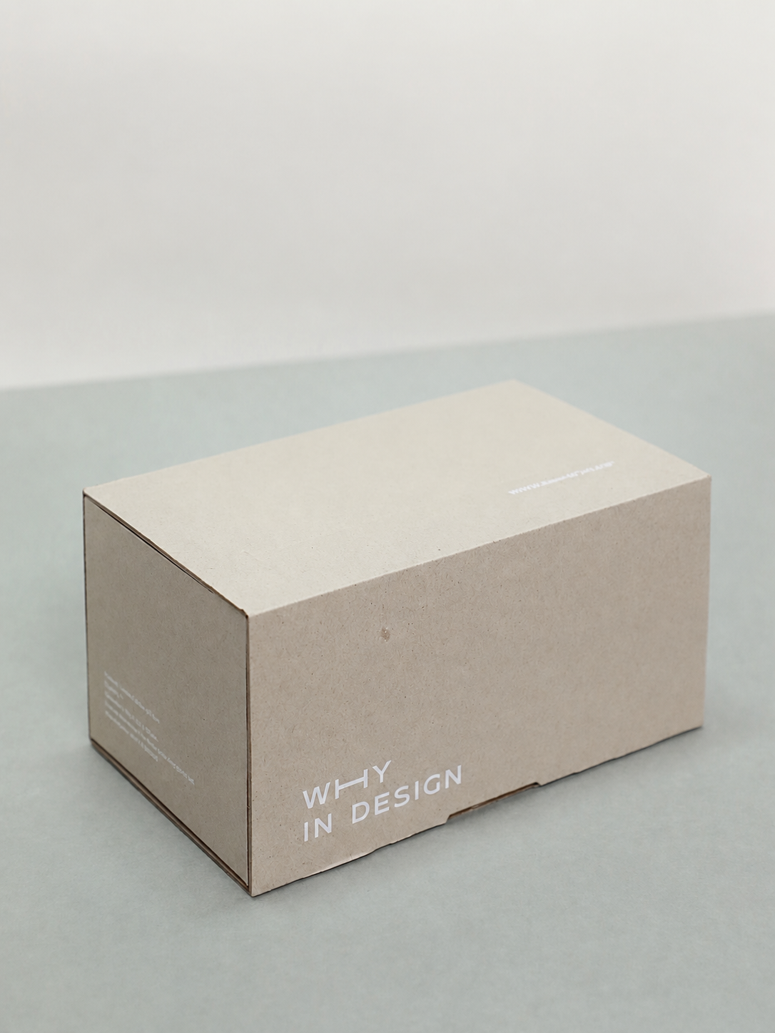
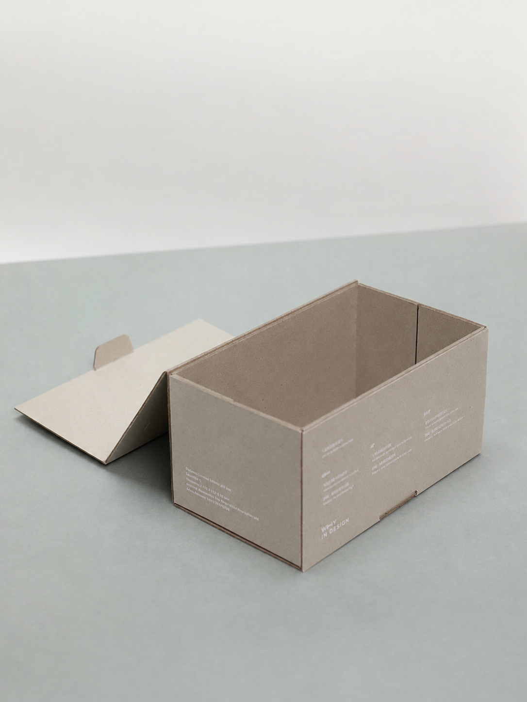
Why in Design wanted packaging that could feel considered without covering the character of the base material. The box leaves natural greyboard visible and uses only a small amount of white typography.
A Foldable Greyboard Form
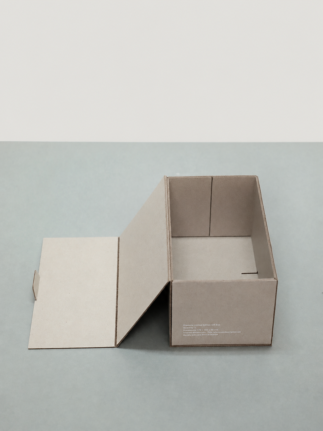
The lid and base use scored greyboard panels that build into a firm rectangular box. Interior reinforcement keeps the walls straight while allowing the structure to remain material-led.
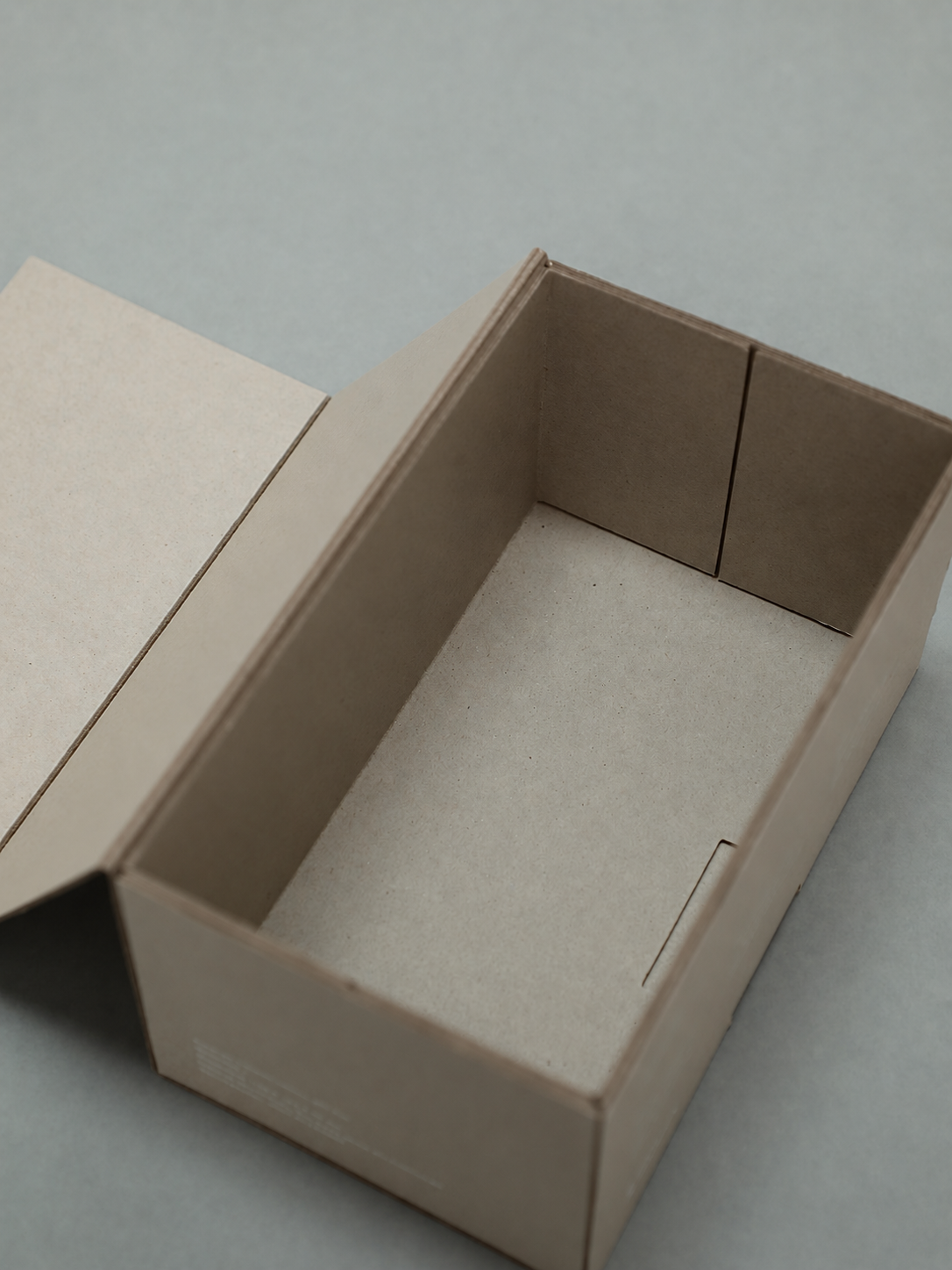
Clean folds and close corners give the unwrapped board a precise silhouette.
White Type on a Natural Surface
Small white text creates contrast without overwhelming the fibres and warm grey tone. The restrained print makes the material itself the dominant visual element.
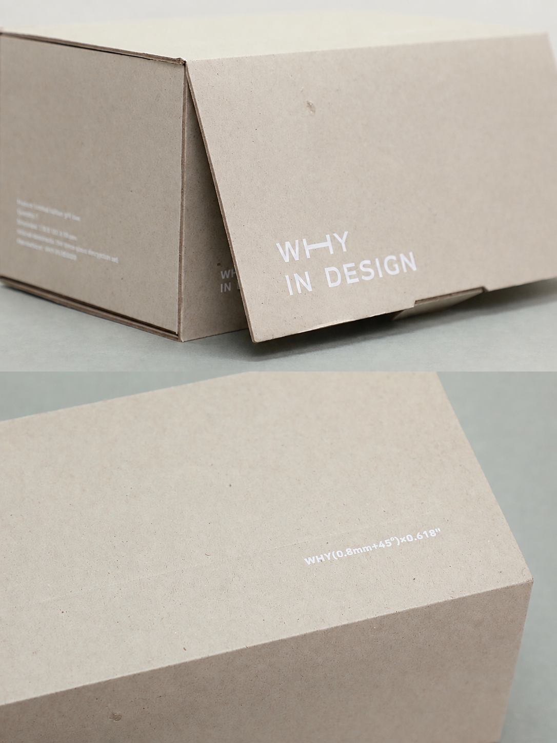
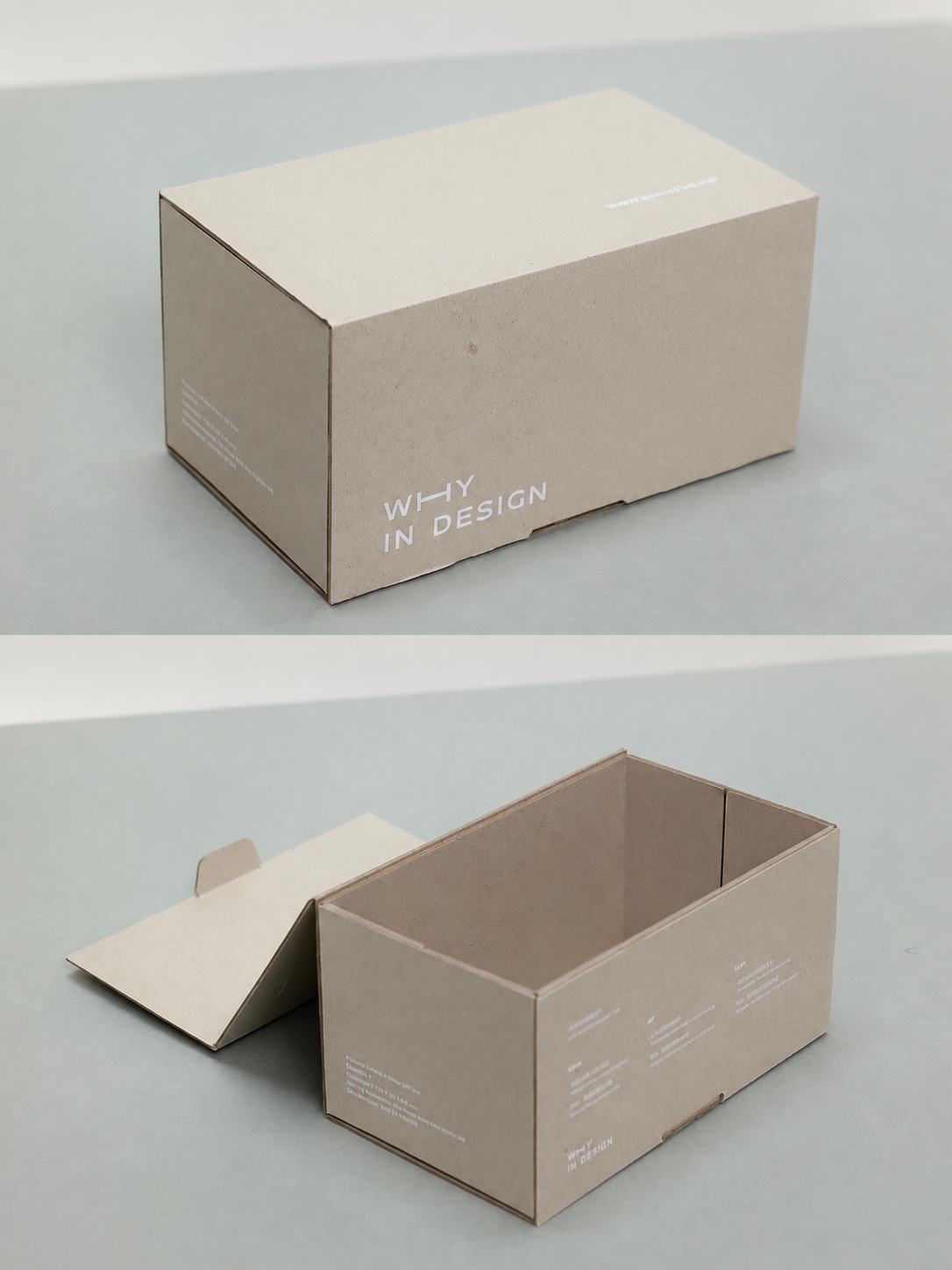
A limited finish palette keeps the box quiet, clear and recognisable.
Finished Packaging
The finished packaging opens fully for easy access and closes into a compact object with a calm studio character. It can be reused for storage after delivery.
Outcome
Greyboard presented without disguise.
The project demonstrates that careful structure and minimal printing are enough to turn an economical board into distinctive creative packaging.