
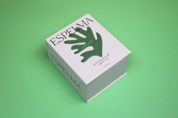
Use a physical finished pack to define the approval scope. This photograph is a packaging reference, not a measured colour standard. Third-party reference; not a Bravo Package project.
Start with an identifiable approved reference, check the proofing and finishing conditions, and compare equivalent samples before deciding how to resolve a colour mismatch.
Identify what the approved sample represents
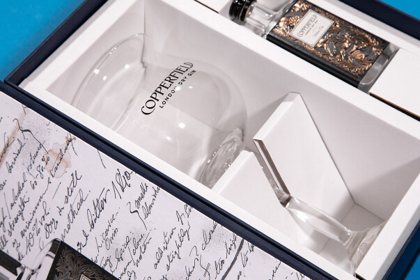
When a perfume-box delivery looks different from its sample, retrieve the agreed physical reference and identify its artwork version, sample number and approval scope. An undecorated fit sample may establish structure; a quick colour print may establish layout. Approval of either does not automatically approve every colour and finish. Resolve missing scope before deciding whether the delivery meets the brief.
Record the reference’s finished state too. Is it an unfinished printed sheet or a converted box with the agreed coating and lamination? Comparing those stages can help locate a change, but the final pack still needs an appropriate reference. Keep the original approved sample identifiable rather than replacing it with a newly selected production box.
Check how the proof relates to production
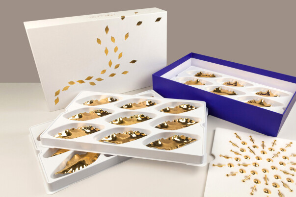
Ask which output method, substrate and colour settings produced the sample and which will produce the order. “Digital is inaccurate; offset is accurate” is not a useful decision rule. A quick print and a verified digital contract proof serve different purposes, and digital printing can also be the production method. Establish what this particular sample demonstrates.
For a colour-managed proof, ask the supplier to identify the simulated printing condition and its verification record. Such a proof can support colour communication within its defined scope; it does not independently approve paper texture, metallic reflection or assembly. List any differences between proofing and production, then agree how the unverified features will be checked before release.
Include the substrate and finishing sequence
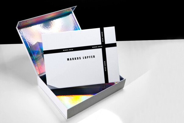

The same colour values need not produce the same appearance on papers with different base colours, surfaces and absorption characteristics. Specify the stock and retain a physical sample; matching GSM alone does not establish equivalence. If the supplier proposes a substitute, review important colours and the finishing combination before carrying the earlier approval forward.
Lamination and coatings change surface reflection and may change perceived colour. Avoid assuming that every colour will become uniformly darker or lighter. Request a sample using the proposed materials and finish. Clear office tape over a desktop print cannot approve a production laminate. Likewise, a blanket adjustment to brighten the artwork may damage other colours. Any compensation should be versioned and checked with a new proof or sample.
Agree viewing and measurement conditions
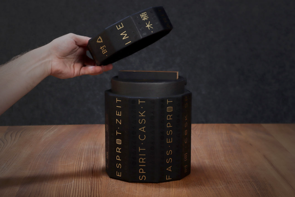
Compare the reference and production sample under the same stable illumination, background and orientation. Avoid mixed lighting and distracting reflections. Phone photographs are useful for locating an issue, but exposure, white balance and display settings introduce additional differences. They should not decide a precise colour acceptance on their own. A separate review under the intended retail lighting can assess brand recognition; document its purpose alongside the controlled comparison.
Where measurement is needed, agree the target, measurement locations, sample condition, instrument settings, colour-difference formula and acceptance range. A bare ΔE number without those conditions is an incomplete requirement. Do not import a percentage or a tolerance from an unrelated order and assume it applies to this paper, colour and finish.
Review the run and resolve a mismatch
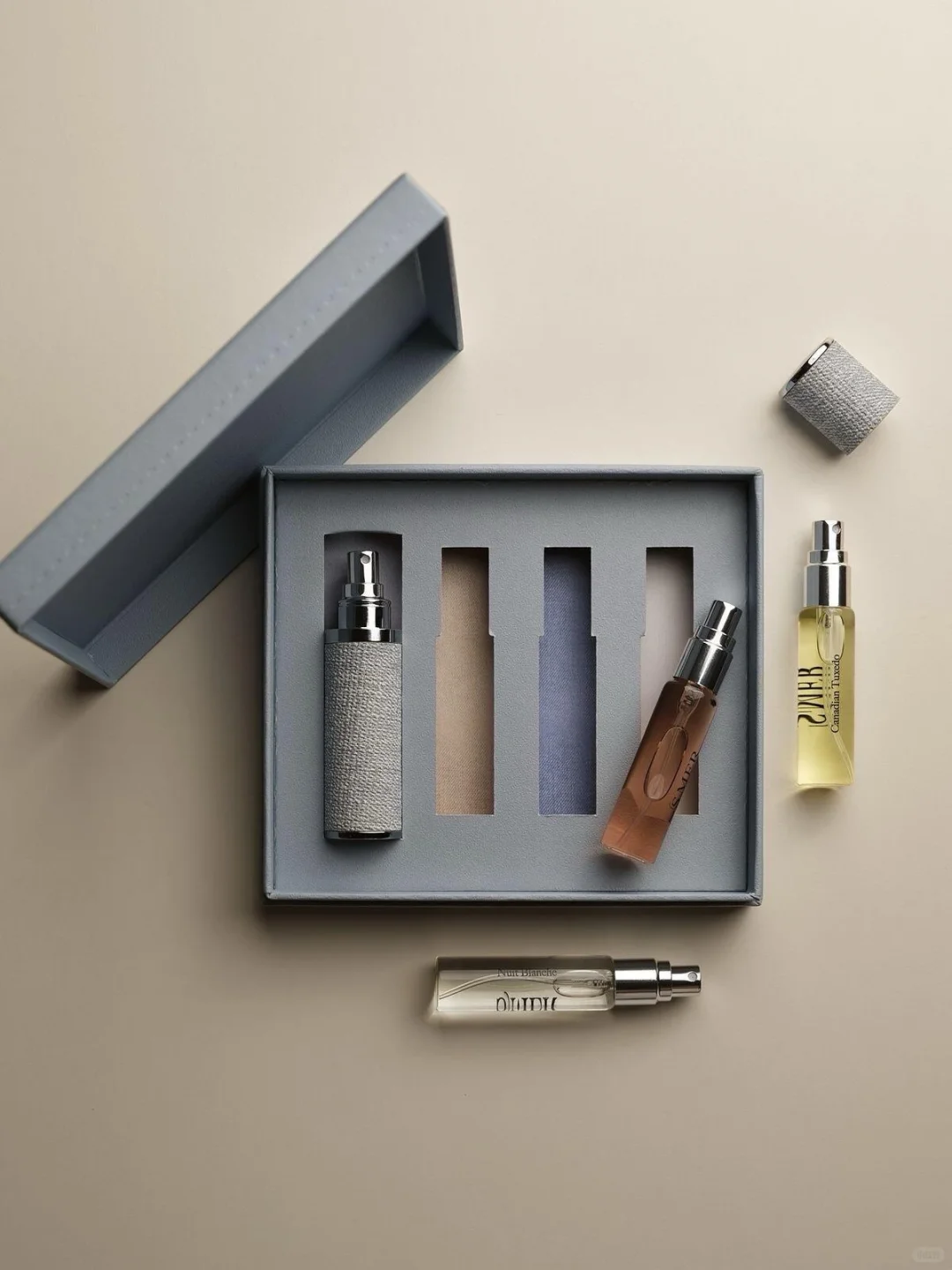
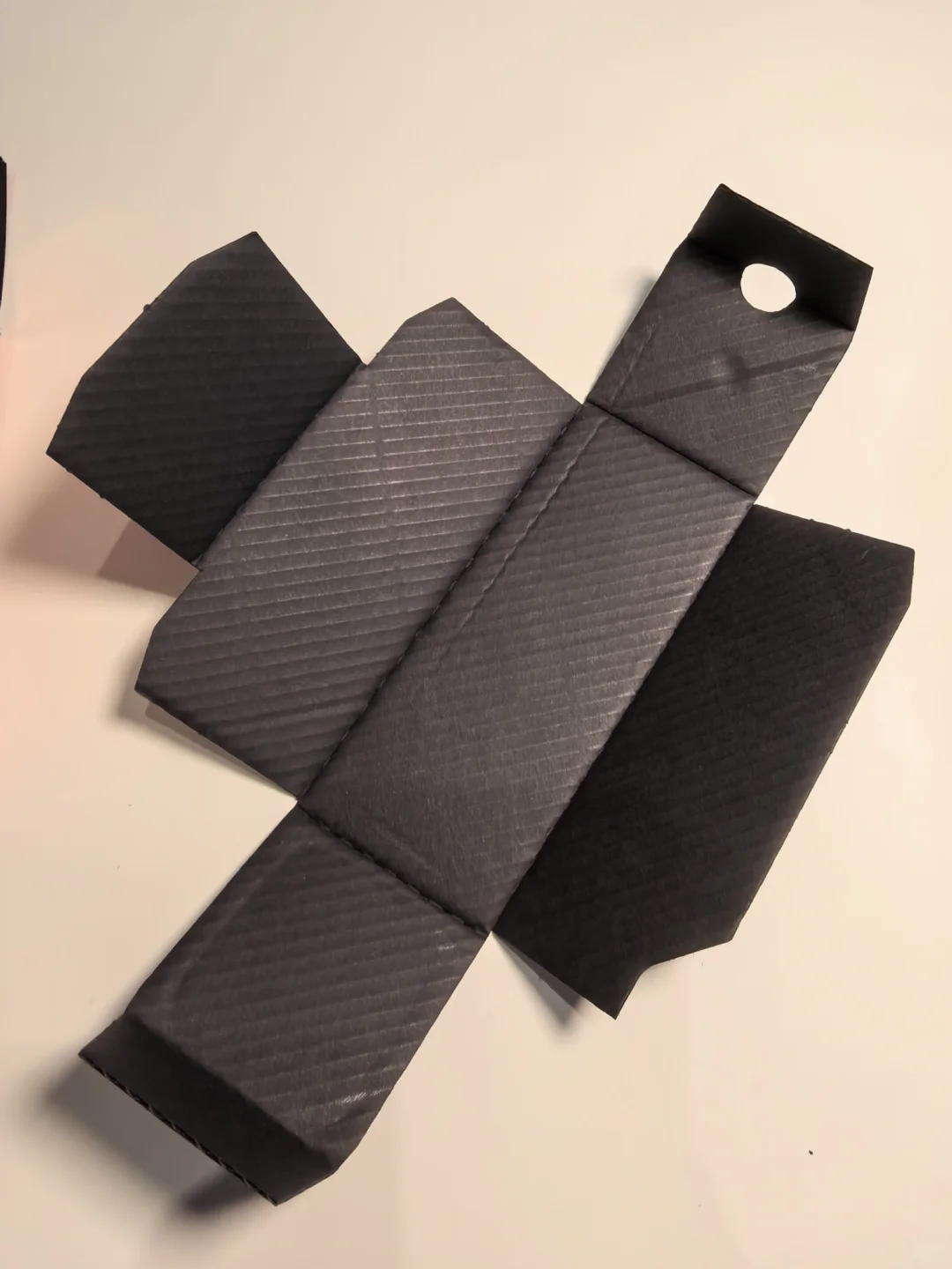
One acceptable sample does not establish consistency throughout a run. Agree first-off checks, process sampling and delivery inspection with the supplier. Compare defined locations and samples from the agreed production stages, and record changes to materials or finishing. Compare samples in equivalent agreed drying or curing states; a wet sheet straight from the press is not automatically the final colour reference.
If a mismatch appears, retain the batch details, affected quantity, photographs, physical examples and comparison conditions. Determine whether it is an overall shift, local unevenness or inconsistent assessment. Ask the supplier for a documented cause and a remedy that can be checked. An explanation does not automatically make the deviation acceptable. Record the decision to resample, rework or release against the agreed requirements.
Build a usable record for the reorder

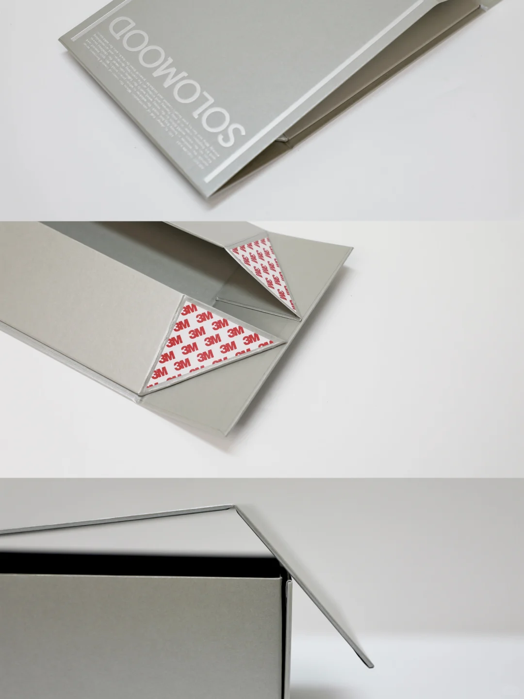
Keep final artwork, stock specifications, finish, colour reference, approval date and batch records in one handover. Identify priorities for the main brand colour, fragrance identifiers and essential text. Matching a large background should not obscure a fragrance name or reduce necessary contrast. Review variants separately where they use different stocks or finishes.
Before a reorder, check for changes to paper, film, ink, artwork or the production sequence, and plan renewed proofing according to their effect. Also assess whether an older reference remains usable after storage, light exposure or contamination. A reliable reorder instruction identifies the accepted version, its conditions and the current review, rather than relying only on “same as last time”.
Technical context: Fogra prepress certification programmes distinguish verified proofing, validation prints and viewing conditions. A service provider’s actual scope and records should be checked for the project.