
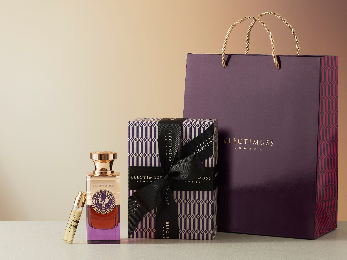
The Electimuss presentation combines bottles, a patterned ribboned box and a purple branded bag. It illustrates a visual system without proving exact colour equality, shared substrates or matching feel. Third-party reference; not a Bravo Package project.
Coordinating perfume boxes, bags and cards starts with a shared visual and tactile brief, followed by component-specific specifications. Decide which colour relationships, typographic roles and surface qualities should connect the set. Matching colour names, digital values or paper names do not replace physical comparison. Review the finished box, bag and card together under consistent viewing conditions, then assess feel separately. Fit and carrying performance with the complete gift box require their own checks.
Define what should connect the set
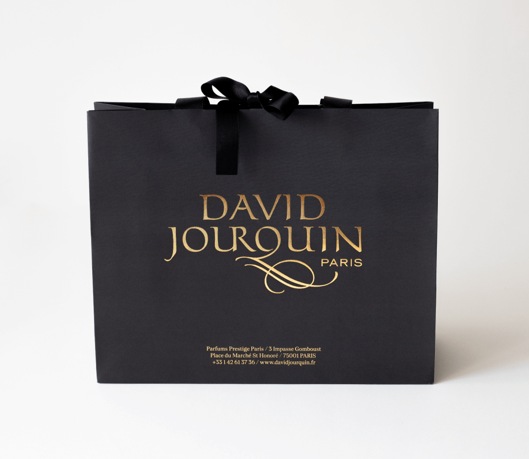
Define the role of each component: identifying the product on the box, supporting the intended carrying and presentation setting through the bag, and providing information through the card. Discuss the relationship between large colour areas, marks, typography and the intended surface feel. Coordination does not require identical colours, papers or processes everywhere.
Write reviewable goals, such as clear collection identity, a coherent relationship between pale backgrounds and readable text on each surface. A colour name does not establish a metallic effect, and a screen swatch is not a basis for inventing unapproved production values. Digital references can communicate intent; finished physical samples still need approval.
Specify each component individually

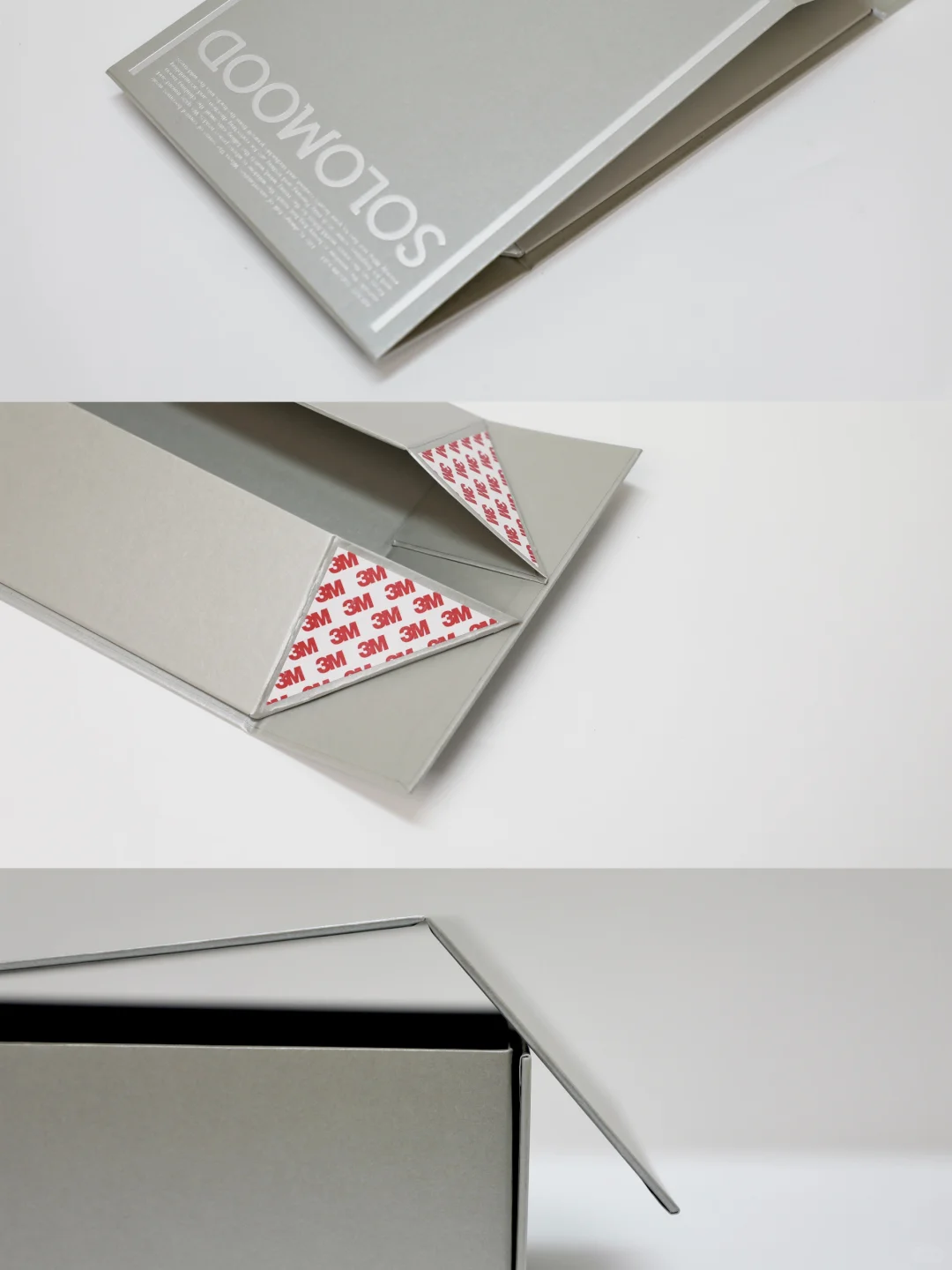
Record the box covering and structure, bag paper, card or card sleeve, surface specification, artwork revision, and the colour and configuration of handles or ribbons separately. Even components described as white paper or tactile paper need identified physical references and specifications. A shared name is not enough to combine purchasing or approvals. Different components may use different constructions and materials.
Identify whether each reference is a raw paper sample, printed sample or finished formed component. Preserve changes to paper, surface or handles so that an old sample is not confused with a new specification. Paper categories are not ranked here, and material names do not establish abrasion, water, environmental or strength performance.
Compare finished physical samples together
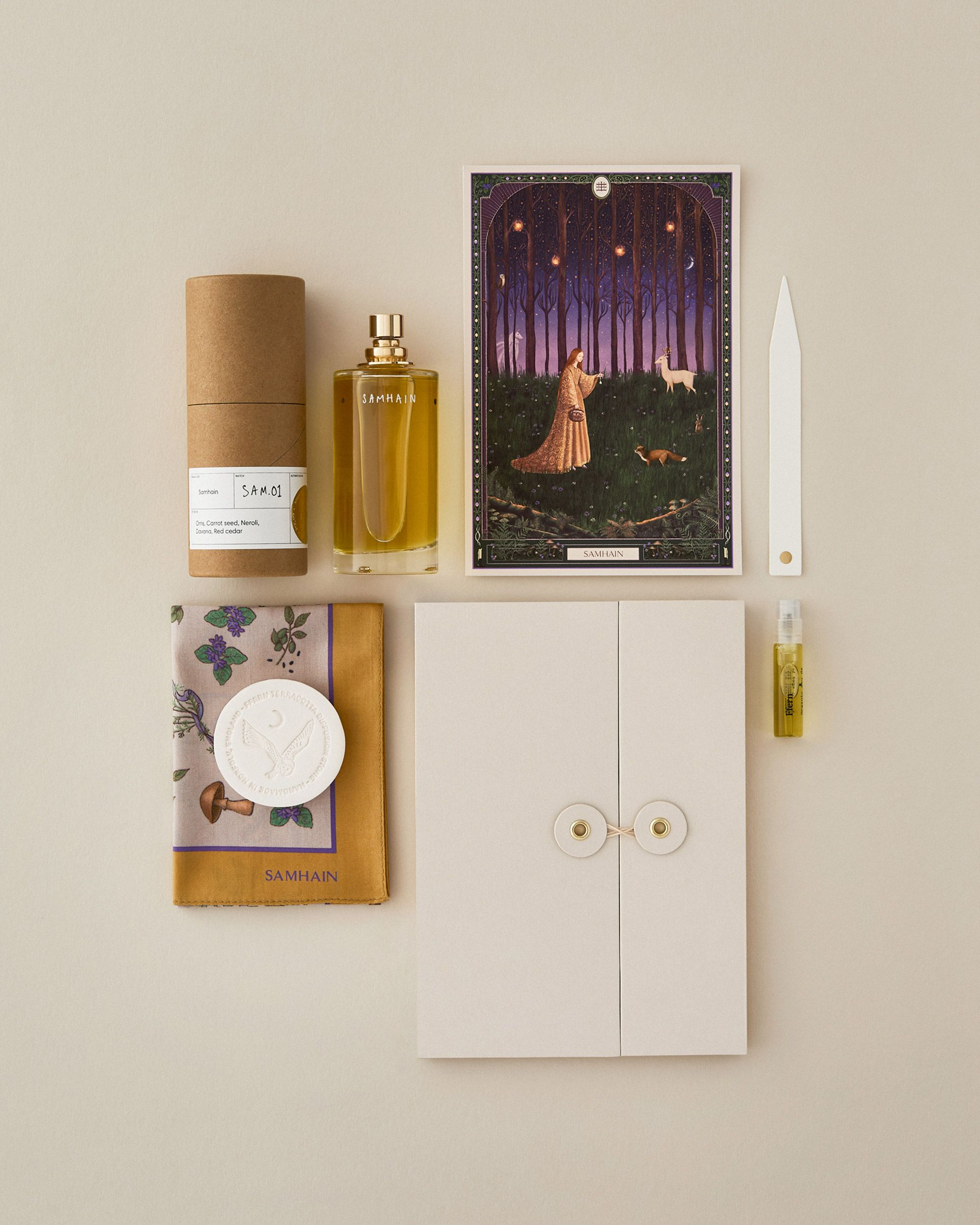
Place the actual box, bag, card and handles together under the same viewing conditions rather than selecting colours from separate photographs on different screens. Begin with broad background areas and shared marks, then review decorative details. If lighting or angle changes, record the observations instead of declaring a component incorrect from one photograph.
Where the set appears inconsistent, first verify sample identity, material and finishing revision, then discuss which element needs adjustment. Do not assign a cause to a paper or printing method without evidence. A common colour reference does not establish a matched result. Retain the approved physical set for later revisions and repeat orders.
Review readability and feel as separate tasks
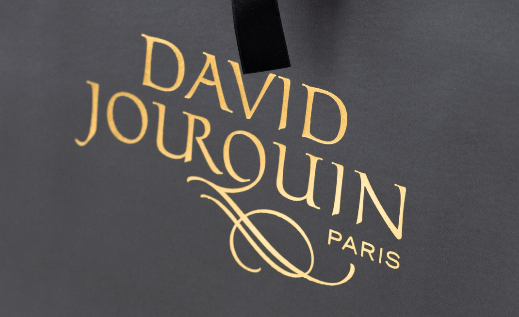
Review marks, small text and graphic edges at each component’s actual size. Scaling box artwork onto a bag or card is not a completed review. Texture, background colour and reflection affect what can be seen, so use the relevant sample rather than imposing a universal type-size or colour rule for all surfaces.
Assess feel by handling the actual finished components. State which surfaces should feel related and which differences are acceptable. Photographs do not establish tactile qualities, and promotional words such as soft or premium are not shared specifications. Where a card has a sleeve or opening action, perform that sequence before reviewing it within the complete set.
Check bag fit and carrying separately
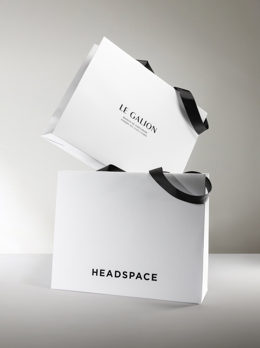
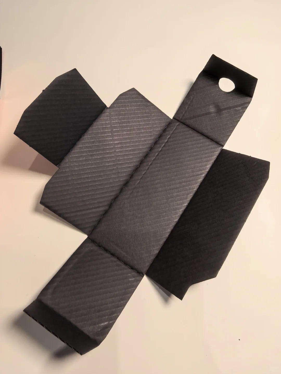
After reviewing appearance, place the actual complete gift box inside the bag and review insertion, removal, handle position and the intended carrying action. Include final dimensions, weight and additional materials. An empty box or flat drawing is not equivalent. Record the bag construction, handle attachment and handling scope requiring confirmation separately.
Coordinated colour and feel are not evidence of load capacity, and paper weight alone does not establish carrying performance. Review relevant samples after changing paper, handles or bag dimensions. Define the card position too, so that a visually coherent set does not obstruct access or leave a component out during assembly.
Approve and retain the complete reference set
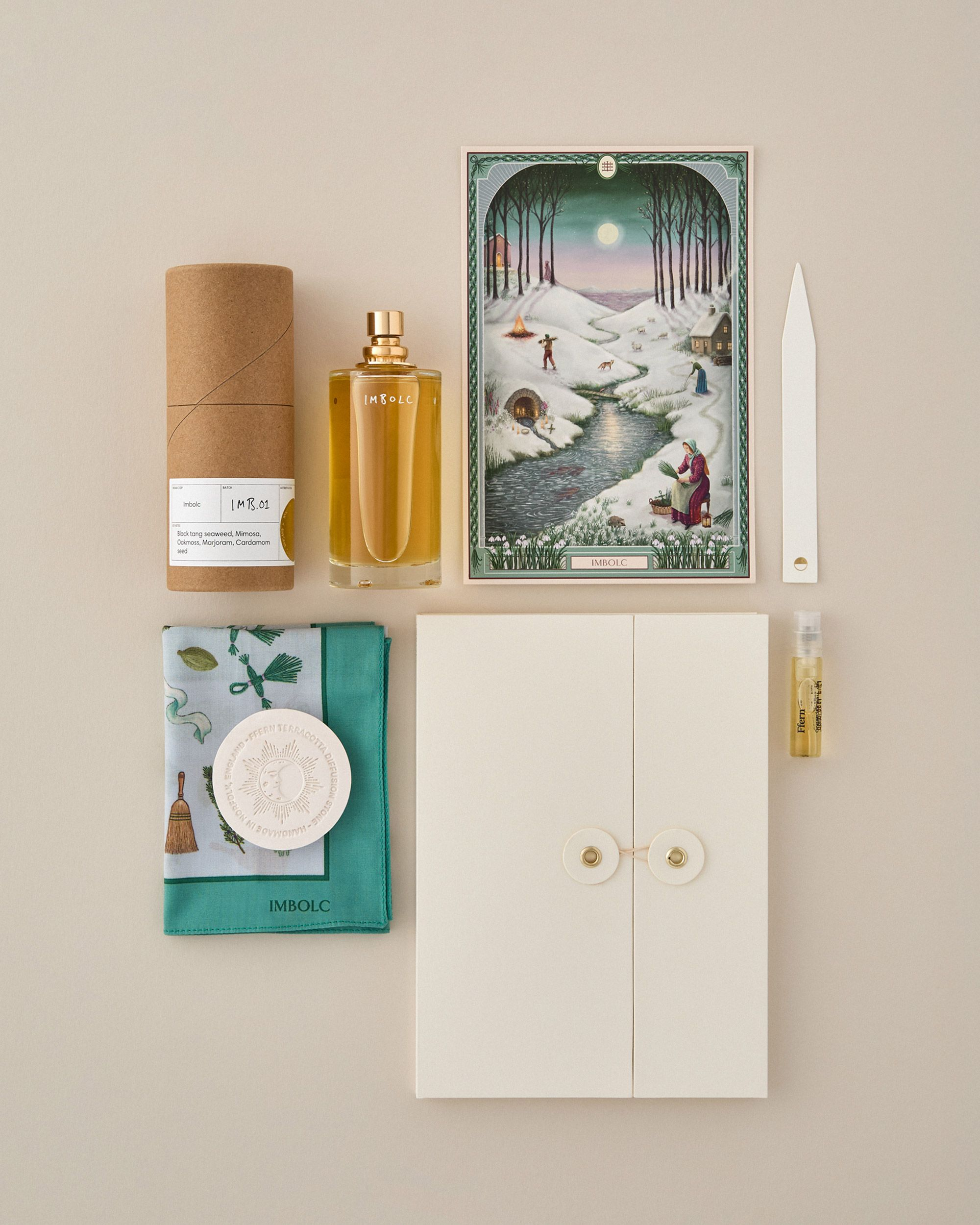
Archive material, artwork and surface revisions for every component, retaining the approved box, bag, card and handle references. Record viewing conditions, approval scope and open items. An individually accepted component has not automatically been approved within the complete set, and a shared brand does not justify mixing collection revisions.
After changing paper, colour, finish or typography, compare the affected component within the set again. For repeat orders, check actual specifications against retained samples rather than copying an old colour name or supplier description. The aim is a documented, coherent relationship without promising zero variation or a guaranteed increase in brand value.