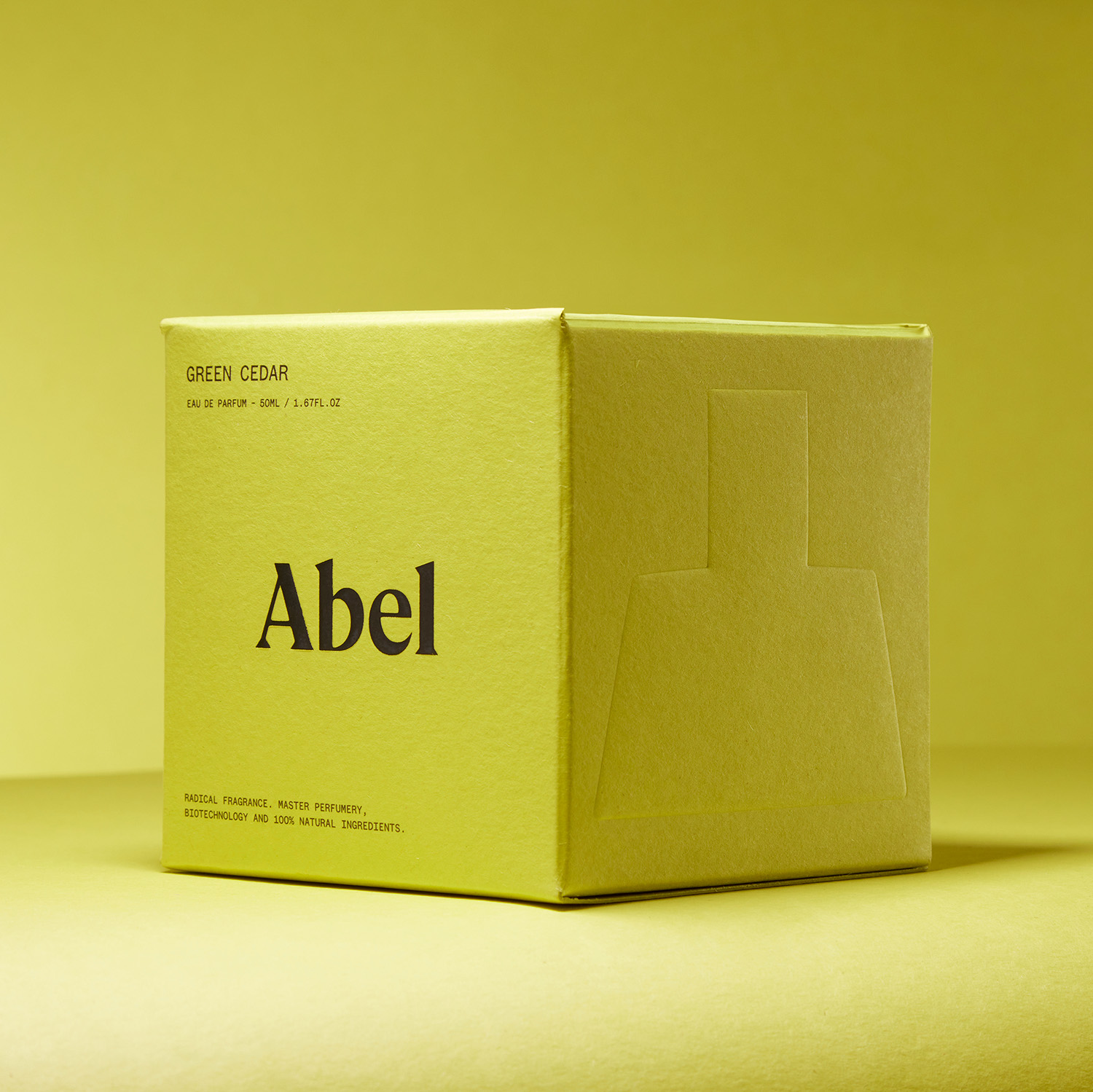
A large Abel wordmark, a smaller scent name and supporting text occupy separate positions on this yellow carton. The photograph illustrates hierarchy, without validating its printed claims. Third-party reference; not a Bravo Package project.
Minimal perfume packaging needs a clear reading order, not simply fewer words. Decide what a person must recognise first, what helps them choose a scent or size, and where they will find detailed information. Then organise the panels through placement, type, spacing and contrast. The brand name need not always be largest, and empty space cannot replace information that must be supplied. Check the result on the formed pack, at actual size, in a product thumbnail and on the relevant printed sample.
Define the recognition task first
Write down the situation and the question the reader needs to answer: identifying the product on a shelf, finding a particular scent in a range, or distinguishing sizes in an online image. These tasks may call for different emphasis. Starting with “the logo must be largest” can obscure the actual priority. A reading order for one front face is not automatically the rule for every panel and channel.
Inventory the information before arranging it. Brand, scent name, product format, size and set contents can support recognition and selection; detailed content needs an identifiable place to be found. The brand must establish the information required for its product and sales context. Design organises that content within the brief rather than providing a reason to remove required labels.
Group brand, scent and size by function
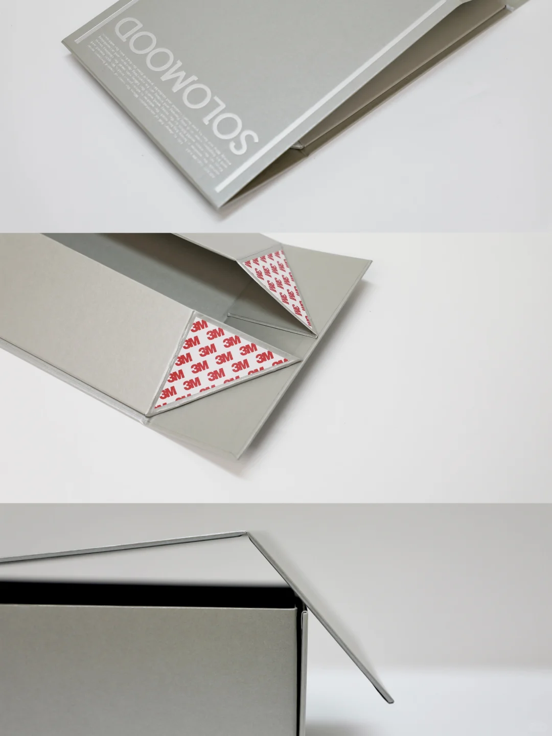
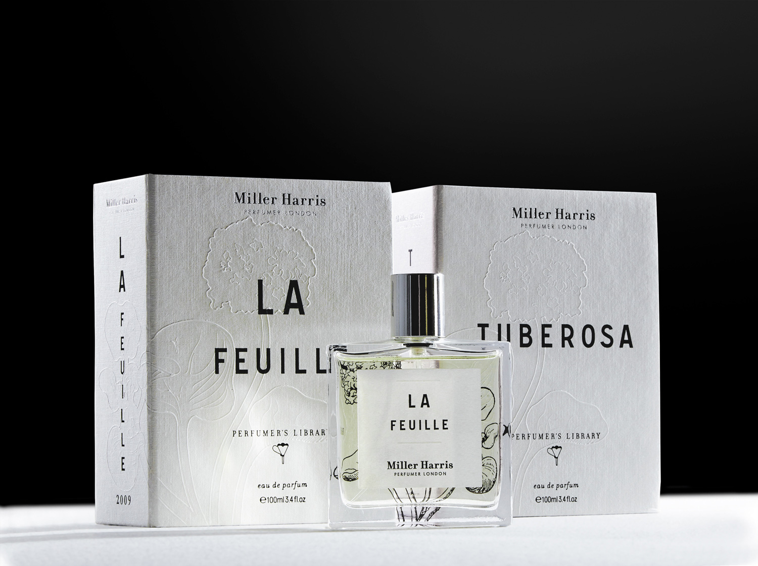
Build related information into groups before comparing their emphasis. Proximity can connect a scent name with its size, while the brand mark and collection name may form another relationship. Type size, weight, block width, alignment and spacing all affect reading order. Enlarging one line alone does not establish a complete hierarchy.
Test longer scent names and additional languages. A new line break should not confuse product identity or detach a size from the correct item. Group detailed copy by the reader’s lookup task, but do not shrink it indefinitely or replace meaningful wording with unexplained symbols to tidy the back. A QR code may carry supplementary material; do not assume it replaces information that needs to accompany the product.
Use space and contrast to support reading
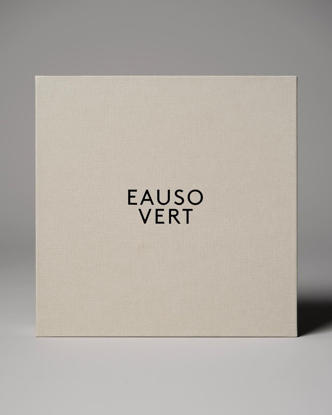
Space can separate information groups or make a small element prominent. Judge it by whether people can find the intended information, not by an empty-area score or word count. Removing competing decorations and repeated headlines can be more useful than pushing all the copy into a corner. Every face does not need to be reduced to an isolated logo.
Low contrast, fine type, wide letter spacing and reflective decoration are choices to assess, not shortcuts to approval. Texture, the printed layer and surface treatments change the result; lighting also changes apparent contrast in a photograph. Review the chosen type on the intended material and process. A pleasing screen image cannot validate pale or small lettering, and a fixed size ratio cannot account for every font and box.
Review the hierarchy on the formed panels
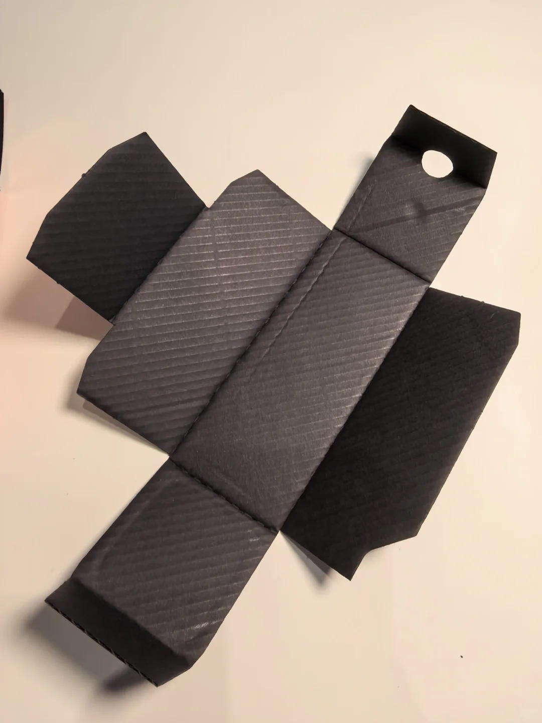
Fold the layout into the actual structure and identify how the front, side, back and opened interior will be viewed. Information intended for initial recognition should not end up across a fold, on a join or under a sleeve simply because it looks orderly on the flat sheet. On curved or narrow surfaces, check how much can be read before the pack must be turned.
Panels can share tasks while retaining a clear relationship: which face appears first, where scent and size are found, and how detailed information is located. Verify this through physical handling. One front-view photograph cannot establish the completeness of the pack. Save panel assignments with the viewing direction, structural revision and artwork version whenever the arrangement changes.
Keep the range consistent and each SKU identifiable
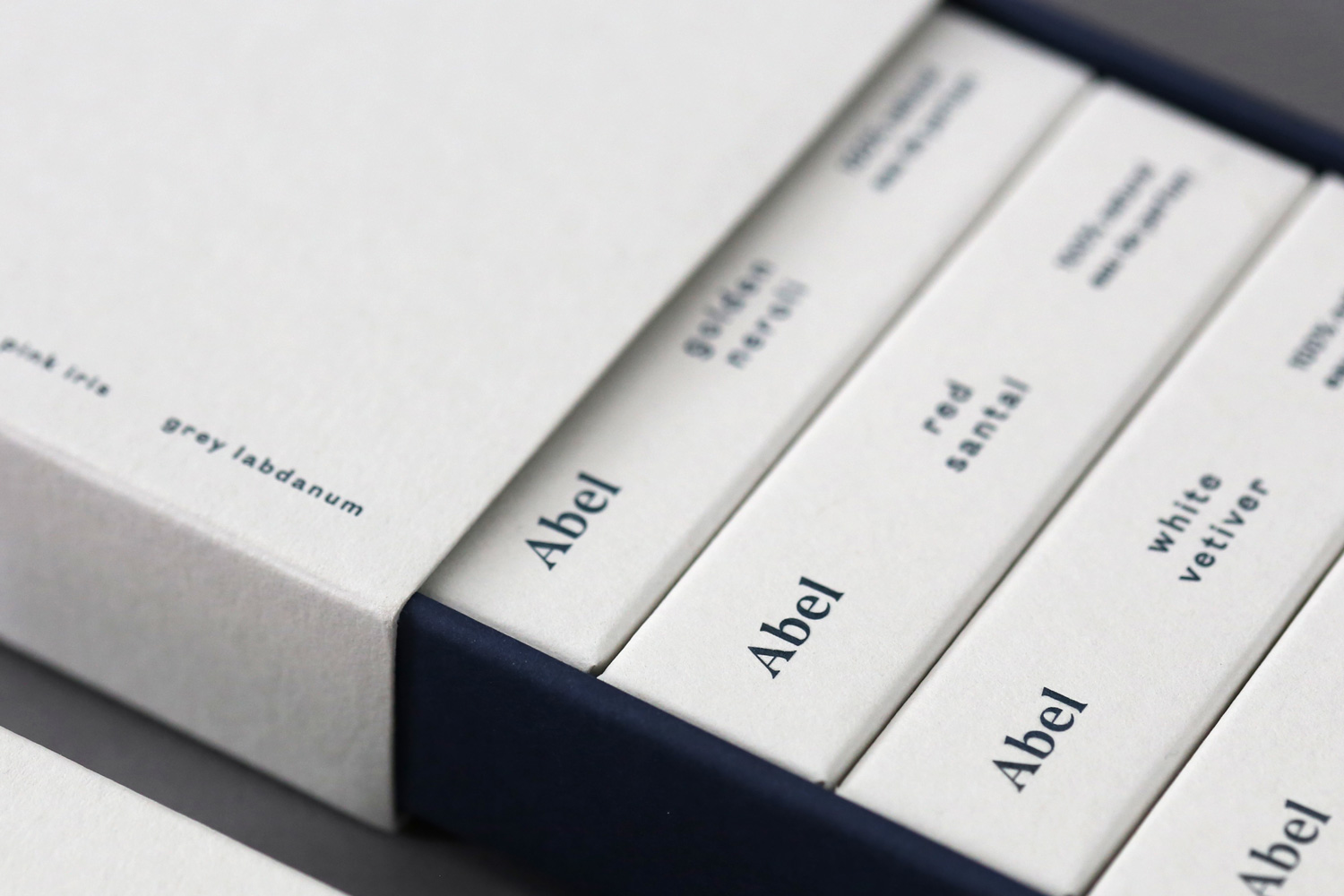
Share information positions, alignment relationships and typographic roles across the range so readers know where to look. A shared rule does not require every scent name to have the same size or fit on one line. Longer names, smaller formats and discovery sets need considered adaptations. Test the extremes of the range rather than presenting only its shortest name.
Colour, illustration or numbering can add distinction, but names and sizes must remain clearly associated. Review each SKU alone and in a group, then compare the packaging with bottle labels and online product names. The system must work beyond a collection photograph. Record shared elements and version-specific changes so an old size, name or file does not enter the next revision.
Verify with lookup tasks and printed samples

Start with an actual-size output rather than enlarging the screen to hide small-text problems. Place the formed pack in its intended display position and check the wording during recognition and handling. Assess the product thumbnail separately for distinguishing items; it cannot carry the role of the pack’s full detailed information. Ask someone outside the design team to locate a specified scent and size without coaching, and record mistakes or hesitation.
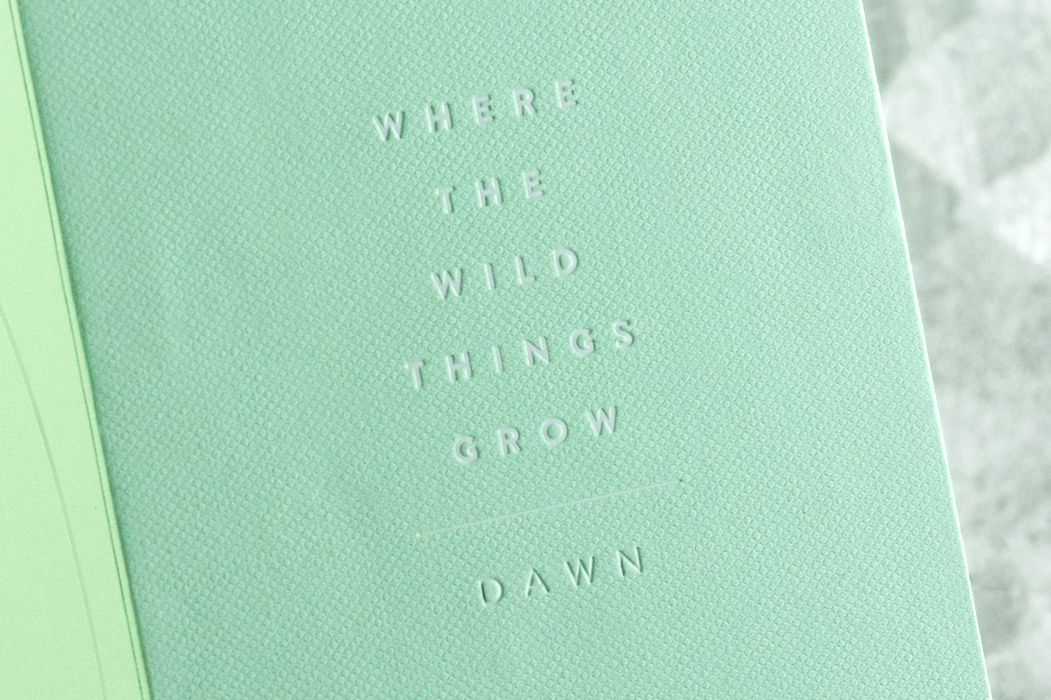
Then inspect fine type, reversed lettering, spacing and reflection on the corresponding stock, print and finishing sample. Record the accepted features, sample revision and remaining issues without inventing a universal type-size, contrast or reading-time threshold. Recheck affected features after copy, material, process or structure changes. Keep the findings of content review and visual readability review distinct.