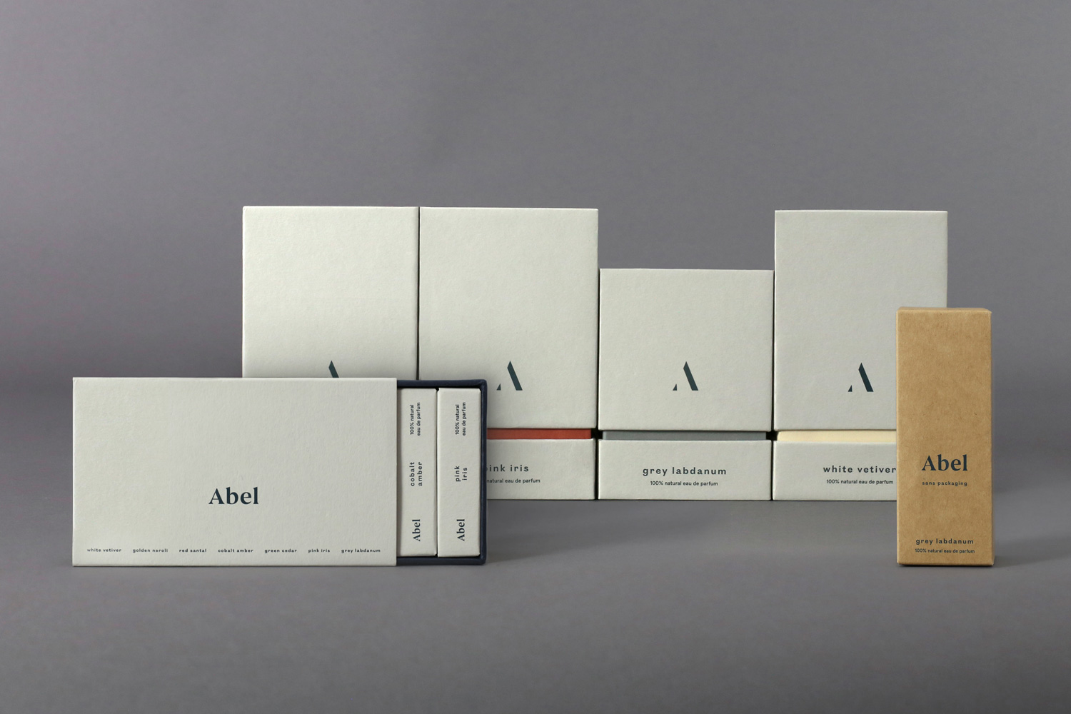
Compare how different formats retain a common brand vocabulary. Do not infer exact dimensions, recycled content or relative costs from the photo. Third-party reference; not a Bravo Package project.
A useful perfume-packaging reference helps you name what you want: an opening action, a tactile surface, a graphic detail or a way to organise a collection. These 25 ideas are grouped by structure, material, decoration and collection experience. They can be combined, but they are not 25 validated production recipes. The photographs illustrate selected visible features rather than documenting a separate example of every idea; hidden construction, materials and protective performance still need confirmation.
Structure | 1. A folding carton with a clear front
Give the main face a clear hierarchy of brand, scent and size, with supporting information on adjoining panels. This suits a single-bottle range that needs an easily identified front. Establish space around the actual bottle and cap, then check exposed and covered panels after folding. A tidy flat layout does not establish bottle retention.
2. A contrasting lid-and-base reveal
Contrast the lid and base through colour or graphic density for a second visual moment when opened. Consider this for a gift presentation with a deliberate reveal. Review lid depth, grip and information placement rather than equating tightness with quality. Check opening effort and unintended separation on the sample.
3. A sliding tray for a gradual reveal
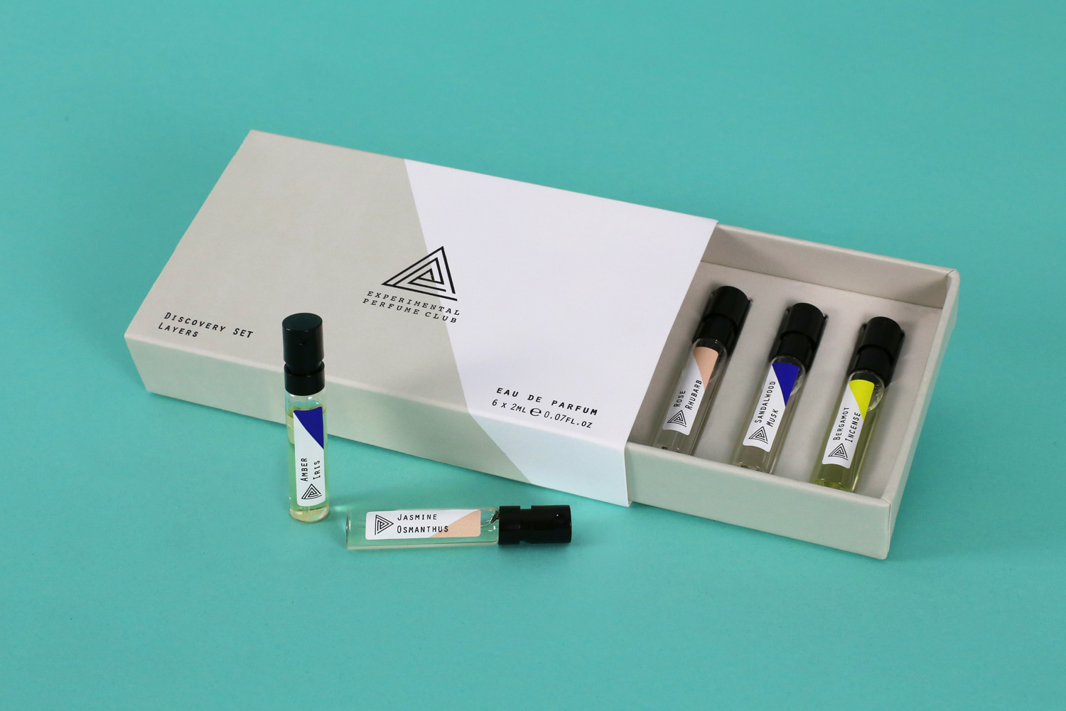
Use the sleeve for branding and the tray for product and supporting information, allowing the pull to determine the reveal. This can frame a vial set or a single bottle. Check grip, sliding clearance and the risk of pulling the tray free; the drawer format alone guarantees neither smooth travel nor secure retention.
4. A hinged opening with a reading surface
A hinged opening can put a short message in view before the product is removed. It suits a presentation with a defined reading sequence. Establish hinge direction and the customer’s viewing position before setting the type. Choose and assess the closure separately instead of assuming the format requires magnets.
5. A removable sleeve for changing messages
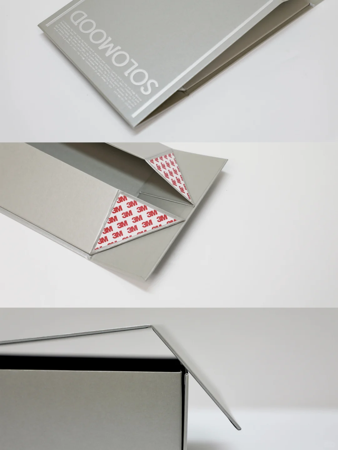
Put seasonal or collaboration information on a removable sleeve while keeping the base identity stable. This is useful when the changing message can be separated from the core pack. Check fit, friction and concealed information. A sleeve is not an automatic saving, and a different stock or finish may change assembly.
6. An envelope-inspired gifting layer
Use folded edges, a tuck or a tie to suggest the pace of opening correspondence. Treat this as a gifting layer around a product that already has appropriate support. An envelope-like bag is not evidence of glass-bottle protection. Check whether the opening action is understandable and whether folds obscure information.
7. A visible paper-support system

Make the support’s outline, spacing and information part of the interior composition rather than treating it as a hidden component. This works when the opened pack exposes the bottle clearly. Choose the actual paper construction around weight, cap and contact points; a paper appearance does not prove recyclability or transit performance.
8. A selective window as a display frame
Frame a recognisable part of the bottle while leaving enough surface for information. Consider it where viewing without opening matters. Develop the aperture, any clear sheet and the support together. Verify visibility, bottle movement and the changed box structure on a sample rather than enlarging a window first and resolving it later.
Material | 9. An understated, low-gloss surface
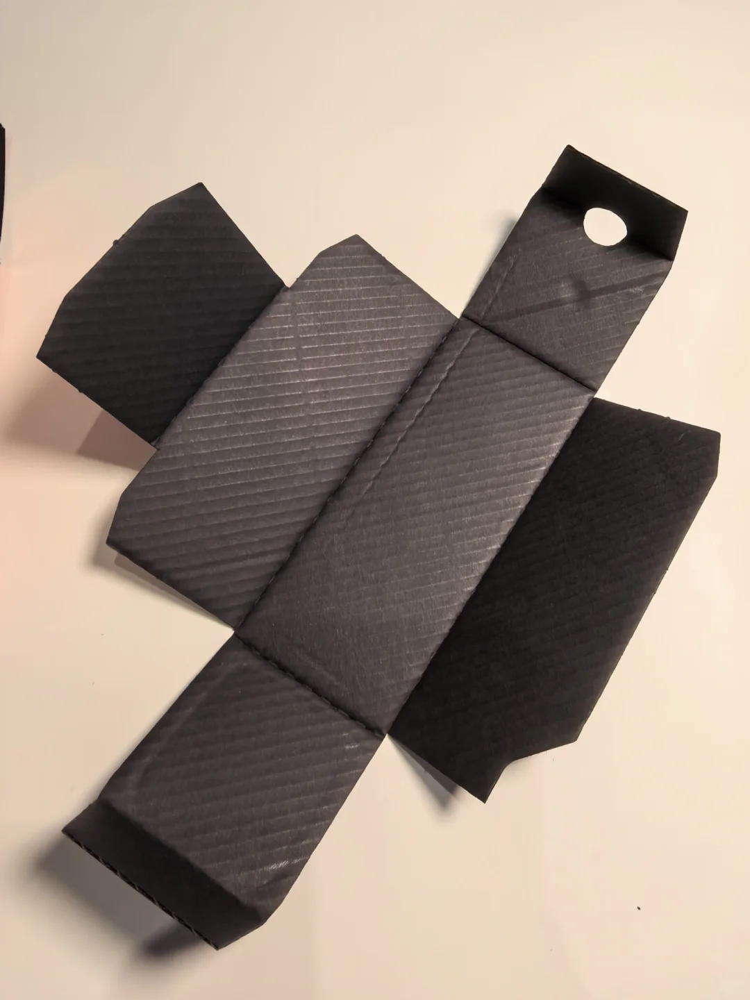
Let a restrained surface and a small amount of type carry the identity. This can suit artwork that does not rely on a full-coverage image. Establish whether the result comes from an uncoated stock, another paper surface or a treatment. Check type, colour coverage and handling marks on the intended material.
10. Texture balanced with readable typography
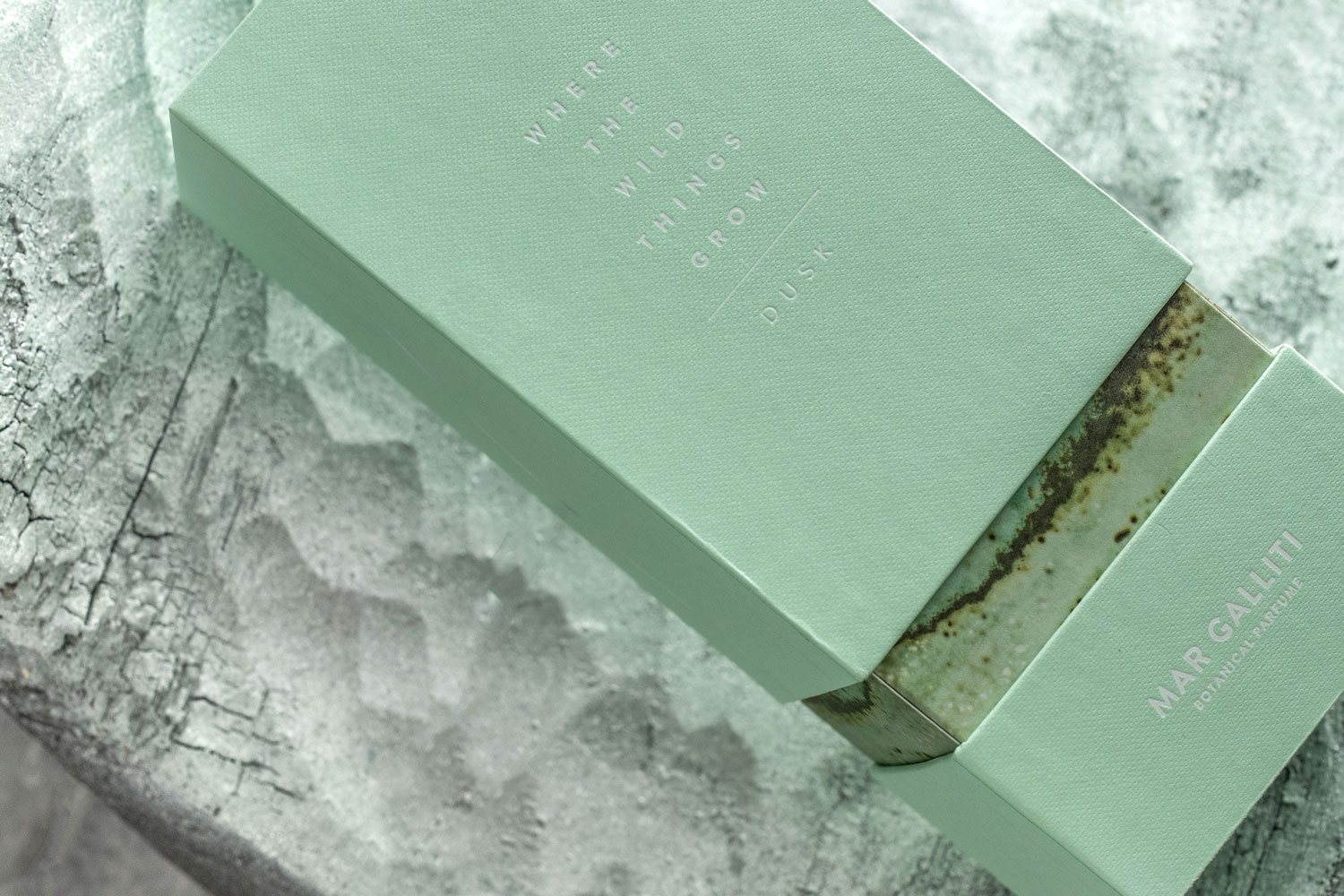
Pair a deliberate texture with clear large lettering and a readable secondary hierarchy. It suits a surface intended to be noticed through handling. Stronger texture is not automatically better for fine type. Review printed detail, folds and joins, without treating visible fibres as proof of handmade production or a particular pulp source.
11. Exposed board edges as part of the composition
Treat the contrast between a face and its visible board edge as part of the design. This suits a proposal that accepts natural-looking variation. Identify exactly which edges remain exposed and review handling and wear. A grey or brown appearance does not establish recycled content or the environmental performance of the complete pack.
12. Choose between coloured stock and printed colour
Compare coloured stock with a printed background as two ways to achieve a coordinated palette. They need not produce the same cut edge, fold or surface appearance. Select using material and process samples. For repeat orders, retain the stock identity and a colour reference rather than relying only on a screen value.
13. A contrasting inner surface
Keep the exterior quiet and introduce another tone or surface inside. It is useful when the opening clearly establishes which face appears first. The inner decoration may belong to another component, rather than the reverse of one sheet. Check its coverage, joins and any areas concealed by the support.
14. A paper-led design with a clear component list
List the box, support, labels and decorations, then identify what each contributes. This is a useful starting point for reducing unnecessary accessories. It does not mean removing essential support or using a paper label to describe the whole pack as recyclable. Validate the remaining structure and make only substantiated material claims.
Decoration and graphics | 15. A typography-led front
Use hierarchy, spacing and negative space to separate brand, scent and size. This suits a brand whose naming can carry the front without many decorative layers. Confirm type and line detail on the actual stock and process. Screen legibility does not establish how small lettering will reproduce in foil or relief.
16. One original symbol across bottle and box
Carry an original symbol across the label, lid and side panel rather than repeating a large logo everywhere. Test it on a single box, a smaller label and a grouped display. Develop your own vocabulary instead of copying a reference brand’s stamp, game piece or distinctive bottle form.
17. Original linework for a scent association
Develop original botanical, landscape or abstract linework when a theme benefits from drawn imagery. A scent need not be represented by a literal ingredient picture. Check fine lines after printing and finishing. Where the artwork crosses panels, review the relationship across the formed fold as well as on the flat layout.
18. A single reflective accent
Concentrate a reflective effect on a scent name, border or small symbol, keeping surrounding surfaces restrained. This can add a changing light response without covering the box in metallic decoration. Establish the actual process separately; approve colour, reflectivity, detail and adhesion on the intended stock rather than equating it with gold-coloured printing.
19. Uncoloured relief for close inspection
Consider an uncoloured recessed or raised detail that becomes noticeable through touch and close inspection. It suits a surface where decoration should not dominate from a distance. Specify the direction of relief and review the reverse surface and nearby joins. Stock, tooling and artwork need joint approval.
20. A limited palette with deliberate contrast
Choose a main colour and a supporting contrast for information or selected details. This can unify several components without assigning every fragrance its own visual language. Compare light and dark or warm and cool relationships without treating them as fixed gender or scent codes. Review the bottle and finished surfaces together.
Collection and experience | 21. Colour coding backed by names
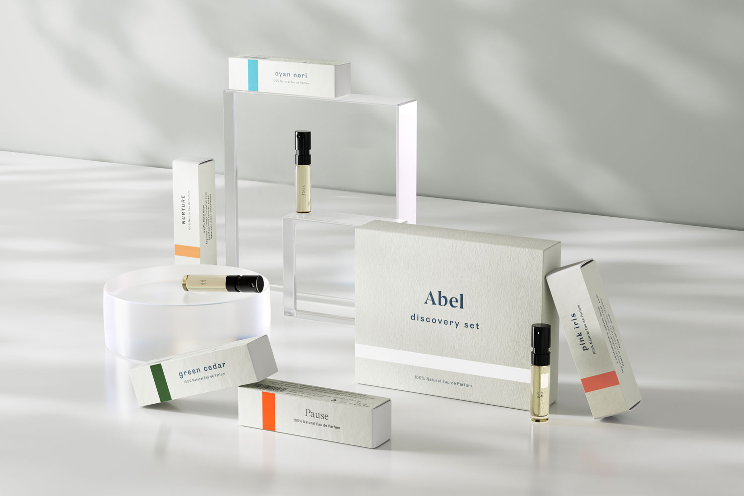
Keep a shared layout and distinguish fragrances through both colour and written names. This suits a range sharing a structural system. Colour should not be the only identifier, especially with similar shades or changing light. Check fronts, sides and sample labels individually, without assuming colour variation proves structural equivalence.
22. Connected artwork that still works individually
Let a group of boxes form a connected visual sequence while keeping complete identification on each one. Use it where the display arrangement is intentional. Test a single remaining box, a changed order and individual shipment. Connected artwork is a composition choice, not evidence that customers will collect the set.
23. A discovery set with individually identified scents
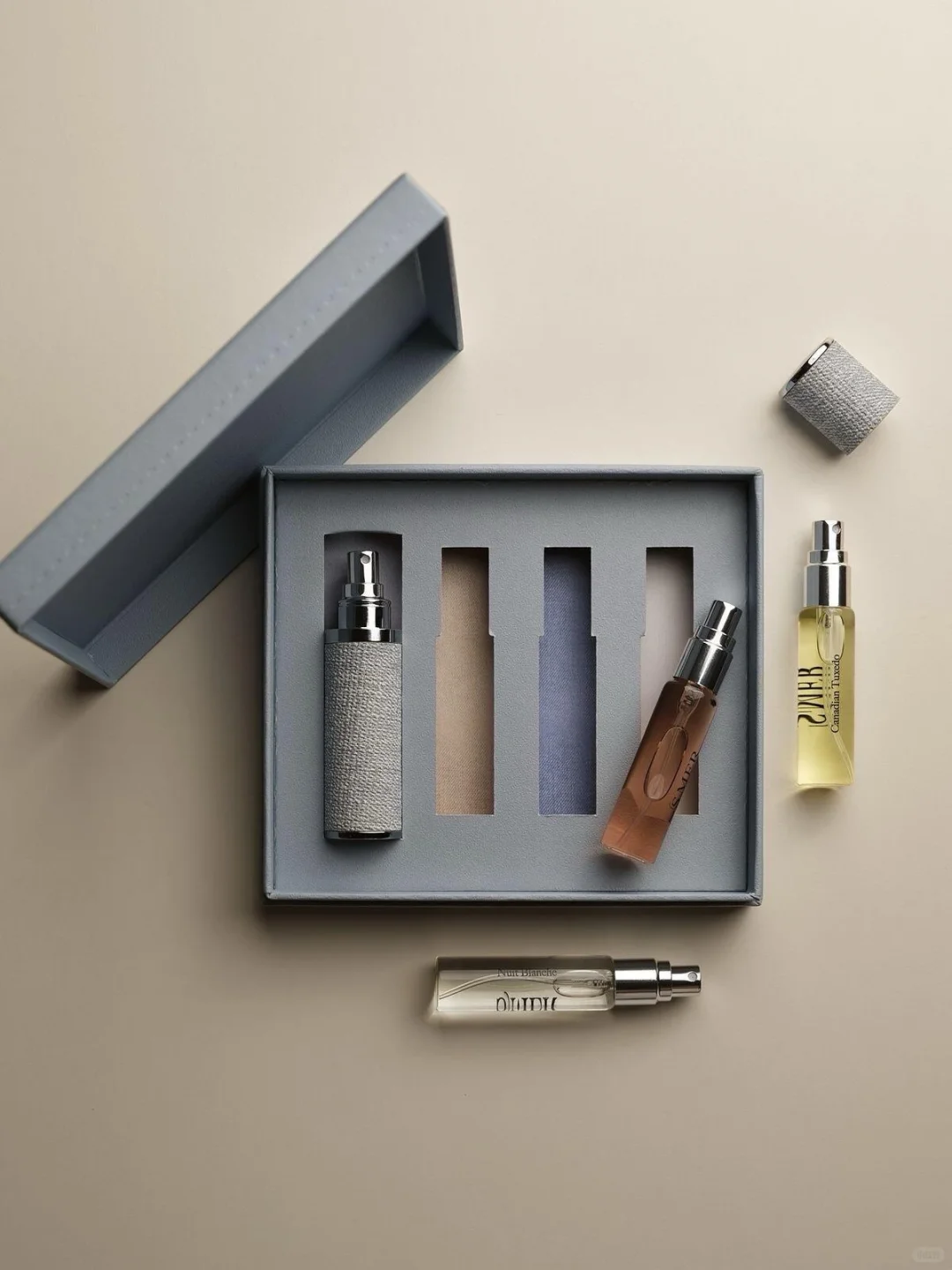
Give each vial an identifiable name and place within a common discovery pack. The smaller cartons or cards can echo the full-size layout while retaining useful scent information. Check whether the user can return a removed vial to its intended position and whether cards interfere with access.
24. Interior storytelling revealed in stages
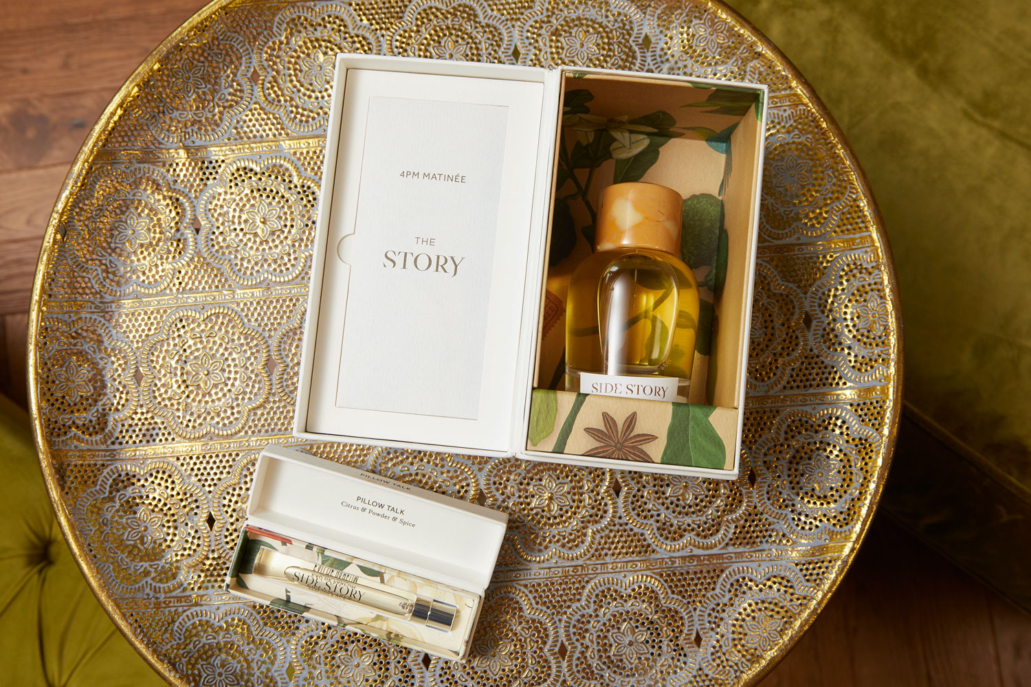
Place a short story, guidance and scent information at different stages of opening and removal. This suits content with a useful sequence. Avoid filling the entire lid with dense copy. Establish viewing position, legibility and concealed areas on a folded sample, and write original brand content.
25. A paired-bottle or full-size-and-travel gift
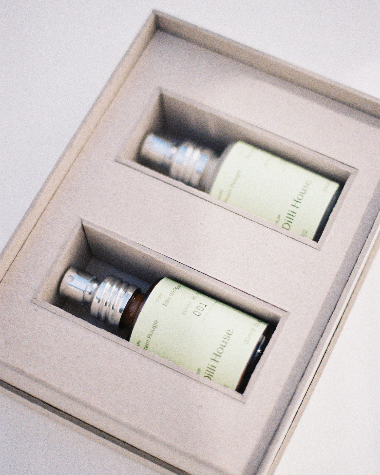
Give each product a clear place in a paired-bottle or full-size-and-travel presentation. Link the formats through colour and layout, while designing support around the actual products. Check cap height, access and contact during handling. Distinguish the quantity of complete sets from quantities of each component.