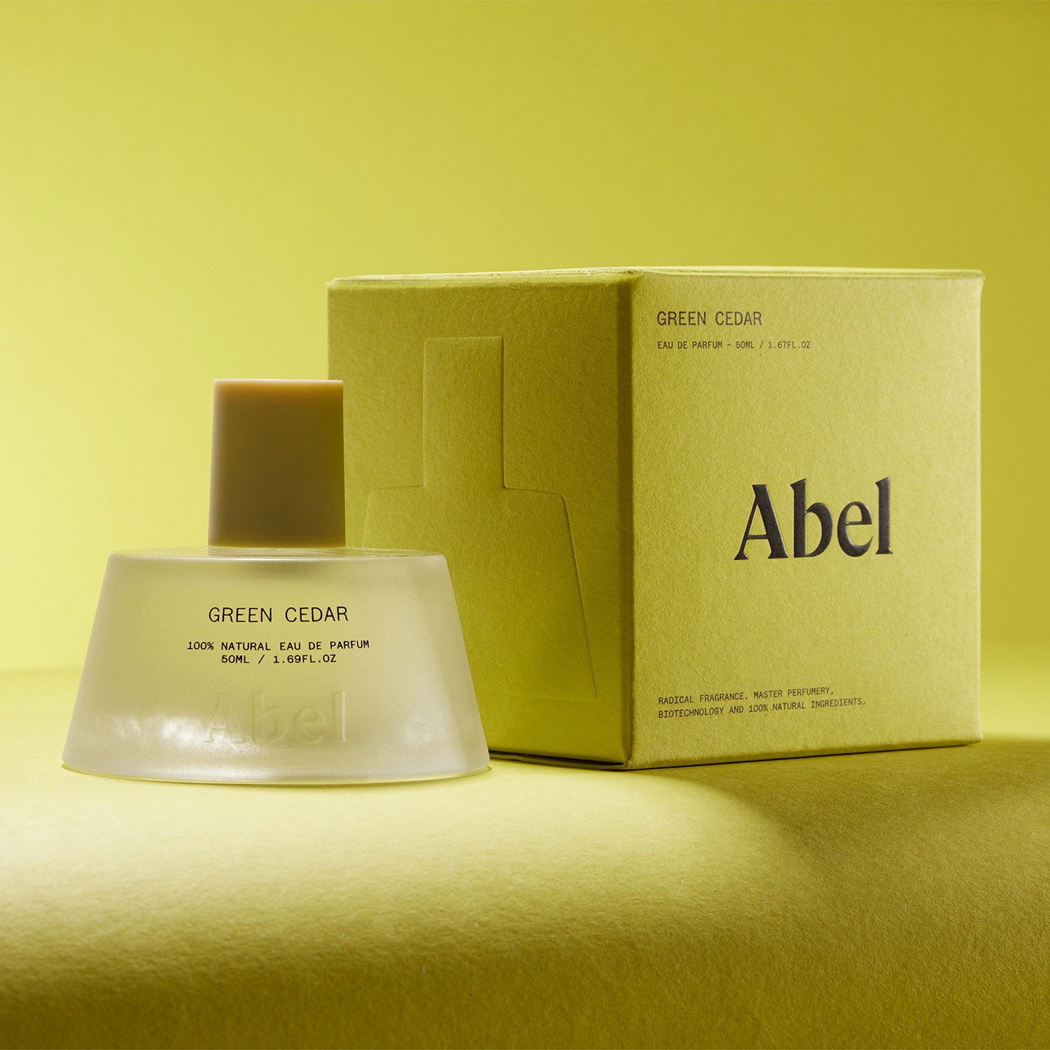
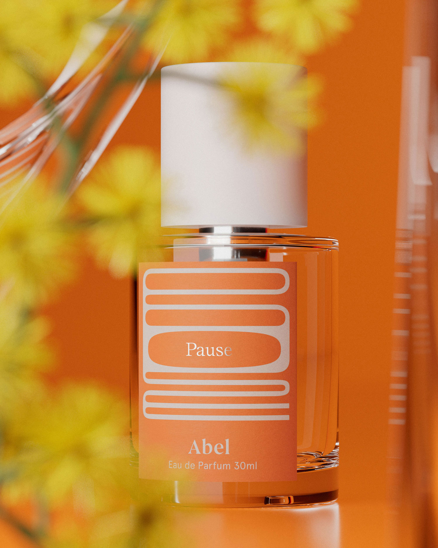
An Abel bottle and carton show the Green Cedar name in one composition. The warm lighting is photographic, not a colour-accurate production reference. Third-party reference; not a Bravo Package project.
A perfume pack needs to remain identifiable on a shelf and in an ecommerce product image, but these settings require different checks. Review the formed pack in its display context, then review the photograph at its intended screen size. Keep the approved product name, size and set contents consistent across both. An overview, a detail image and a label close-up each answer different questions; none can stand in for the complete review.
Start with the same product identity
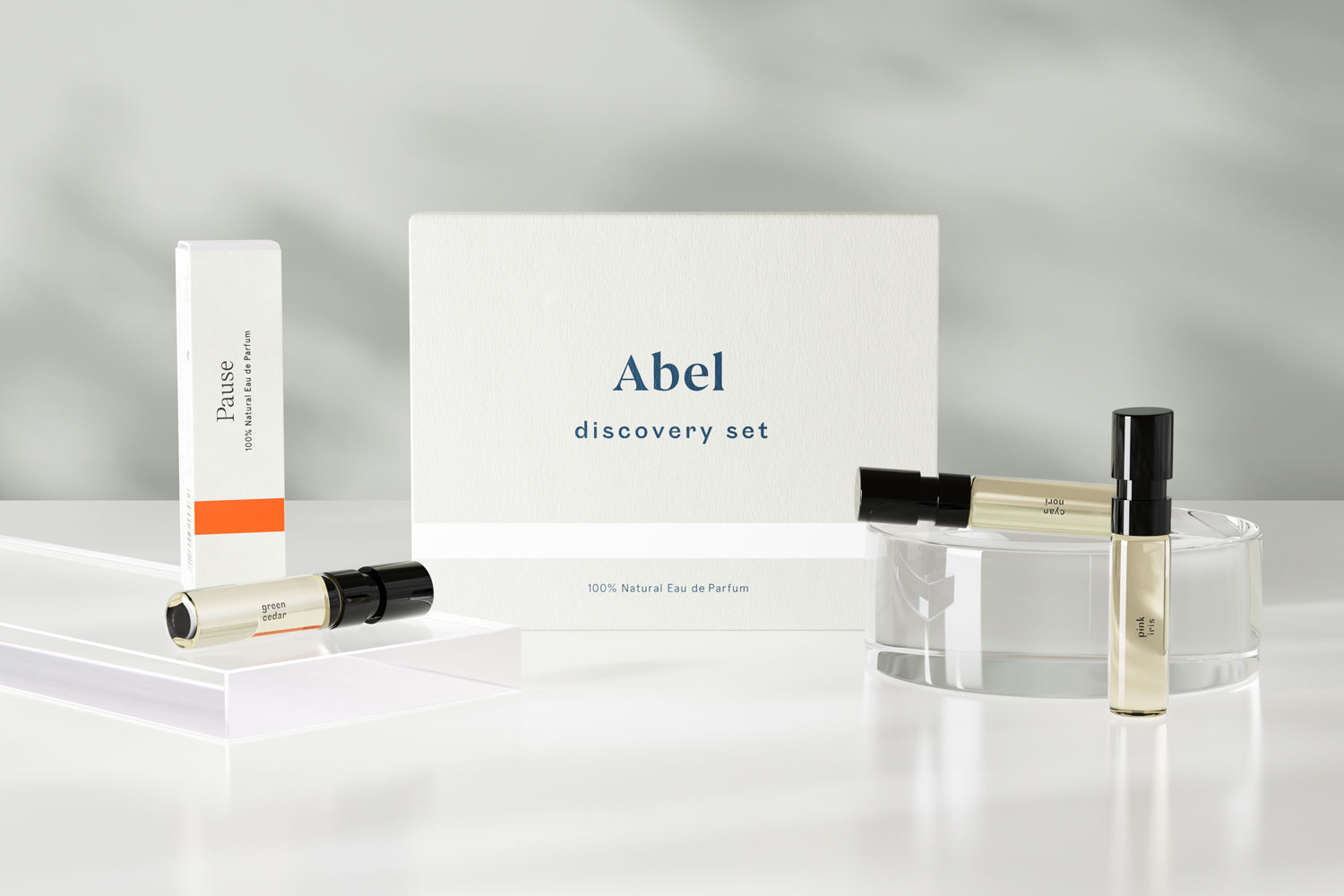
Write down exactly what is being sold: the approved product name, scent, capacity, quantity and set contents, linked to the carton and bottle-label revisions. The physical product, online title and photographs should refer to the same SKU. Styling, colour and storytelling can support the presentation, but should not make an extra sample, another bottle size or a prop appear to be part of the purchase.
Keeping the identity consistent does not require identical presentation. A shopper can pick up and turn a physical pack; an online listing can provide several images. Adjust the view and information arrangement for each setting while preserving the actual product and component pairing.
Review the formed pack in its shelf context
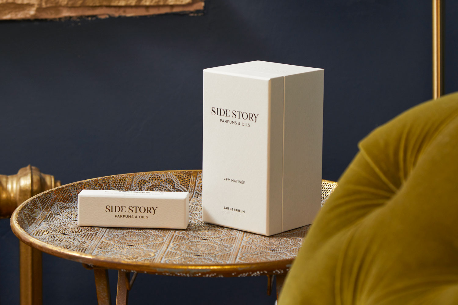
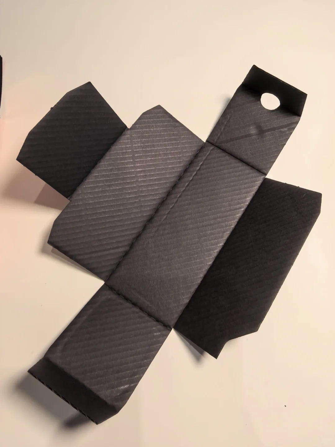
Begin with the planned shelf arrangement: which face points outwards, which similar variants sit beside it and where the viewer encounters the product. A brand-and-scent relationship that looks clear in an isolated large image may read differently within a row. Record individual-product and side-by-side checks separately. Look for the required names, specifications and distinguishing cues without assuming that greater saturation or a larger mark must work better.
Pick up and turn the formed pack. Inspect side and rear panels, joins and closures. Text that is complete on the flat artwork may be divided by a fold or covered by another component. A magnified screen view cannot replace an actual-size review of the physical pack.
Check the product image at its intended display size
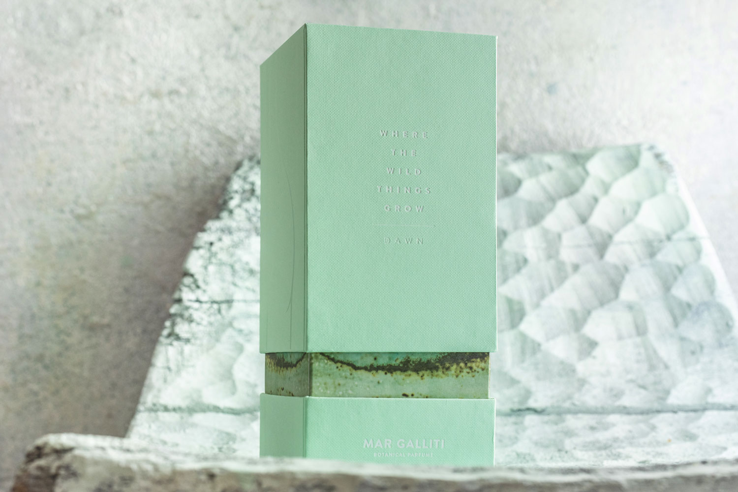
The main product image should help people recognize what is for sale and distinguish similar scents or sizes. Review it in the intended channel display rather than relying only on the full-resolution photograph. After reduction, are the bottle-and-box relationship and the relevant product differences still understandable? Compare the range images so that identifying the SKU does not depend entirely on opening a detail view.
The main image need not carry every line of packaging copy. Additional images can show detailed labels, components and opening views. They still do not replace review of the physical information. Check the channel’s applicable requirements for text, backgrounds and files; no single image size, product proportion or composition is a universal platform rule.
Give overview and detail images distinct jobs
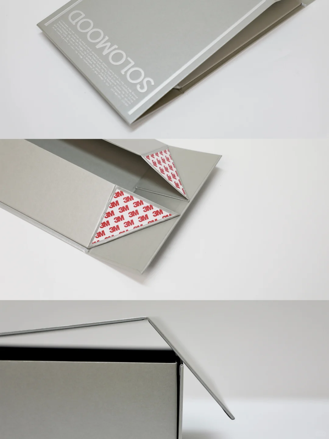
Use an overview to explain the complete product and the relationship between its components. Use supporting views for opening, set contents or another face that needs examination. A close-up answers a local question about text or appearance. Give each planned image a specific job before choosing its framing. A sequence of attractive details cannot replace a complete overview, and styling should not make the component count ambiguous.
A bottle-label close-up shows only the information within that view. It cannot establish the appearance of the entire carton, complete set contents or completeness of all packaging labels. Describe visible information when something is covered. Do not fill in hidden wording from a photograph of a similar product.
Inspect obstruction, reflection, framing and orientation
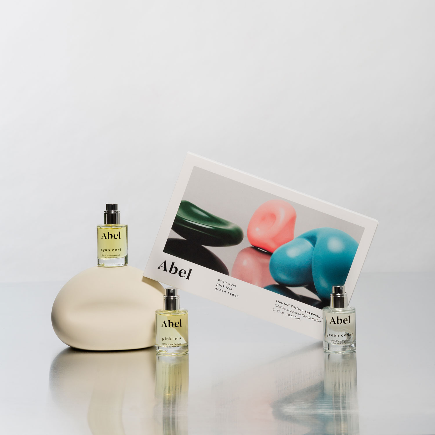
After photography, inspect whether the bottle, lid, props or reflections hide essential identifying information. Check whether cropping removes a product boundary or suggests the wrong relationship between components. Consider whether tilting, turning or reversing a view makes the name difficult to connect to the actual front face. A visually similar label and carton still need to be checked against the SKU pairing record.
Lighting, angle and screens affect the apparent colour, texture and decoration. Photographs can support discussion of an appearance target, but cannot establish paper grade, process identity, colour tolerance or printing quality. Use the relevant physical material and process sample to assess readability and surface appearance.
Keep separate review records and linked revisions
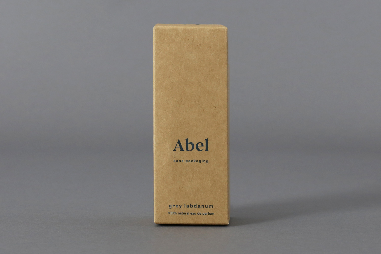
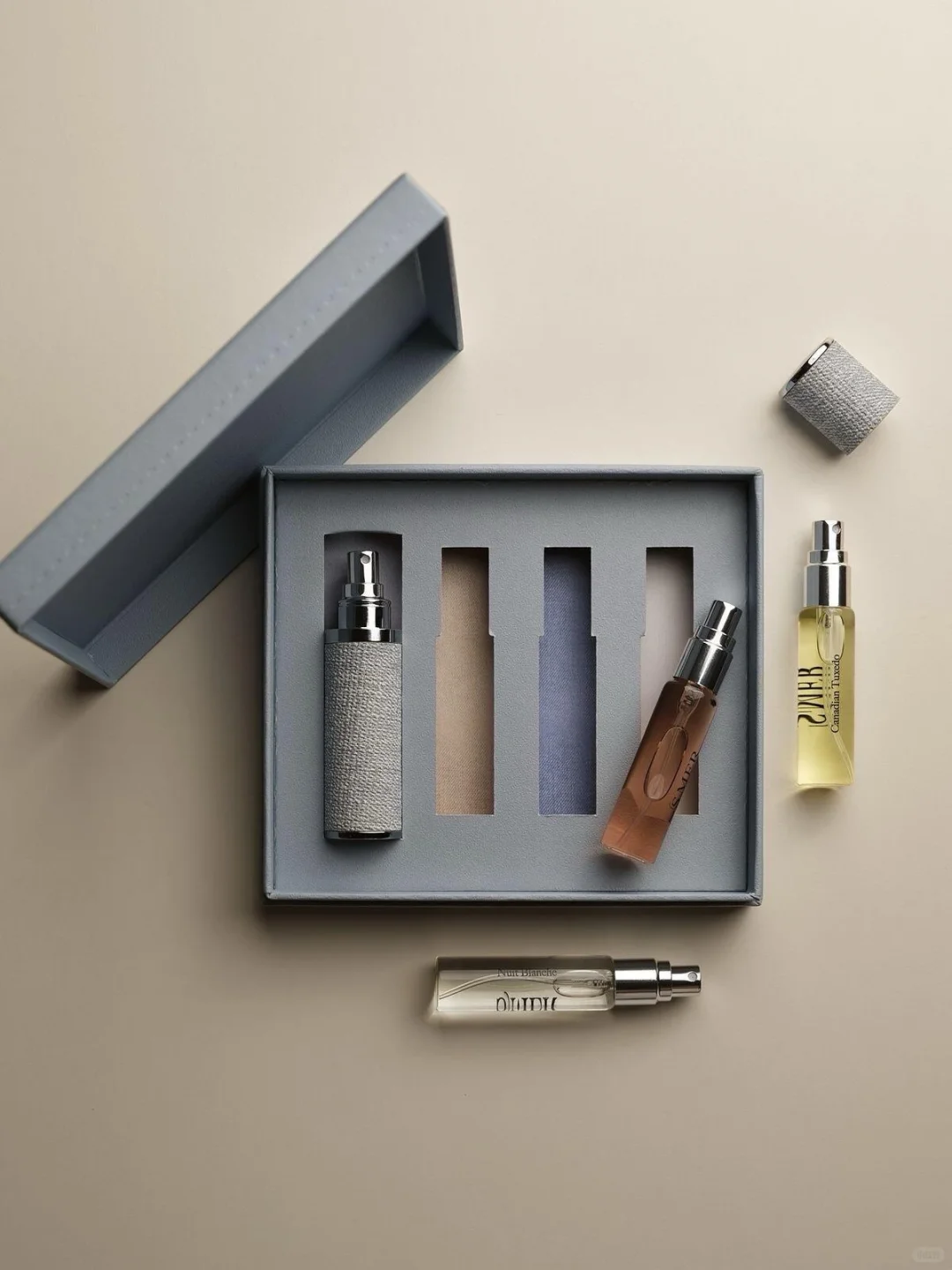
List shelf presentation, actual-size reading, thumbnail identification and supporting-image completeness as separate review items. Record the confirmed scope and outstanding questions. Ask someone outside the design process to locate a named scent or size, noting confusion without first revealing the answer. This provides evidence for a revision; it does not establish sales, memory or click-through results.
Keep the SKU list, label and carton revisions, photographed components, original and selected image files and review records together. When a name, size, set or pack changes, recheck the affected main and supporting images so that an old presentation does not remain online. Preserve separate approvals for physical content and image presentation, linked to the same product revision.