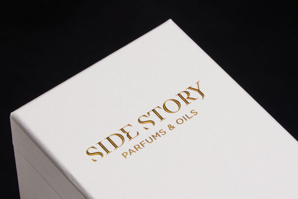
Review the actual mark, its open spaces and position together. The source identifies foil decoration; this photograph does not establish a minimum reproducible line width. Third-party reference; not a Bravo Package project.
PERFUME PACKAGING · SMALL LOGOS AND FINE LINES
Fix the actual size of the mark
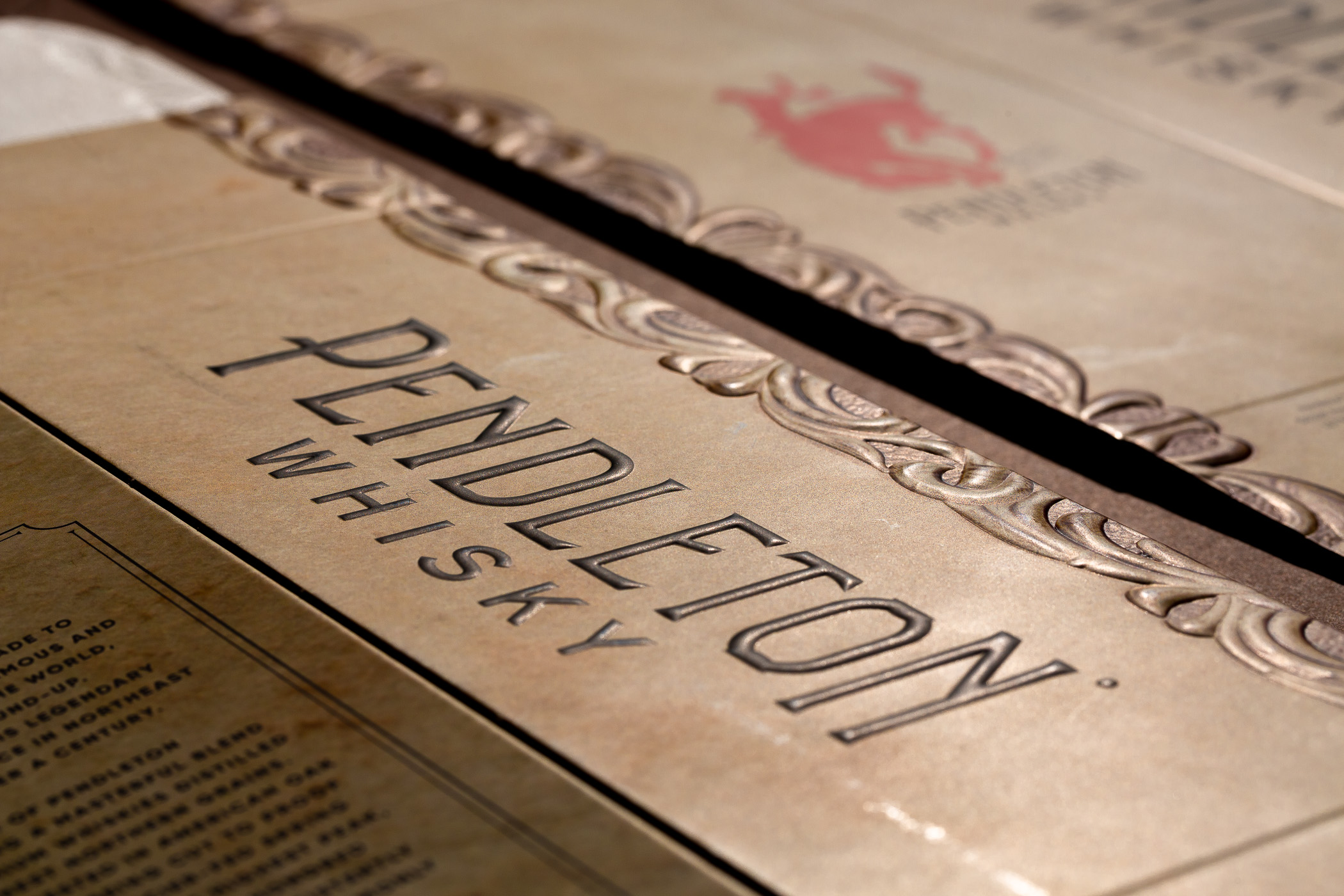
A small perfume-box logo cannot be approved from a metallic screen preview. Provide its final panel, actual width and height, and position so the supplier can assess the real artwork. Point size alone is insufficient: two typefaces at the same size can have different fine strokes, counters and spacing. Reducing a whole box design also calls for another artwork review.
Identify what must be foiled and what may be printed. The main mark, fragrance name, volume and explanatory information need not use the same process. Changes to weight, scale or detail require design approval before production trials. A manufacturing adjustment does not authorise a change to a brand mark.
Inspect strokes and open spaces separately
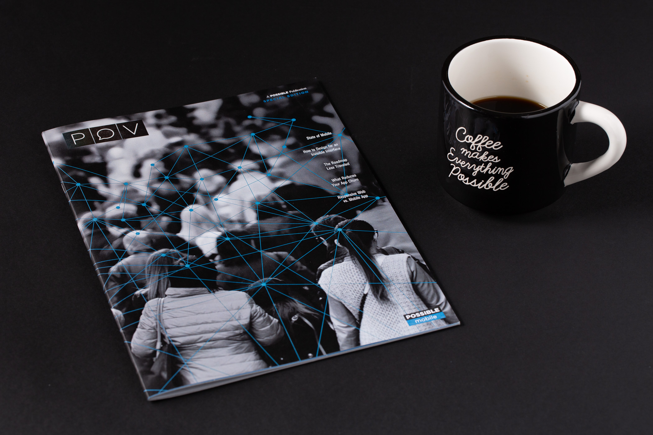
Look at both the foil that must remain and the spaces that must stay open. Identify counters, spaces between Chinese character strokes, adjacent rules and reversed-out wording at final size. A single online minimum line width cannot approve an entire typeface.
Ask the supplier to assess the particular artwork, substrate and process. A positive fine line and a small opening reversed out of a solid foil area are different details. If delicate lettering shares a panel with a large solid, have them assessed together. Neither a named foil, a die material nor a higher price guarantees every detail.
Proof the paper, foil and surface combination
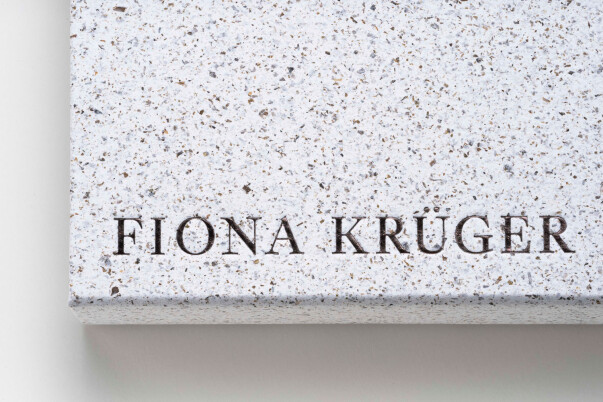
Identify the paper grade, surface treatment and printed condition, including any film, varnish, UV coating or relief. A result on a smooth card cannot approve textured wrap paper on a perfume rigid box. A similar metallic colour also does not establish the appropriate foil grade; the finisher must confirm the material combination.
Proof the actual mark and the most demanding details. Inspect texture, dark areas, printed backgrounds and foil reflection together. A colour swatch helps select a direction but cannot replace a trial on your stock. When the paper, coating or foil changes, confirm whether the previous proof remains applicable. Do not carry over production settings independently.
Review registration and the formed position
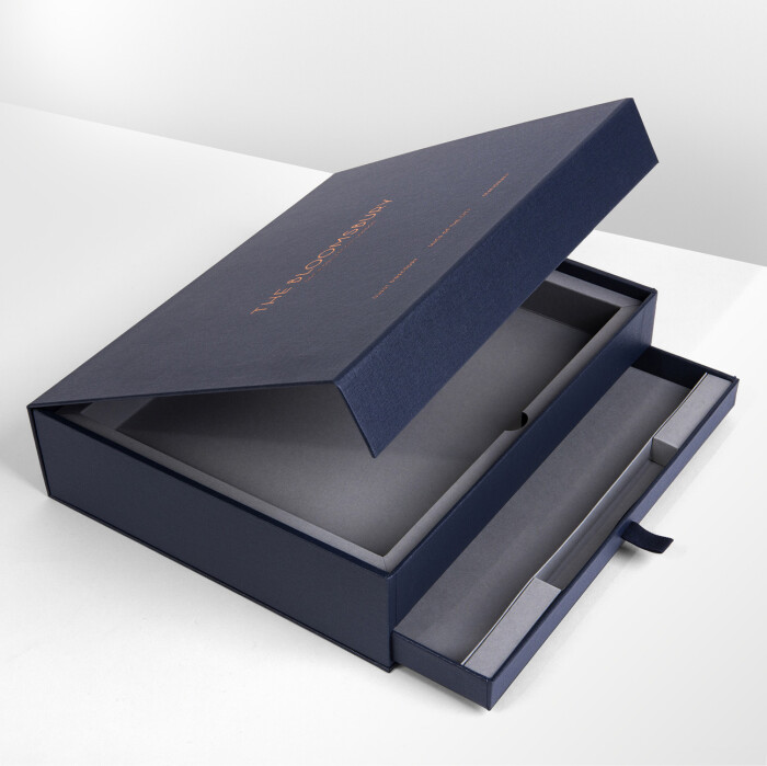
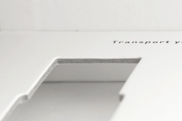
Review the logo alongside neighbouring printed borders, rules, relief, cuts and folds on one layout. Ask the supplier to explain applicable registration and conversion variation and consider how it would affect reading or the design relationship. An online one-to-two-millimetre figure is not a universal acceptance standard, and a render cannot promise zero variation.
Inspect the face, sides, wrapped edges and joints of the formed box. Where fine marks sit near a corner, fold or sleeve contact, review their appearance and intended handling. The appropriate sequence for combined finishes depends on materials, equipment and trials rather than a fixed internet recipe.
Hand over clear files and review the physical result

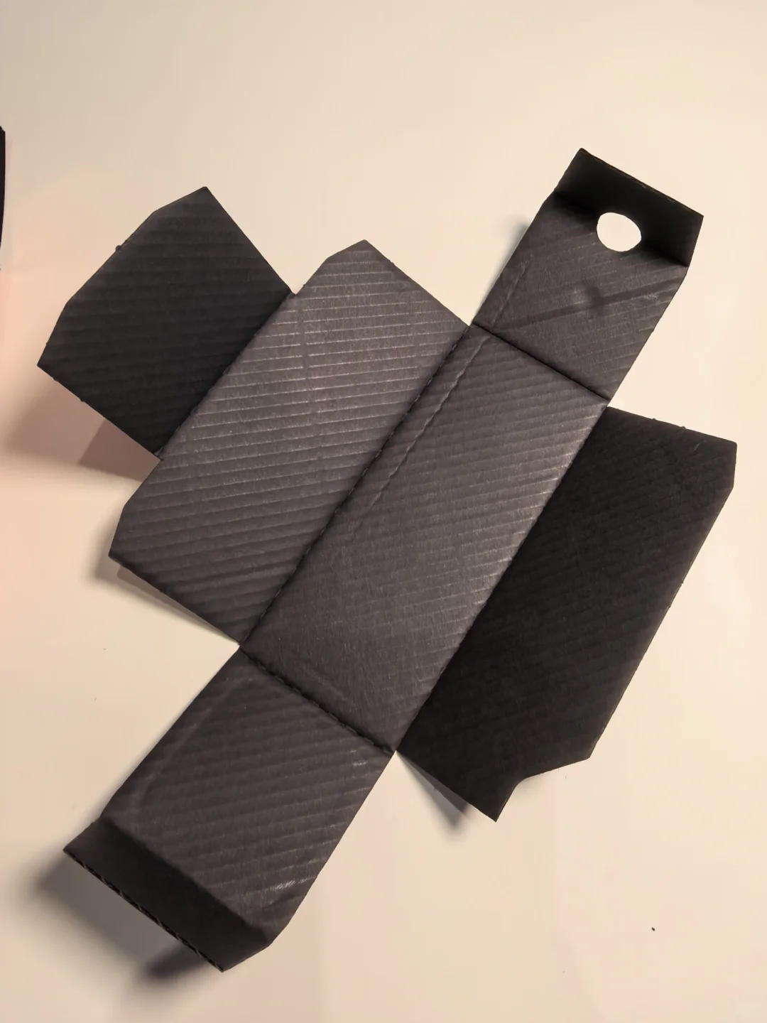
Follow the supplier’s production-file requirements and make the relationship between foil, print and final dieline explicit. A separate, clearly defined foil graphic and an aligned composite preview help communicate the job. Confirm layer names, spot settings, type handling and file formats with the recipient. A glowing metallic gradient is not die artwork. Do not mirror files or import a card printer’s bleed rules independently.
First inspect the sample at normal reading distance, then look for broken lines, filled openings, joined strokes, missing foil and unwanted edge changes. Test functional information such as codes for its intended use. Agree methods and conditions for adhesion, rub or other performance requirements; an informal scratch or tape pull cannot establish consistent acceptance.
Retain the approved version and revision scope

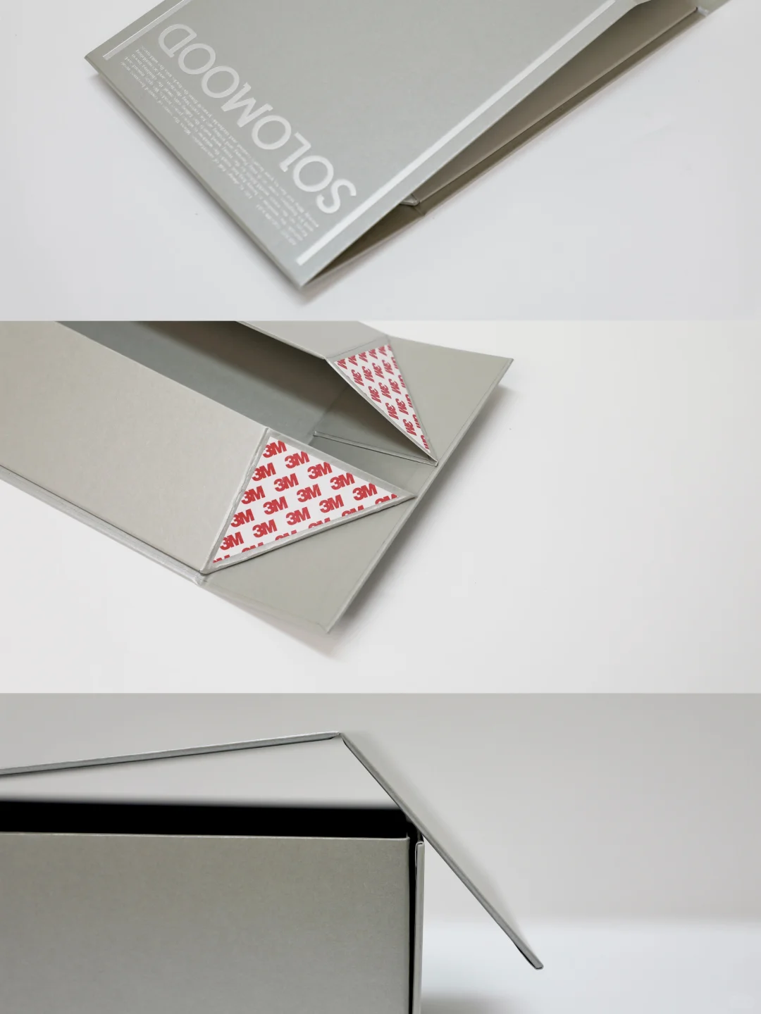
Keep approved actual-size artwork, stock and finish specifications, foil identification, tooling reference and the formed sample together. Define the details to preserve and acceptable appearance. Photographs locate features; the physical sample communicates foil reflection and feel. Describe a problem by the affected letter or line, location, material and sample version instead of calling the logo insufficiently premium.
Ask separately about tooling, setup, proofs, artwork changes and later revisions. A short run does not necessarily dictate cold foil, and a larger run does not remove the need to prove detail. On a reorder involving changed stock, logo scale, print alignment or foil, confirm the files, tools and proofs that need updating before production. Unconfirmed process limits and delivery dates are not commitments.
Technical context: Foilco fine-detail foiling guidance. Consider gaps and counters, and ask the finisher to assess fine and solid areas together. Confirm the actual artwork and stock on samples.