
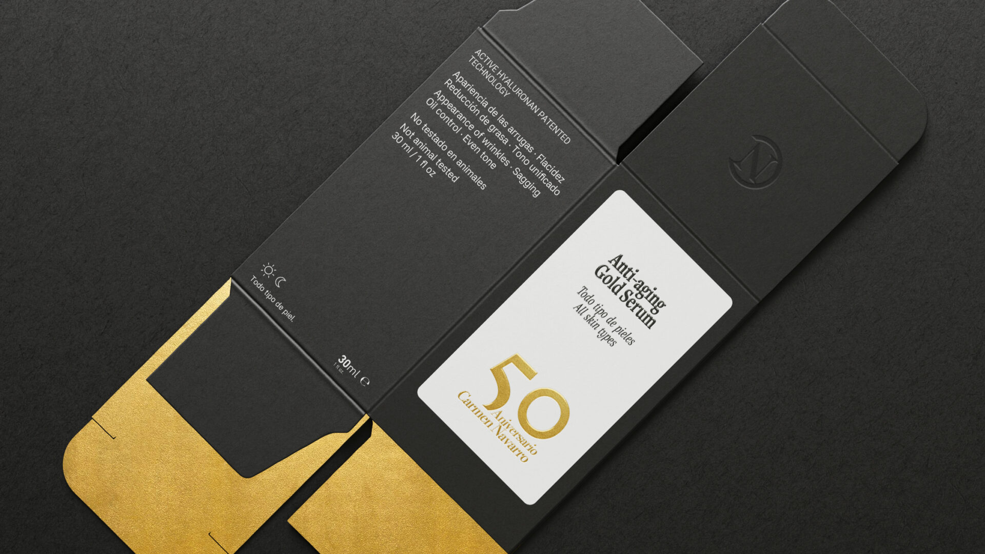
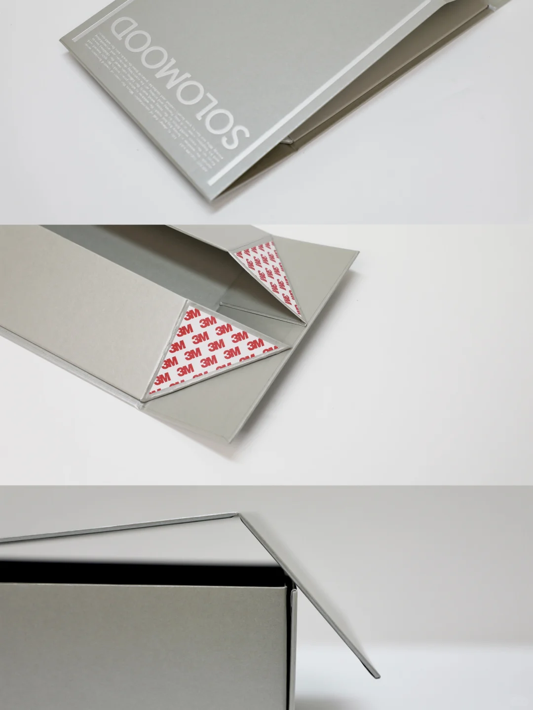
A converted cosmetic-pack reference using Sirio Ultra Black and Sirio Pearl. Identify the stock and finishing separately; this is not a perfume protection test. Third-party reference; not a Bravo Package project.
PERFUME PACKAGING · PAPER AND BOARD
A black perfume box may start with black paper or with white board printed black and then varnished or laminated. Both routes can support a similar design direction. They are not interchangeable specifications. Compare the stock, faces and edges, artwork, finish and converted box before choosing.
Identify where the black comes from
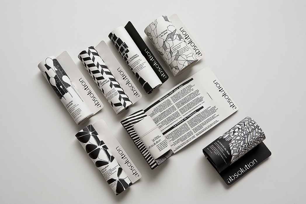
Black board is not a single grade. Record the mill, range, colour, GSM, caliper and surface. Confirm the actual colour of the face, reverse and core. Through-coloured paper, surface-coloured stock and materials with different core layers should not become one specification simply because each is sold as black card.
For black-printed white board, specify the white base and which faces are printed. Examine the opening, tuck flaps, cut edges and interior on a converted sample. With a rigid box, black wrapping paper does not establish the colour of the underlying board. Review wrapped edges, corners and joints separately.
Compare black on the finished surface
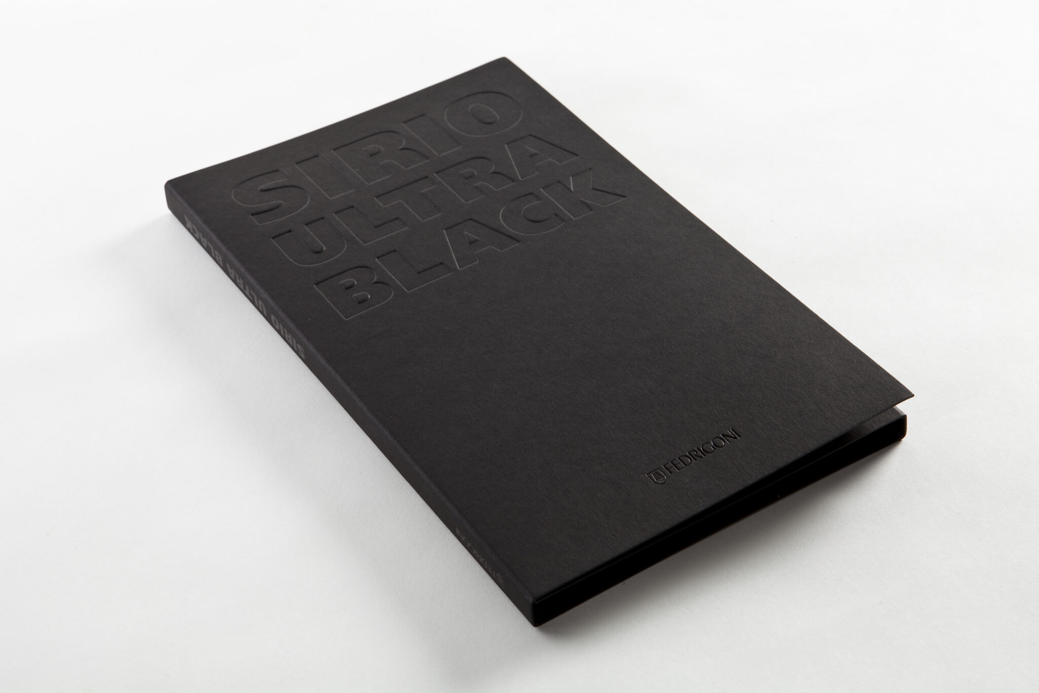
Do not assume black stock is always textured or printed white board is always smooth. The grade, coating, embossing, varnish or laminate can change both appearance and touch. Label every comparison sample with its actual construction: black stock, white board printed black and varnished, or black print with a matte laminate, for example.
Compare depth, warmth, gloss and feel under consistent lighting. Then review fingerprints, scuffs and rubbing using an agreed procedure on the finished surface. A stock name or pristine photograph cannot establish scratch resistance or colour durability.
Agree the print file and output conditions
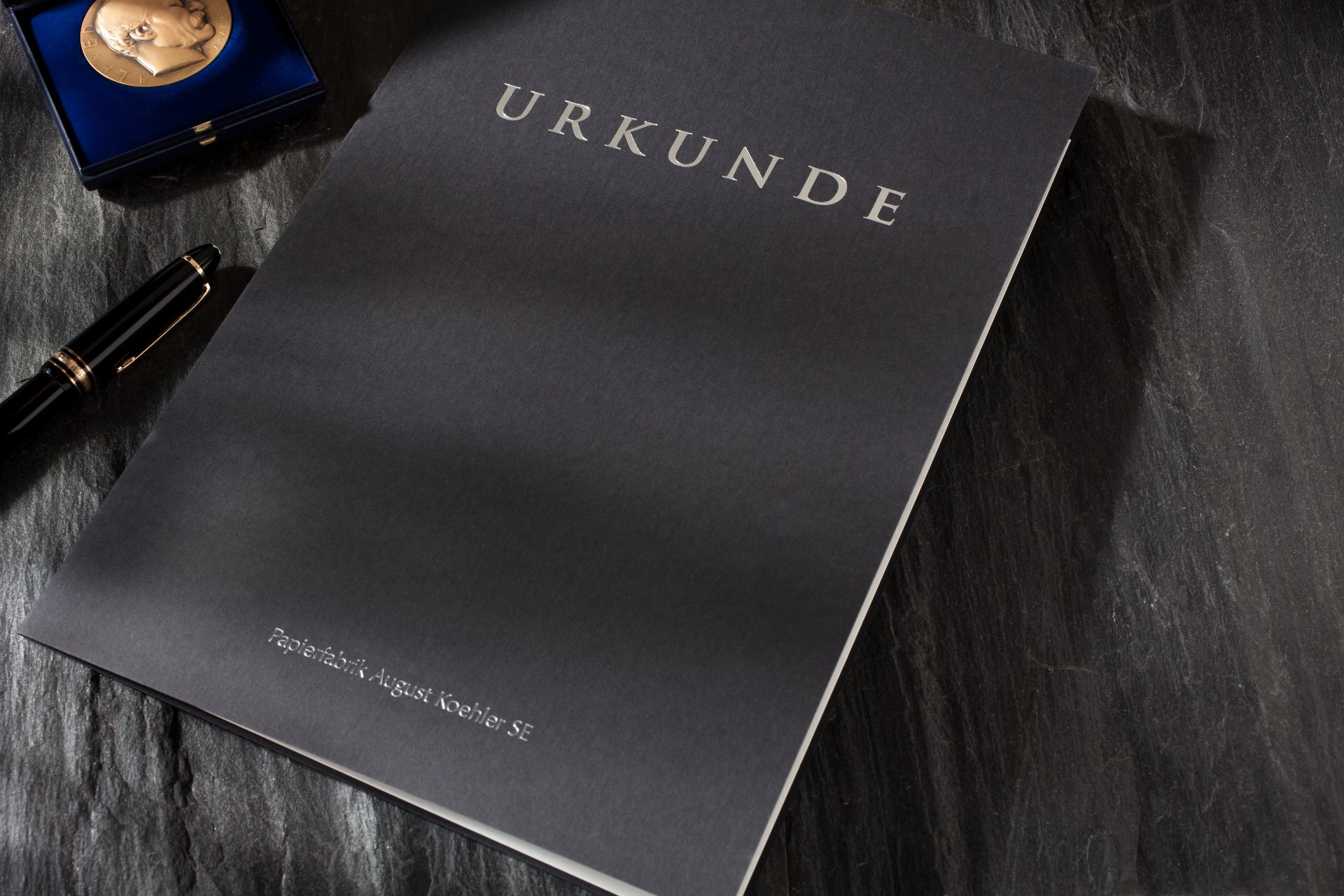
Process black, rich black and the Registration colour are different concepts. Avoid copying a universal “true black” recipe into every panel. Adobe's prepress guidance distinguishes rich black from Registration and directs users to confirm appropriate percentages for the press and stock with their service provider.
Review large solids, small lettering, fine rules and reversed text separately. Agree separations, ink coverage, overprint or knockout settings and the exported file with the printer. Recheck when the stock or equipment changes. Include realistic solid areas, small information text and artwork near folds in the proof, rather than approving only a large logo.
Specify white and colour on black stock
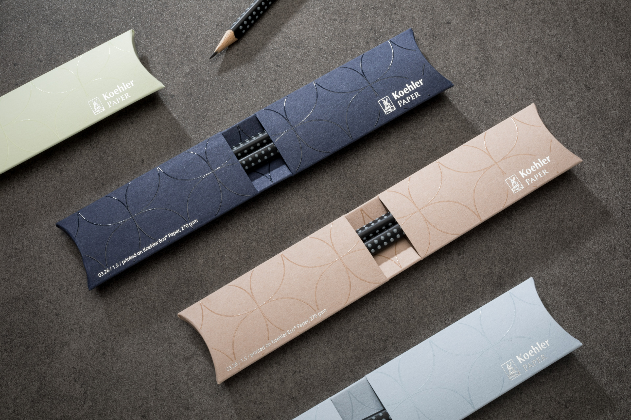
On white board, an unprinted area can supply the white. On black stock, opaque white lettering needs a defined production method. Specify and quote white ink, foil, a separate label or another proposed route. Confirm whether coloured artwork requires a white underlayer with the converter handling the actual job.
Check white coverage, fine lettering, colour and registration between layers. A coloured foil and coloured ink are different effects. Supply separate artwork layers for foil, impression and printing, then review edges and adhesion on the final stock. Do not approve a process from a sample made on another paper.
Check codes and converted details separately
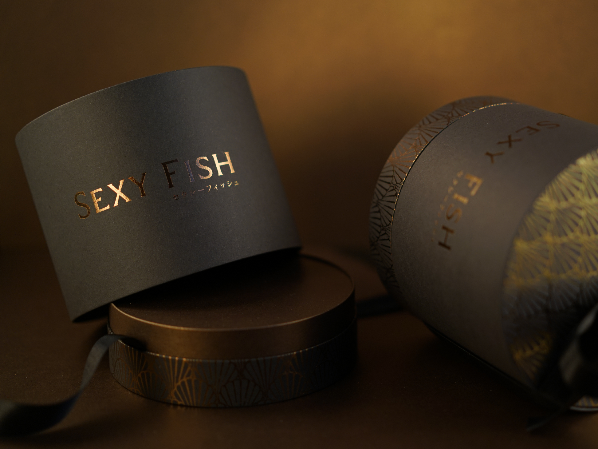
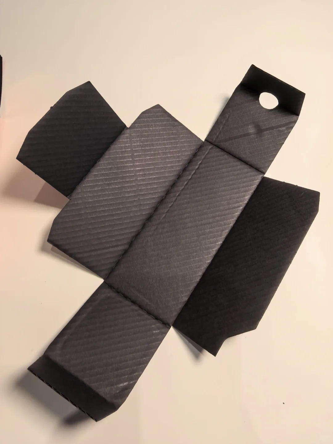
A visible QR code is not proof of reliable scanning. Consider contrast, clear space, size, coverage and the final finish, then scan the actual converted piece on the intended devices and under realistic conditions. A white panel on black stock or a separate label can be a candidate solution; neither is an automatic guarantee.
Fold the box and examine cut edges, creases, flaps, the base, glue areas and opening points. Evaluate exposed white edges, damaged folds and visible board at wrapped joints on the real material and construction. A through-coloured stock still needs proper creasing and converting. Pack the actual bottle to check fit and removal. Black appearance does not establish protective performance.
Compare complete samples and quotations
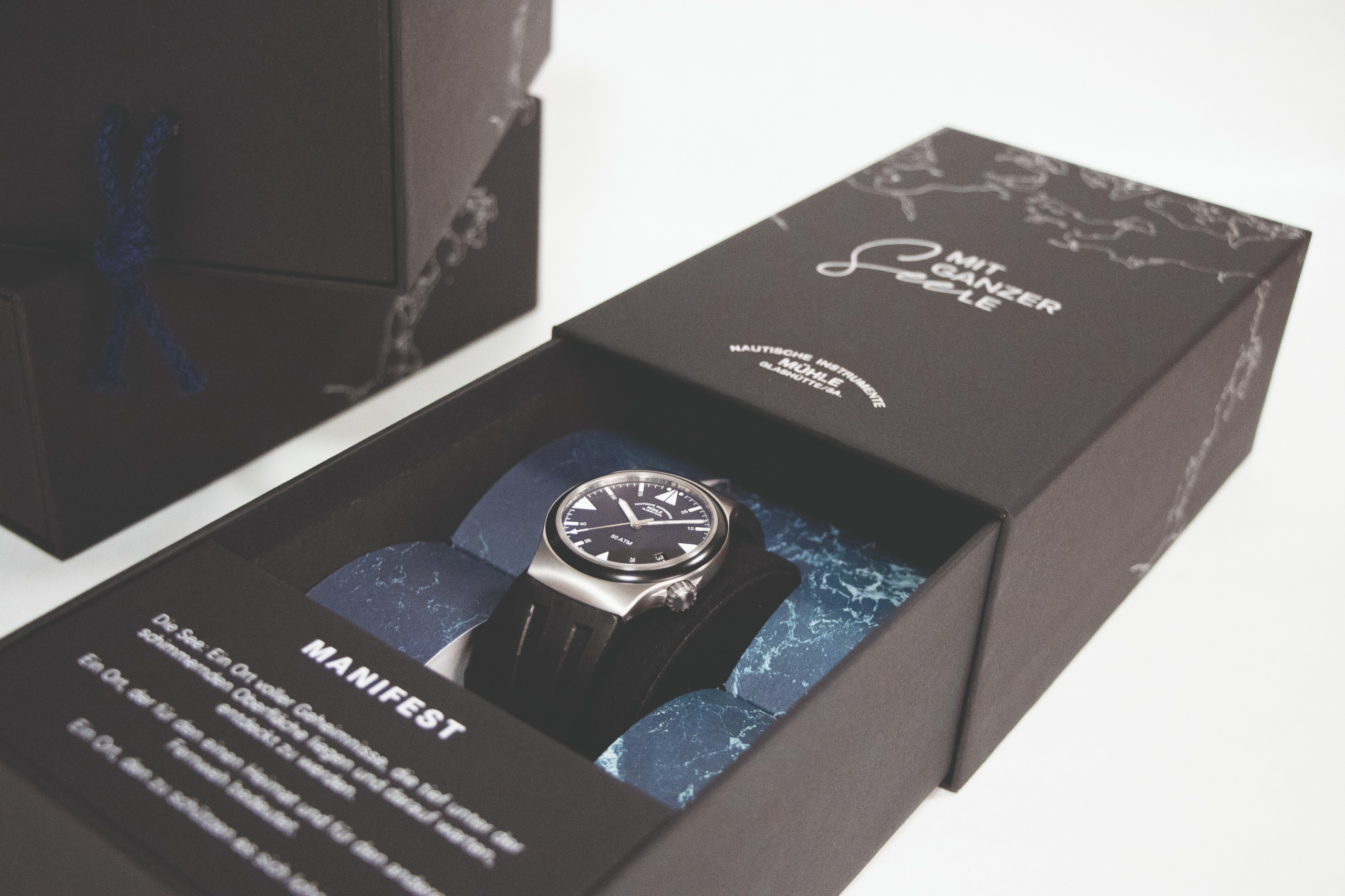

Keep the structure and artwork comparable across the two routes. Itemise the stock, how black is created, white ink or foil, printed faces, finish, insert and supply condition. Compare the complete finished cost and operations. Neither route is inherently the cheaper option for every project.
Retain the stock reference, final process sample and packed converted box with identifiable versions. Agree colour, surface, edge and folding acceptance criteria. Reapprove substitutions or changes to print and finish. Choose the route that can reproduce the intended black, readable information and sound converted details together.
Prepress reference: Adobe about overprinting and rich black. Material reference: Koehler Eco Paper.