
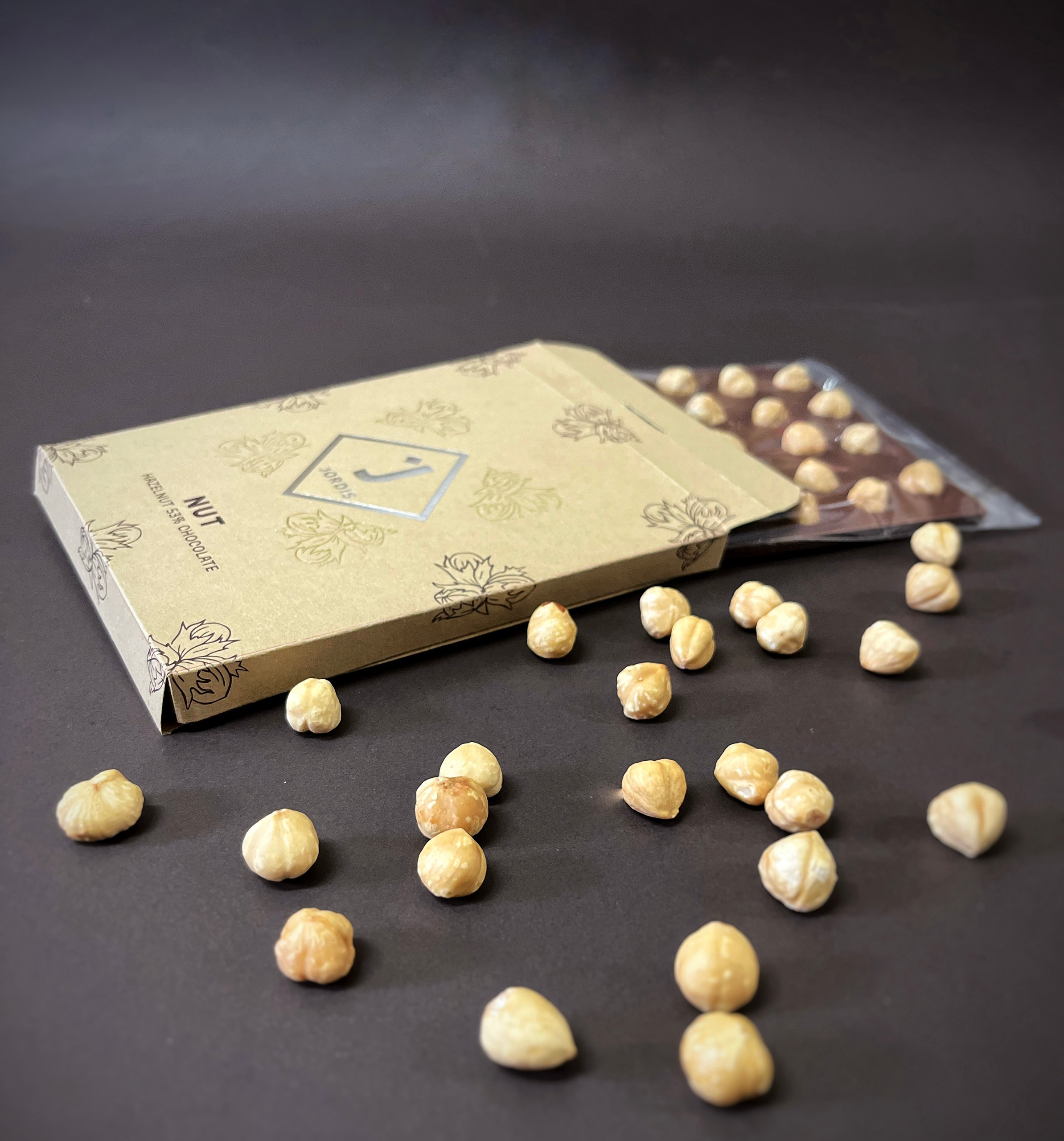
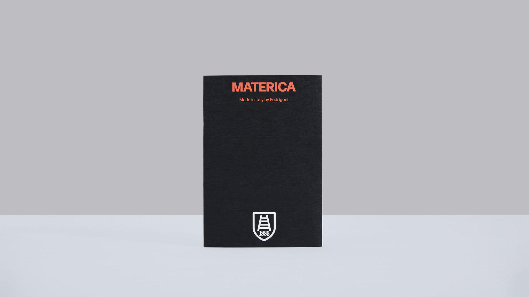
A perfume pack combines visible surfaces, structural support and the actual bottle. This reference does not identify the paper as cotton. Third-party reference; not a Bravo Package project.
PERFUME PACKAGING · PAPER AND BOARD
Cotton paper can support a soft, restrained packaging direction with a noticeable tactile surface. But “a cotton-paper perfume box” is not yet a production specification. It may describe a cotton-containing board, a pure-cotton sheet, or a paper used to wrap a rigid box. Establish the material, component and desired finished feel before choosing a grade.
Verify the composition behind the name
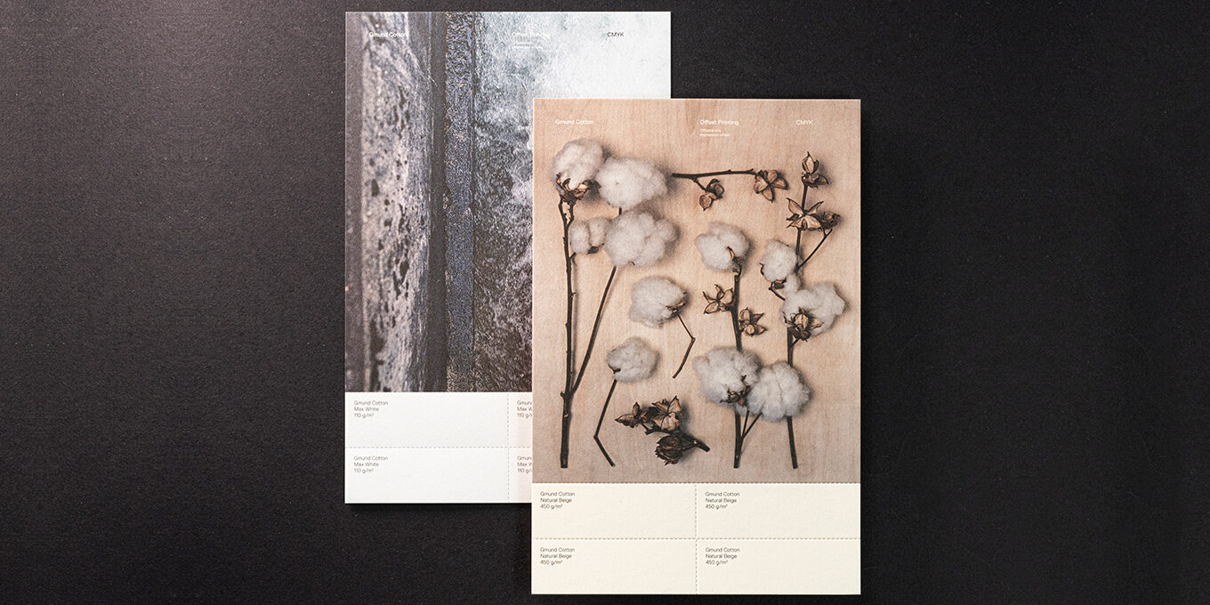
Record the mill, range, grade, colour and specification. Names such as cotton paper, cotton card and velvet-feel paper can describe different things. Some refer to fibre composition; others describe a surface impression. Confirm cotton content from the specific range’s documentation rather than touch, texture or an abbreviated sales description.
For example, Fedrigoni lists 10% cotton fibre in Materica alongside other fibres, while Gmund describes Gmund Cotton as 100% cotton. These are different materials. Colour, thickness and surface still need checking within a range. A paper’s composition or certification must not automatically become an environmental claim about the complete finished pack.
Approve colour and touch as tangible targets

White cotton papers can differ in warmth, brightness and texture. Compare physical swatches side by side under the same viewing conditions, then place them with the bottle, cap, label, insert and proposed foil. A phone photograph cannot substitute for an approved paper swatch.
Check the feel again after converting. Does the intended surface feel soft, fine, rough or visibly fibrous? Use an identifiable sample to express the preference. Record which side faces out and any coating or lamination. If a proposed finish changes the original feel, treat that as a change requiring review.
Test printing on the final stock
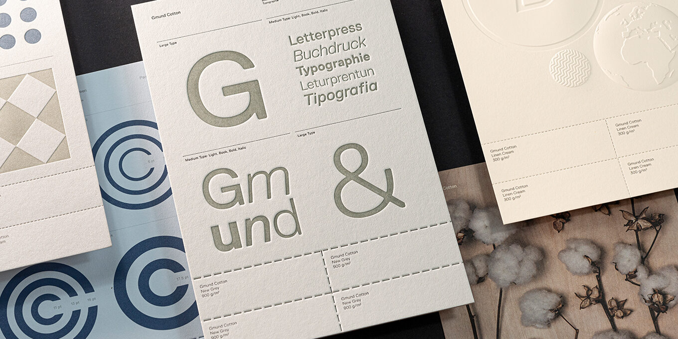
Cotton paper does not imply universal printing compatibility. Gmund Cotton’s printing guidance distinguishes between grammages and equipment capabilities, and calls for proofing on the same stock. Confirm the exact grade and converter’s equipment before approving a printing route.
Include the final logo, smallest text, fine lines, images and realistic solid areas in the test artwork. A handsome brand name does not establish that back-panel information is readable. Check coverage and contrast separately for light stocks, dark stocks, white ink and spot colours. Do not dismiss an unwanted colour shift as a vintage effect. Test writing separately on any card intended for consumer notes.
Review impression and foil separately
An attractive impression should not become a request for maximum depth. Specify whether the artwork needs blind debossing, a raised motif or inked letterpress. Ask the converter to confirm feasibility for the actual stock, design and intended result, then retain an approved sample.
Inspect the reverse as well as the face: unwanted marks, blurred fine details and incomplete foil edges need attention. When solid colour, small type, impression and foil share a design, check registration and legibility together. Supply separate artwork layers for printing, impression and foil, and itemise them in the quotation. A process name alone does not define the production scope.
Separate the surface from structural support

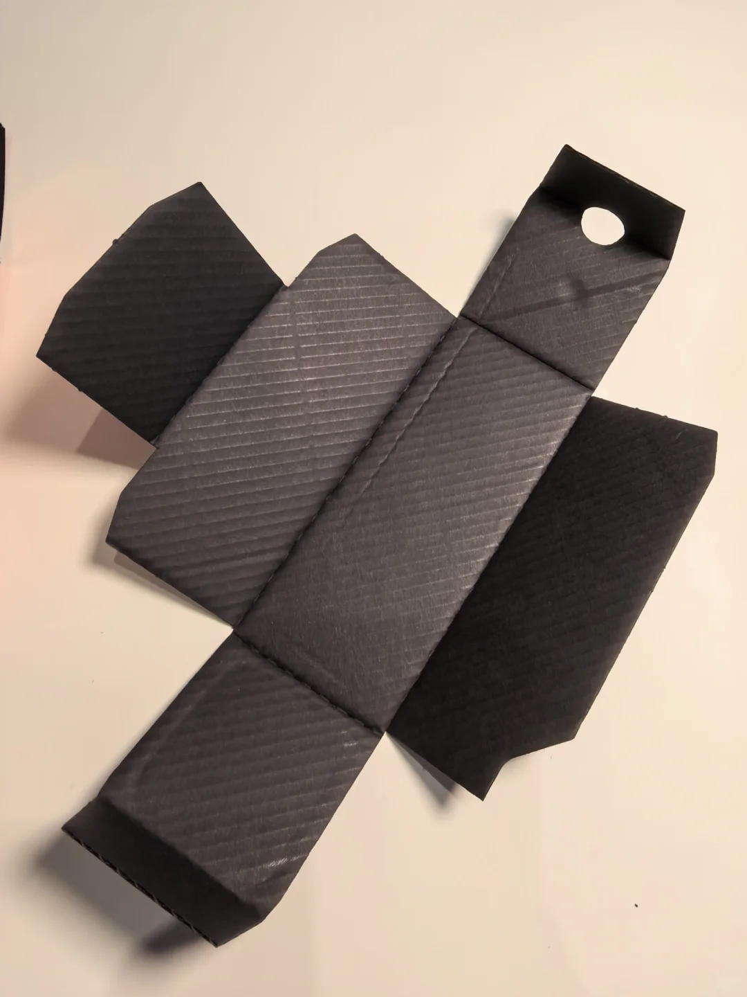
A soft surface neither proves weak board nor establishes adequate bottle protection. State whether cotton paper will form a folding carton, wrap rigid board, line an interior, or become a tag or card. Components can share a visual direction while needing different materials and thicknesses.
For rigid boxes, sample the board, wrapping, edges, corners and bonding together. For folding cartons, review creases, glue areas, tuck flaps and closing clearance. Pack the actual bottle to check positioning, removal and closure. Cotton content, texture and a substantial-looking photograph cannot replace finished-pack checks or protective-performance verification.
Define acceptance with matching samples

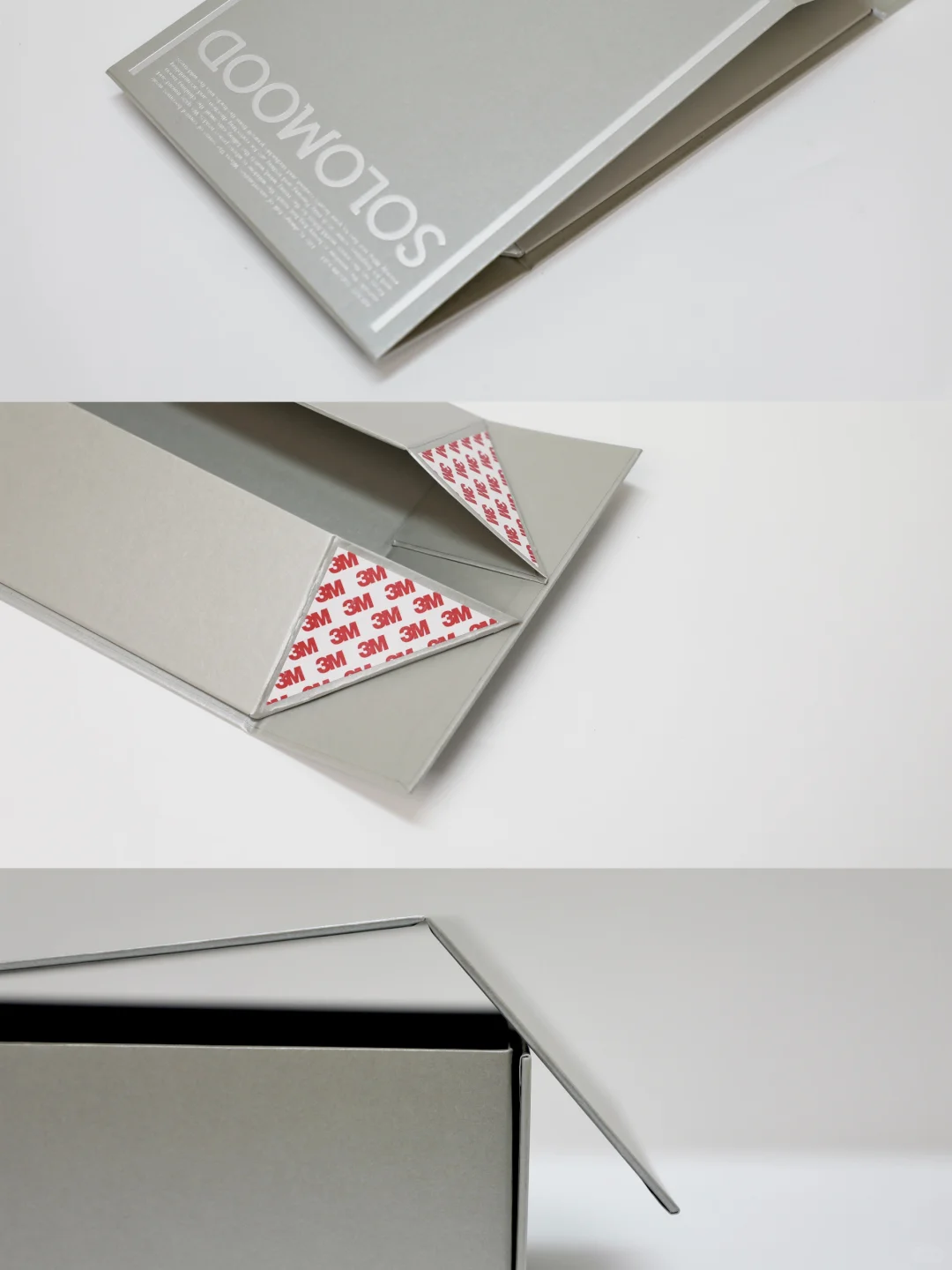
A plain swatch addresses colour and basic feel; a process sample addresses printing and finishing; a packed box addresses fit and handling. Keep each sample with its purpose identified. A small printed card cannot establish the quality of a complete perfume box.
Record the paper range and batch, colour, GSM, caliper, direction, finish, structure and artwork version. Agree how to inspect colour, coverage, white spots, scratches, cut edges and bonding, including acceptable variation and rework conditions. For repeat orders or substitutions, compare against the same physical reference and record. The useful outcome is a repeatable combination of touch, readable artwork and suitable construction.
Material references: Fedrigoni Materica, Gmund Cotton and Gmund Cotton printing tips.