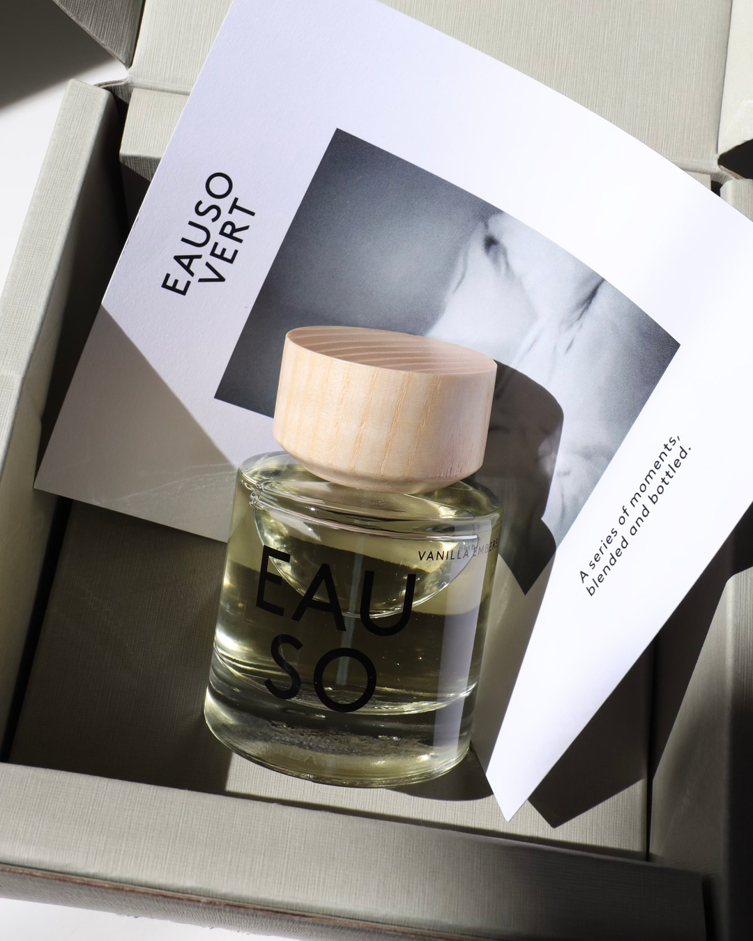
Illustrate coordinating a separate story card, product and visible packaging surfaces. Do not infer scent notes, paper composition or print method from the image. Third-party reference; not a Bravo Package project.
Words such as “rain-washed,” “quiet” or “bright” can start a packaging discussion. They do not specify a paper, a printed panel or a way to support the bottle. Turning a fragrance story into a workable production brief means moving from mood to original visual choices, named components, material and process candidates, scoped samples and revision approval. There is no fixed colour code for scent notes. The story explains the intention; physical products, files and samples establish what can be made.
Start with the approved story and use context
Ask the brand for the approved story text and select the words that actually affect the design. Explain the situation each word describes. “Quiet” might mean fewer competing messages, a slower reveal or lower contrast. Clarify the intention before specifying cream paper or relief decoration. The same word can support several visual interpretations; woody notes do not require brown packaging.
Keep the practical conditions beside the story: bottle and cap dimensions and weight, sizes, quantities per version, sales channel and the way the customer opens and handles the pack. A narrative cannot justify an unassessed bottle shape or displace necessary product information. Separate facts supplied by the brand from the designer’s associations. Do not turn an attractive but unverified history, ingredient or effect into packaging copy.
Translate mood into original visible choices
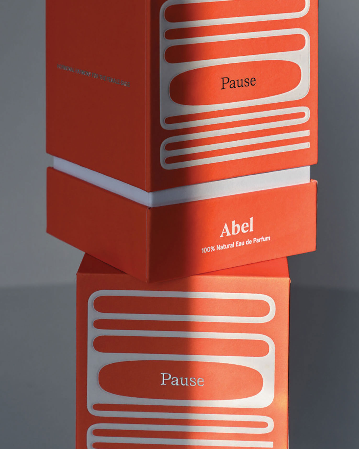
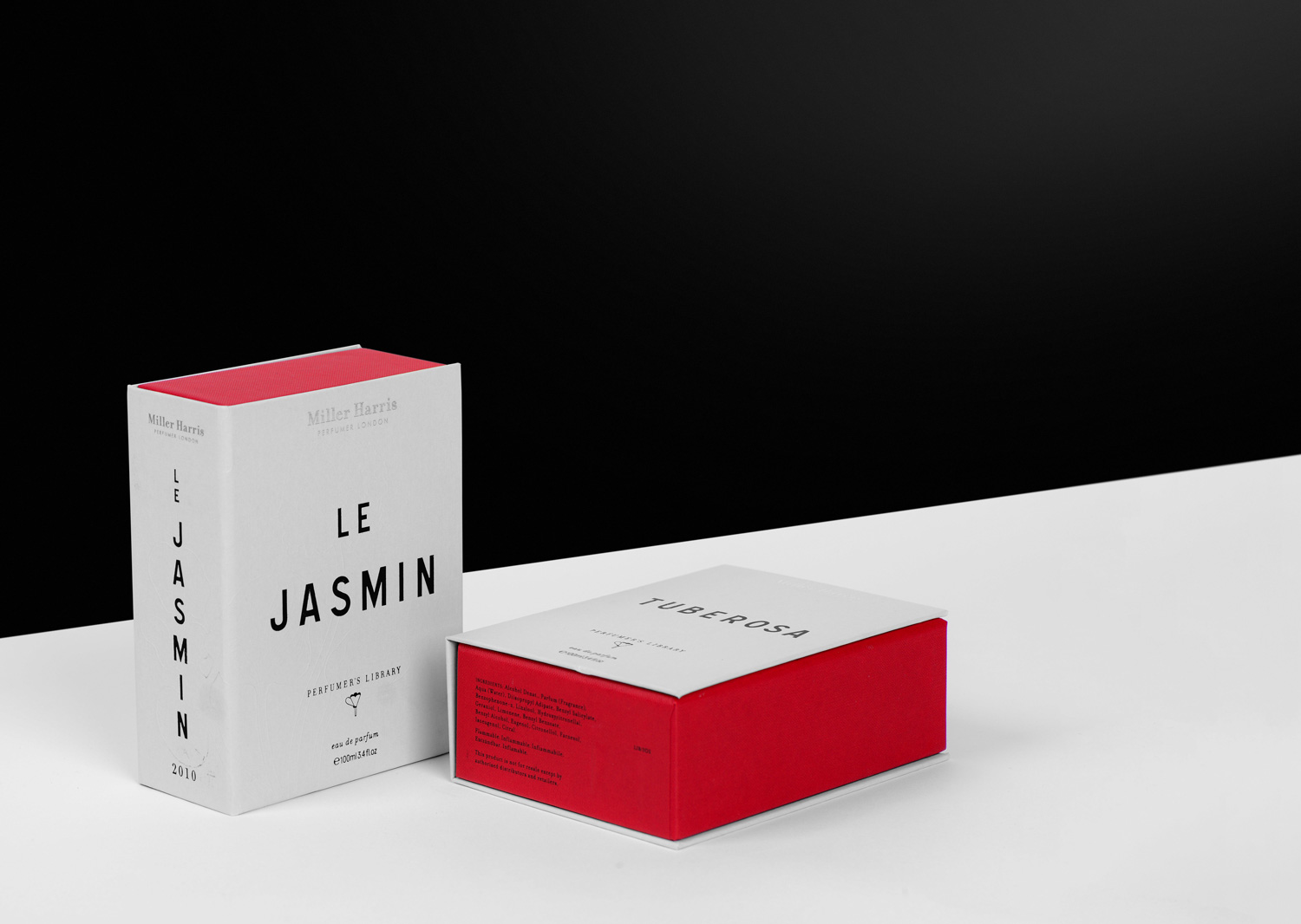
Break the direction into information hierarchy, colour relationships, graphic rhythm, surface intention and opening sequence. Replace a phrase such as “premium mystery” with choices that can be compared. For example, test a low-contrast layout against a concentrated reflective accent, explaining what should attract attention first. These are alternatives, not recipes dictated by an emotion.
Build the system with original graphics and copy the brand is entitled to use. Specify how a motif changes between a larger box, a sample format and a card. Annotate the particular relationship you like in a reference rather than copying its logo, distinctive bottle or wording. An AI concept image can support a conversation about form. Its polished appearance does not establish a physical object, available material or proven manufacturing method.
Assign each choice to a component and panel
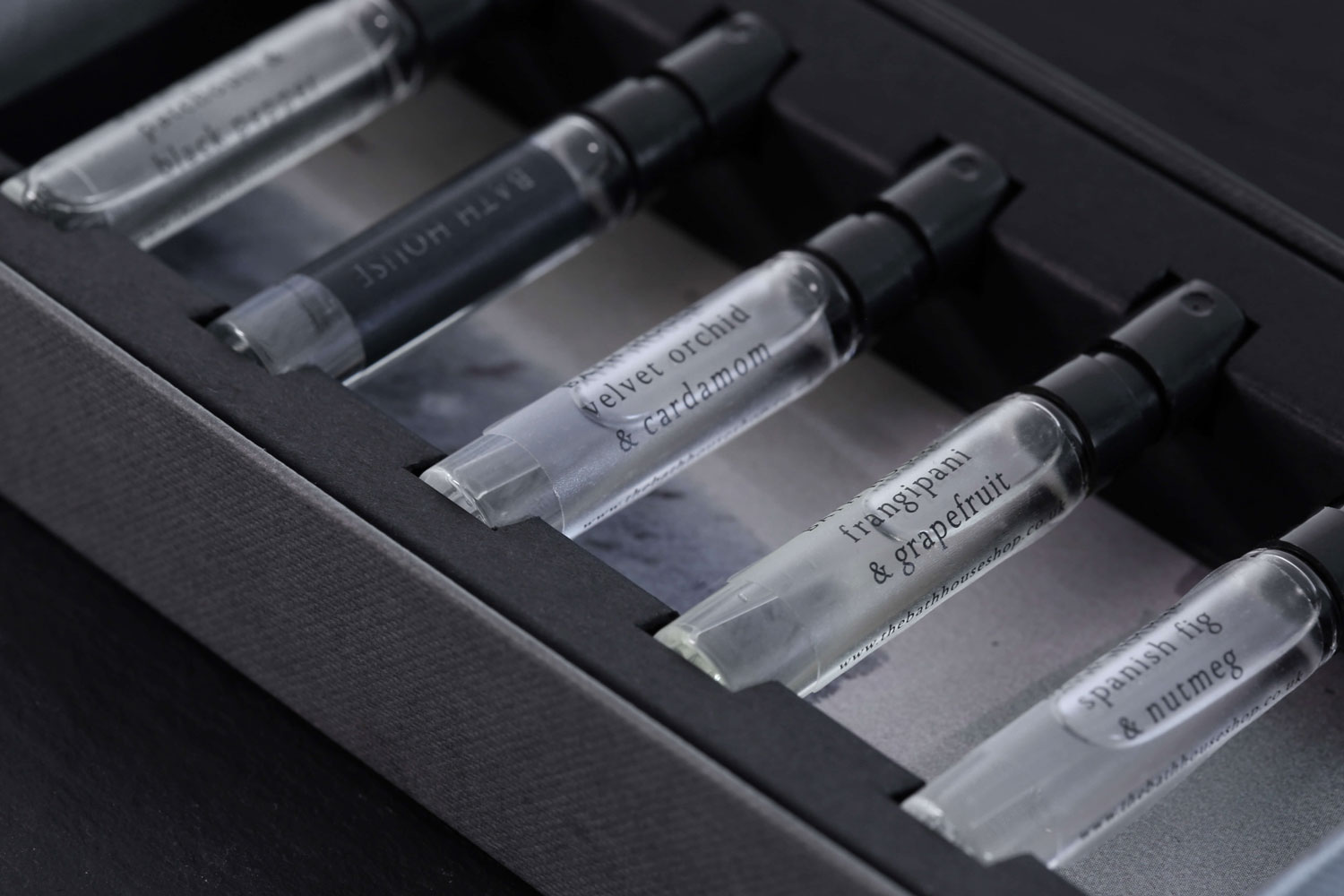
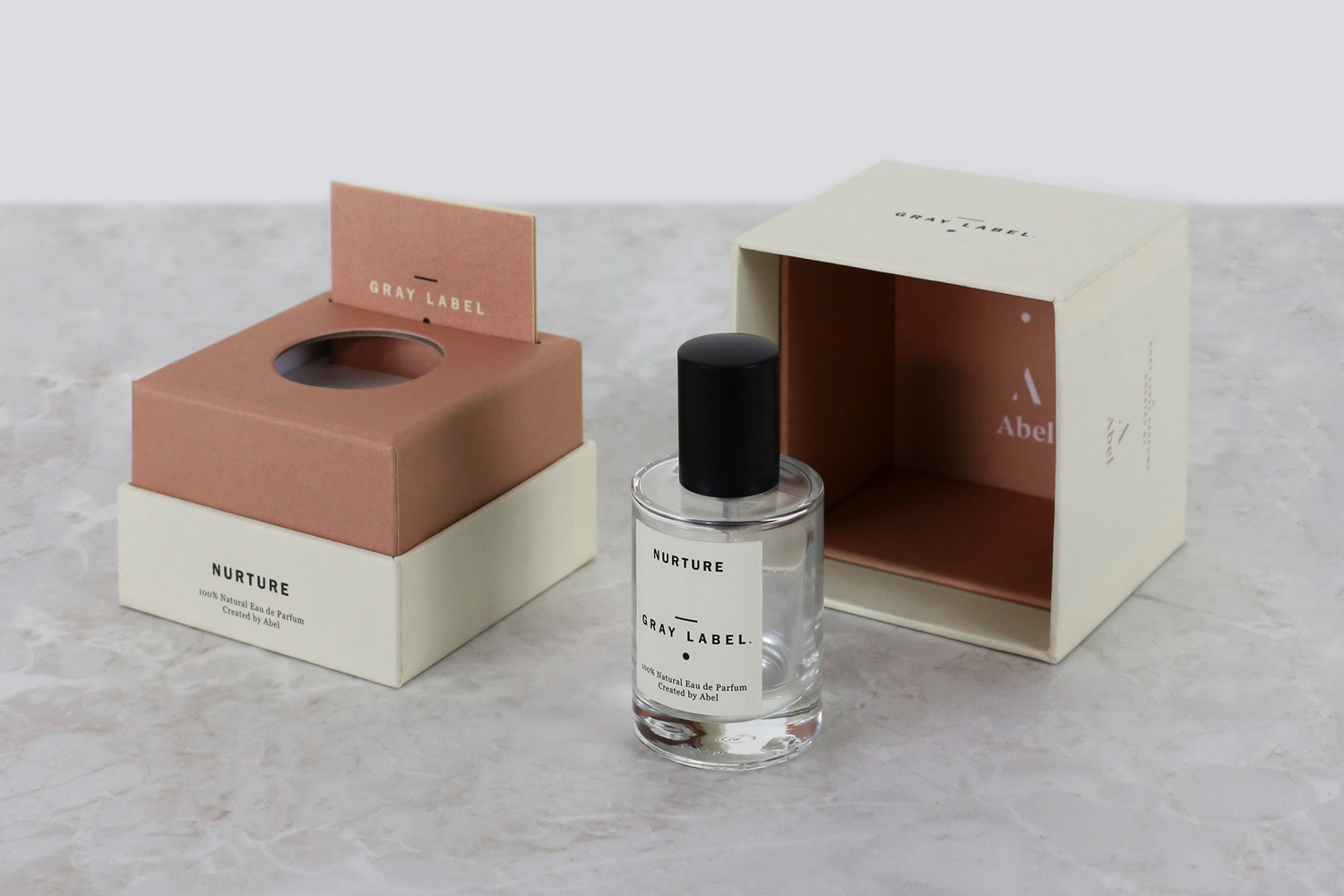
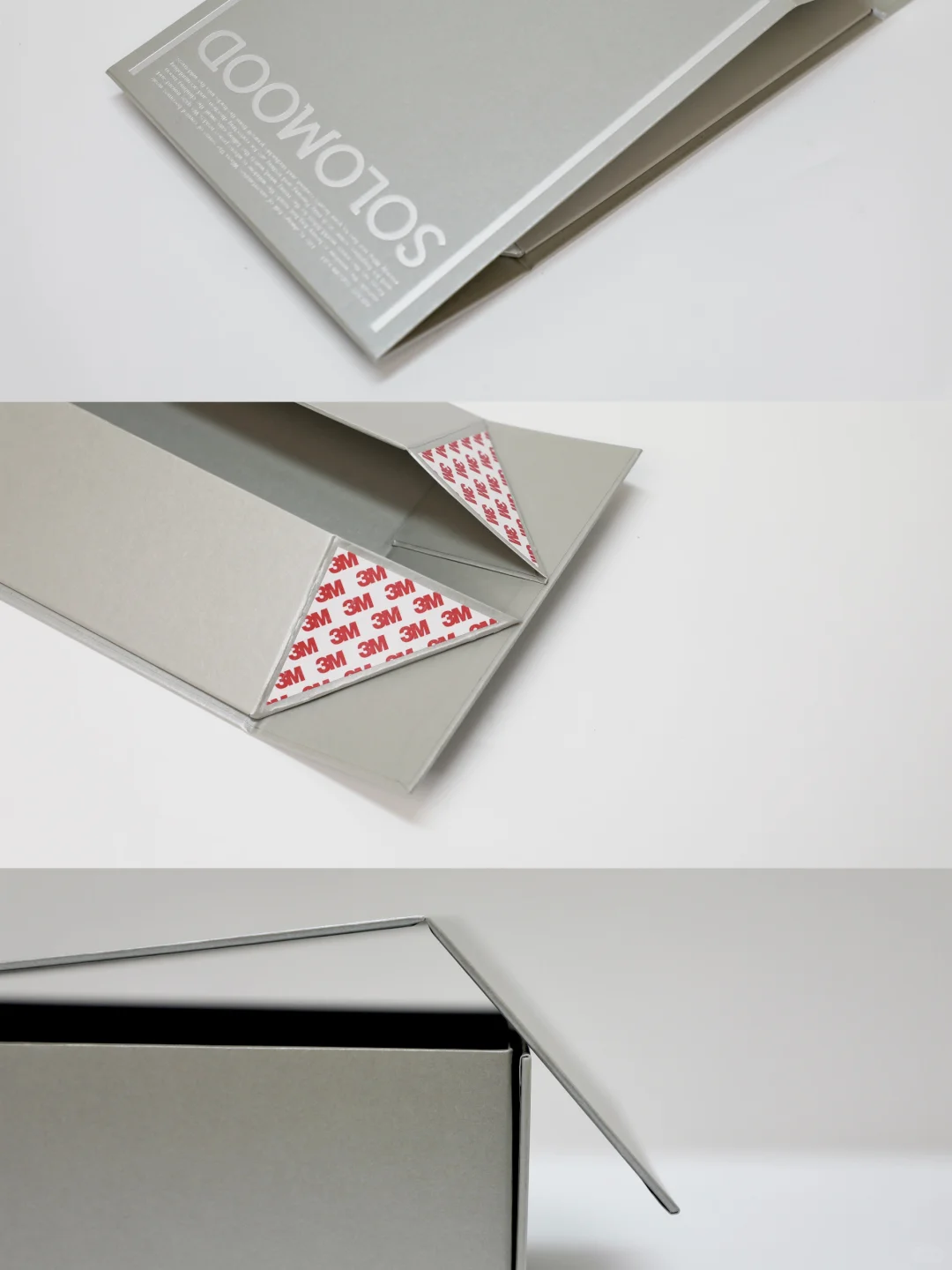
List the parts the proposal actually needs: outer box, lid, base, insert, sleeve, label and card where applicable. Name each component. For every design choice, identify the panel, its formed orientation and the action that reveals it. Putting the scent name on the front, the story inside the lid and guidance on a removable card is one possible allocation, not a layout to apply without checking the structure.
Mark inside, outside, top edge and opening on the corresponding structural revision. Use the actual bottle and cap to check access and concealed areas. Copy placed on a join, flap or surface hidden by an insert still needs revision. Check bottle and packaging identifiers for every version. Products arranged together in a reference photograph are not necessarily a matching scent or SKU.
Replace feel words with named material and process candidates
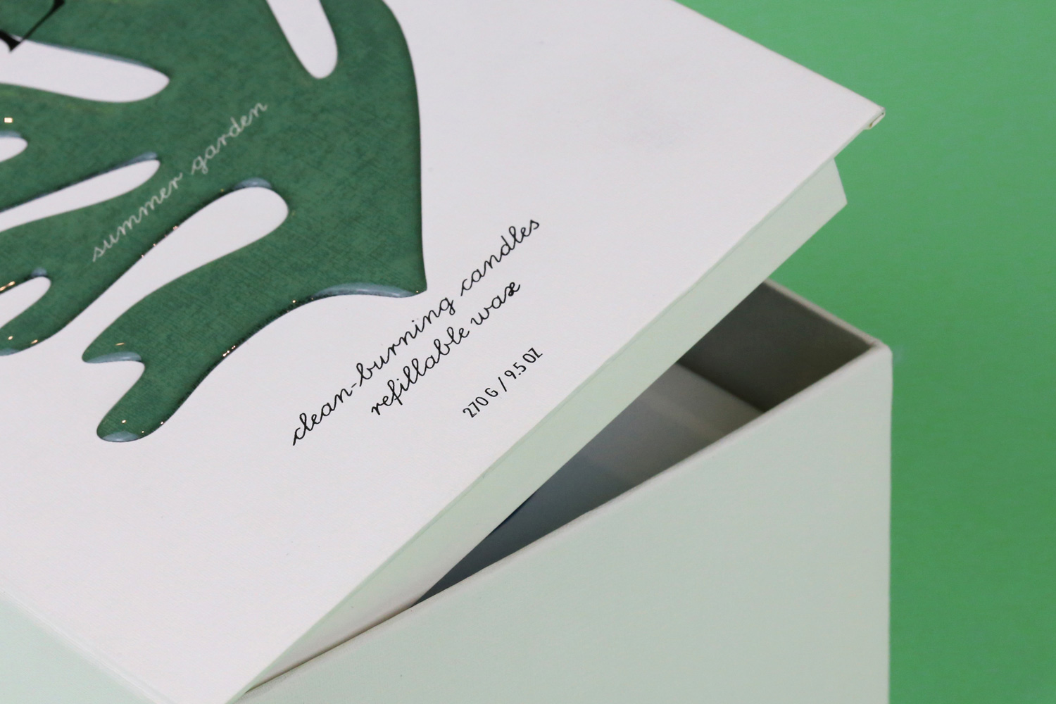
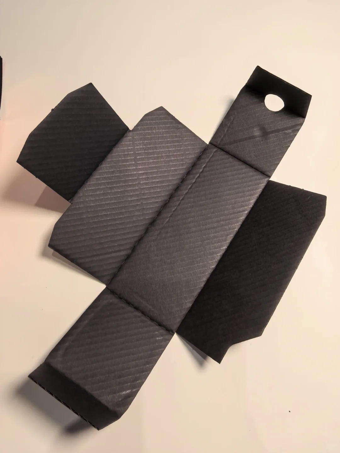
Describe the visible or tactile target first, then ask the supplier for named candidates. “Low gloss with readable fine type” needs a stock name and grade, colour, thickness or grammage, plus a proposed printing and surface-treatment route. “Premium paper” is insufficient. Identify whether a detail should be raised or recessed and where a reflective effect belongs on the artwork.
Separate appearance from process identity. Texture in a photograph does not prove handmade paper, pale lettering does not prove white ink, and a metallic look is not automatically foil stamping. Ask how the material, printed layer, lamination or varnish and other finishing will work together. Compare alternatives while recognising that a change can affect touch, detail and cost. Similar process names are not approval of an equivalent result.
Give each sample a specific approval scope
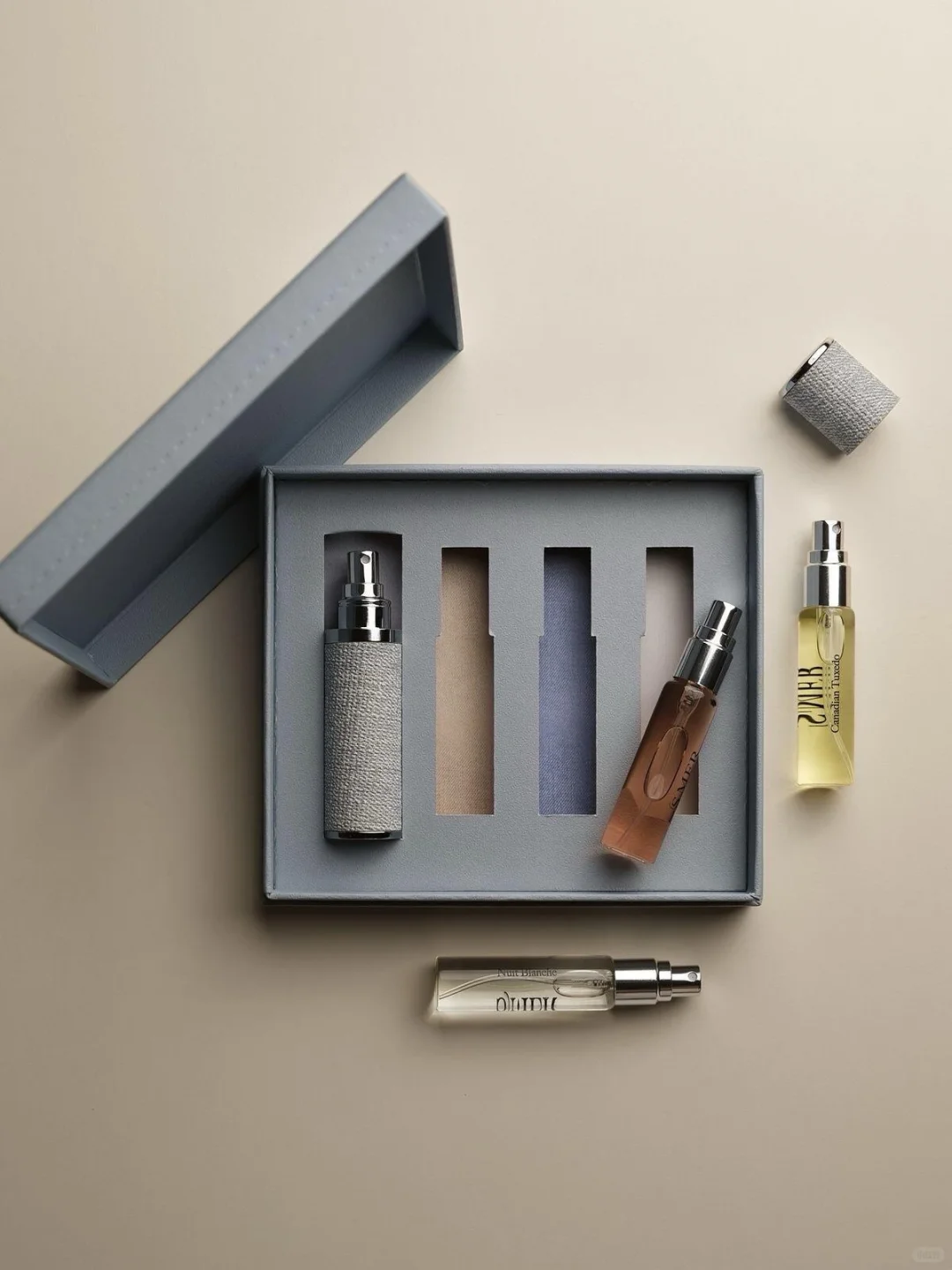
Match each question to a sample that can answer it. A material swatch can establish a surface direction; a print-and-finish trial can test lettering and decoration together. A structural sample can examine folding, opening and bottle relationships, while an artwork-bearing folded sample can check the reading sequence. One sample may cover several tasks, but list what it actually shows. An unprinted mock-up cannot approve absent colours or inside-lid copy.
Review the surface on the intended material and production route, using an agreed colour-assessment method rather than an invented universal threshold. Identify hand trimming or pasted modifications and whether the files include them. Digital formed views remain supporting tools. If transit performance is required, arrange relevant verification separately; an intact appearance or a box that closes is not proof of protection.
Connect design intent to revision approval
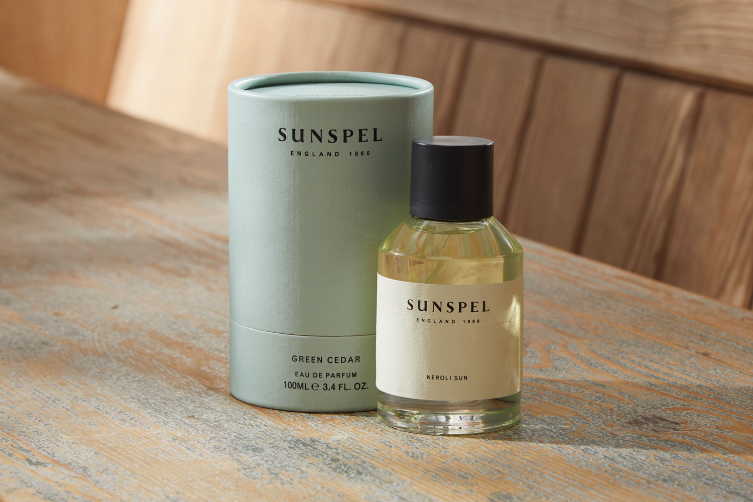
Keep a traceable record of story text, component names, structural revision, artwork files, material-and-process sample identities and accepted features. Record the design reason separately from the sample finding. Wanting the story to appear first is an intention; checking the inside wording after opening a specific sample is an approval result. Assign unresolved questions to an owner and a next check rather than hiding them behind “overall approved.”
When stock, printing route, colour, copy, opening or bottle hardware changes, recheck the affected features. An old screenshot cannot approve a new revision. The handover should show where each story choice belongs, which file defines it, which sample supports acceptance and what still needs testing. That makes the concept usable for the next production conversation.