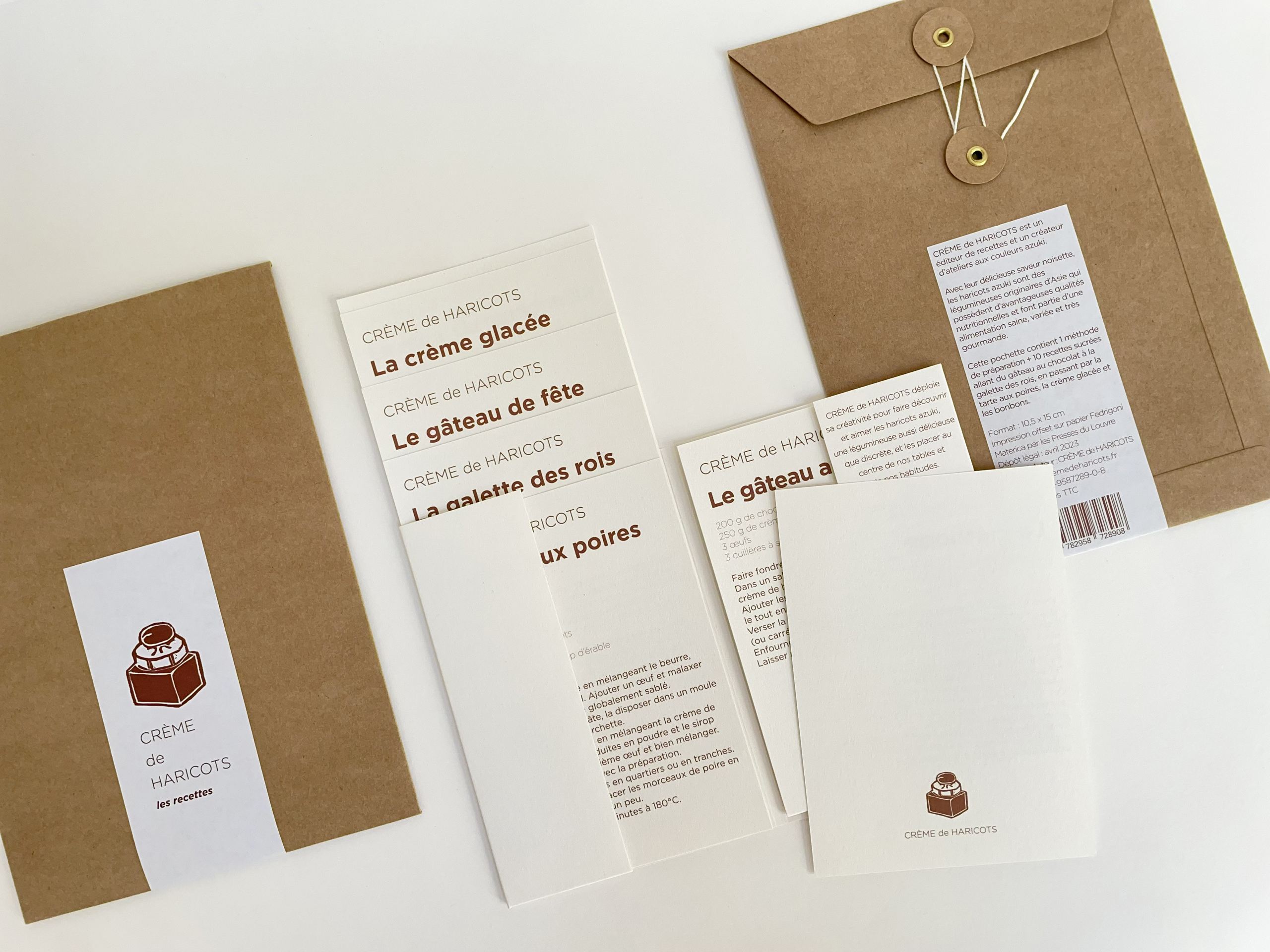
A kraft pouch and separate printed carriers in the Crème de Haricots recipe project. The source identifies the inner pages as Materica Gesso; it does not identify the pouch grade. Third-party reference; not a Bravo Package project.
PERFUME PACKAGING · PAPER AND BOARD
Kraft paper can contribute to a perfume pack's visual identity, but its base colour also affects how artwork appears. Establish which elements may reveal the paper tone and which must remain clear and consistent. Approving a white-background mockup does not define an acceptable result on brown paper.
Approve a specific stock
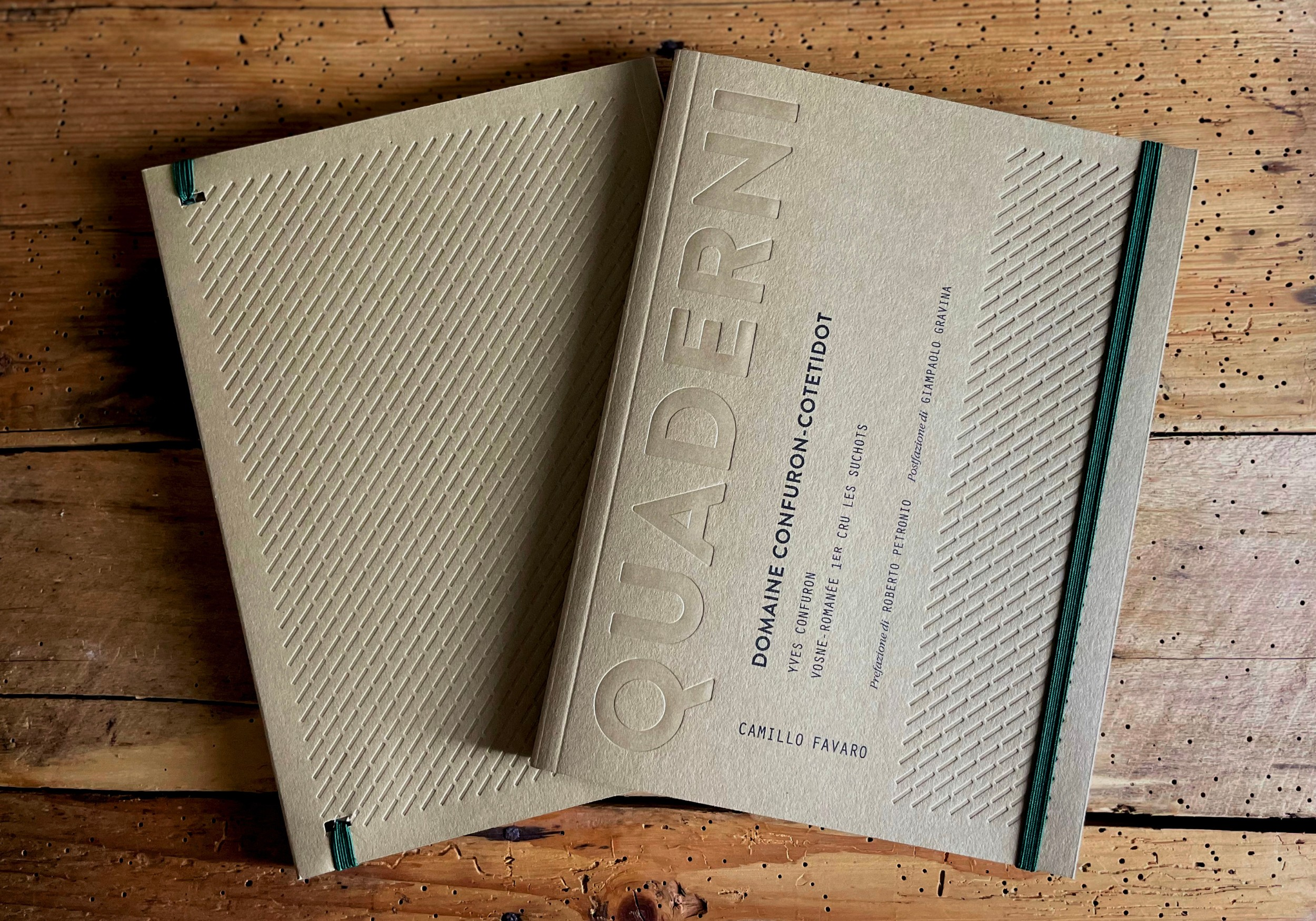
Kraft paper is not a complete colour specification. Record the mill, grade, shade, GSM, caliper, surface and intended face. Retain an identifiable swatch. White kraft, brown kraft and differently finished stocks should not become interchangeable because their names sound similar. Brown appearance does not establish strength or suitability for a particular box.
Compare the stock with the bottle, label, cap and insert. Look at warmth, depth and visible texture. Distinguish changes in the unprinted paper from changes introduced by printing. For repeat orders or split deliveries, require approval of material substitutions and compare against the retained reference rather than a phone photograph.
Turn the colour reference into a same-stock target
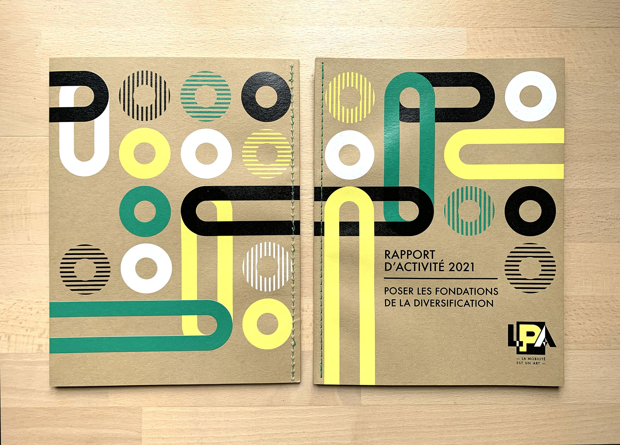
A colour number communicates a direction; it does not guarantee identical appearance on every paper. Pantone uses C and U to describe colour appearance on coated and uncoated stock, and explains that paper affects the result. An uncoated guide therefore does not establish the final appearance on a particular brown kraft.
Proof the actual artwork on the selected stock using the proposed printing route. Identify the ink or colour specification, artwork version and any white underlayer. If a digital layout sample differs from production, define what it approves and arrange separate colour and process confirmation. One sample should not silently approve every production condition.
Test the critical artwork at its final size
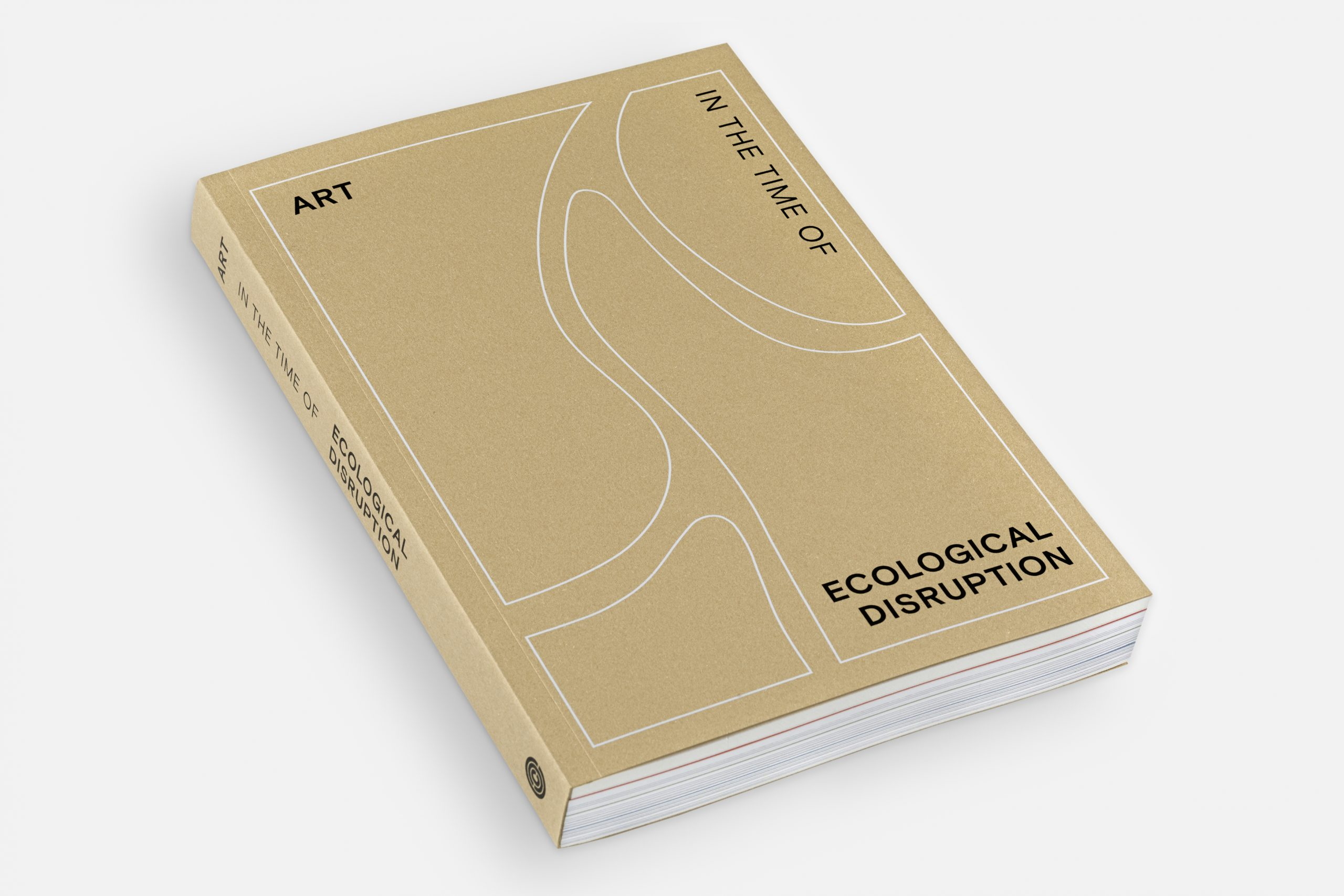
Include the main brand colour, logo, smallest text, fine lines, solids and important image detail. Check legibility at the intended size before comparing hue, density, coverage and edges. Test any barcode or QR code on the finished piece; a visible pattern is not proof of reliable reading.
If the result misses the target, check the stock, file, ink and output conditions before repeatedly darkening the artwork. Universal recipes such as red always becoming brick red are unreliable substitutes for a proof. Decide which elements can work with the paper colour and which need another process or carrier. Do not use a rustic aesthetic to excuse an unapproved mismatch.
Compare white ink and separate paper components
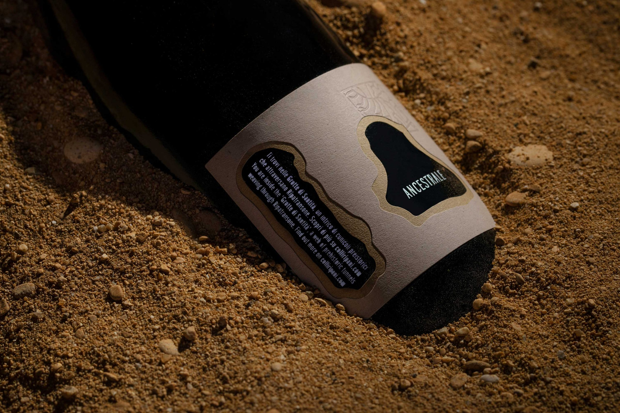
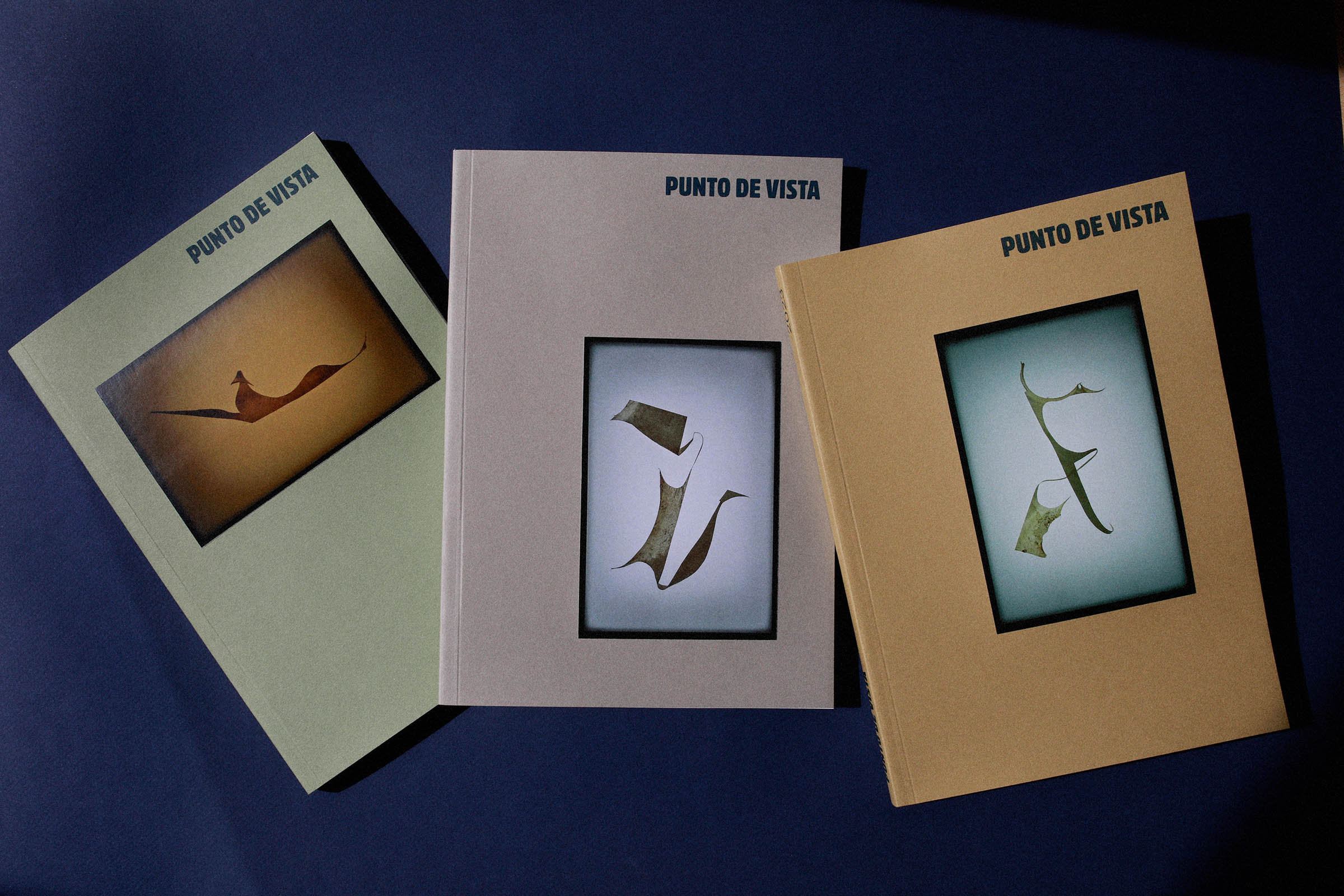
For white lettering, pale graphics or a clearer brand colour, ask the converter to propose white ink, an underlayer, another printing route, or a separate label, sleeve or card. Specify the substrate, printed faces, operations and quantity for each option. The name white ink does not establish the required opacity.
Review white solids, fine lettering, registration, adhesion and rubbing on the final material. Approve coloured artwork together with any white base. A label or sleeve also needs checks for positioning, edges, adhesion and effects on opening. Compare the complete cost and update requirements. Savings from fewer operations cannot be attributed solely to the paper, and no route automatically reduces waste.
Approve the packaging family together
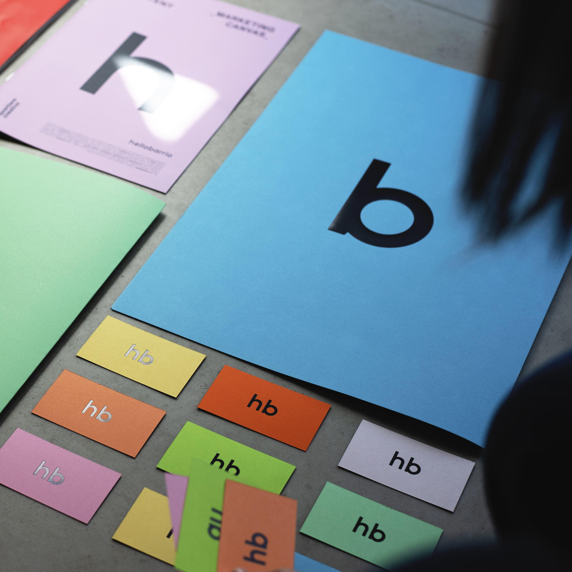

The box, bag, scent card and label may use different stocks, equipment and finishes despite sharing a brand colour. Keep a reference for each and review the assembled family together. Define whether colours should appear close or express an intentional material difference. Samples approved separately under different lighting may not form an acceptable set.
Agree viewing and acceptance conditions. If instrumental measurements are used, specify the method, conditions and tolerance rather than borrowing a universal delta-E number. Review colour, gloss and touch after the final finish. A natural-looking surface still needs proper creasing, gluing, closure and bottle-fit checks.
Retain references for production and reorders
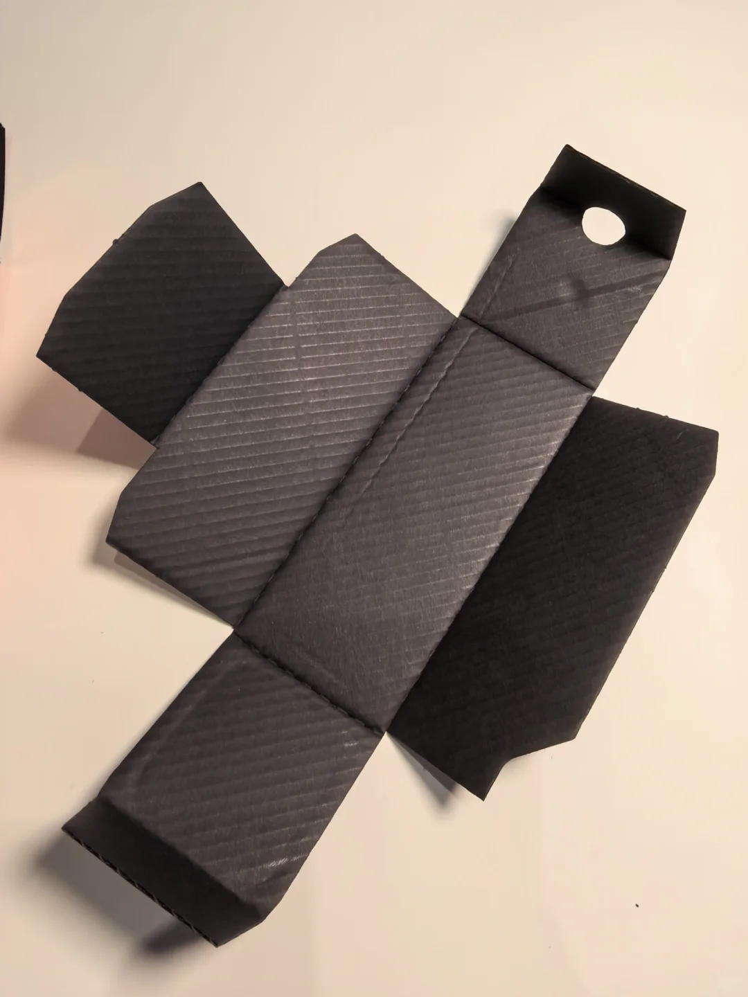
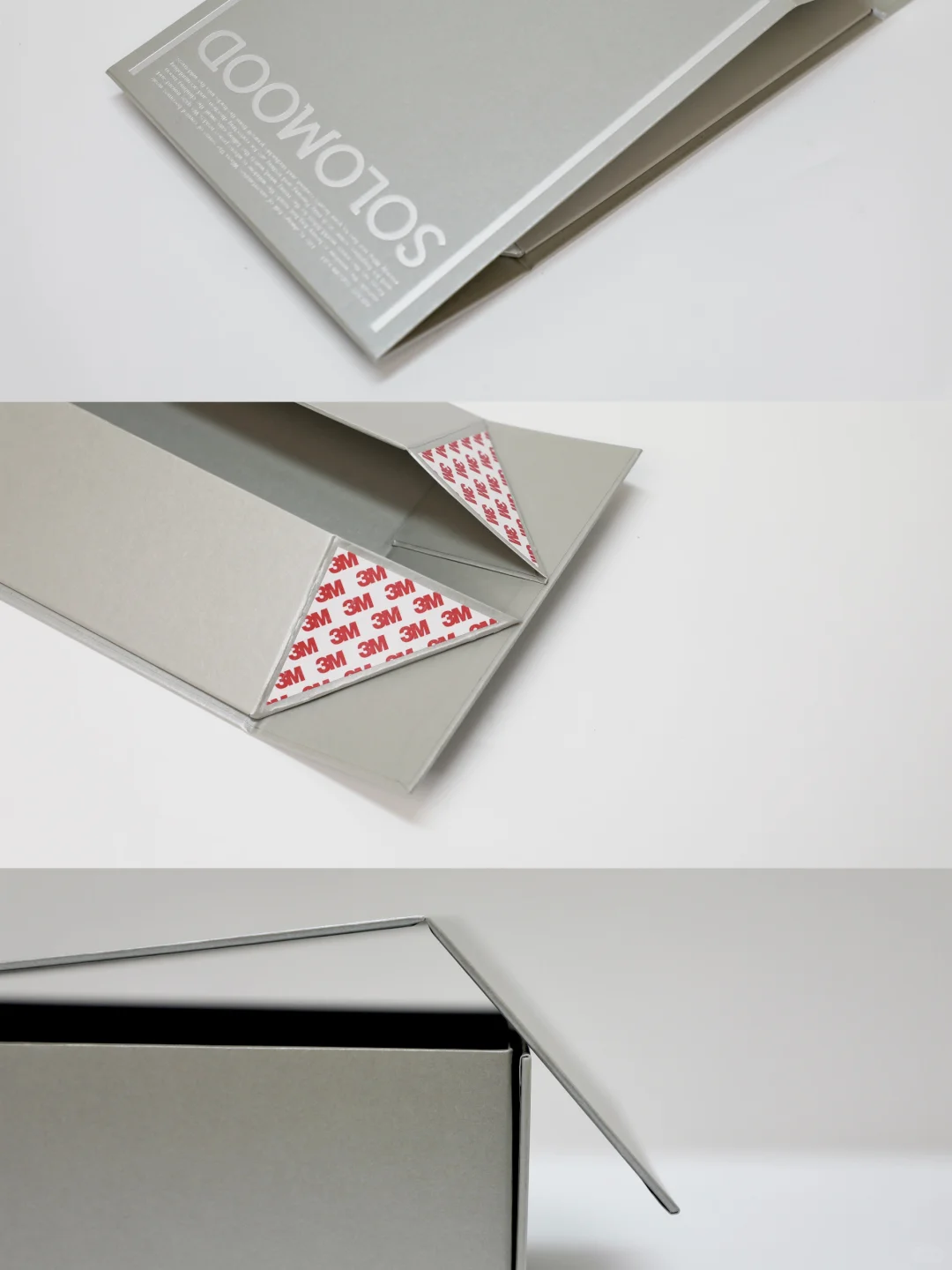
Keep the stock swatch, final printed process sample and packed converted box with their purposes, versions and batches identified. Inspect artwork, marks, scuffs, cutting and construction as well as colour. Agree process sampling and an exception-review procedure with the printer; one good starting sheet cannot represent an entire run.
On reorders, confirm whether the stock, printing route, ink or finish has changed. Store references appropriately and check that they remain usable. Define acceptable variation and the response to an out-of-tolerance result before production. Kraft's material character then becomes an approved choice rather than an explanation offered after delivery.
Colour reference: Pantone coated and uncoated references and printing-process colour variation.