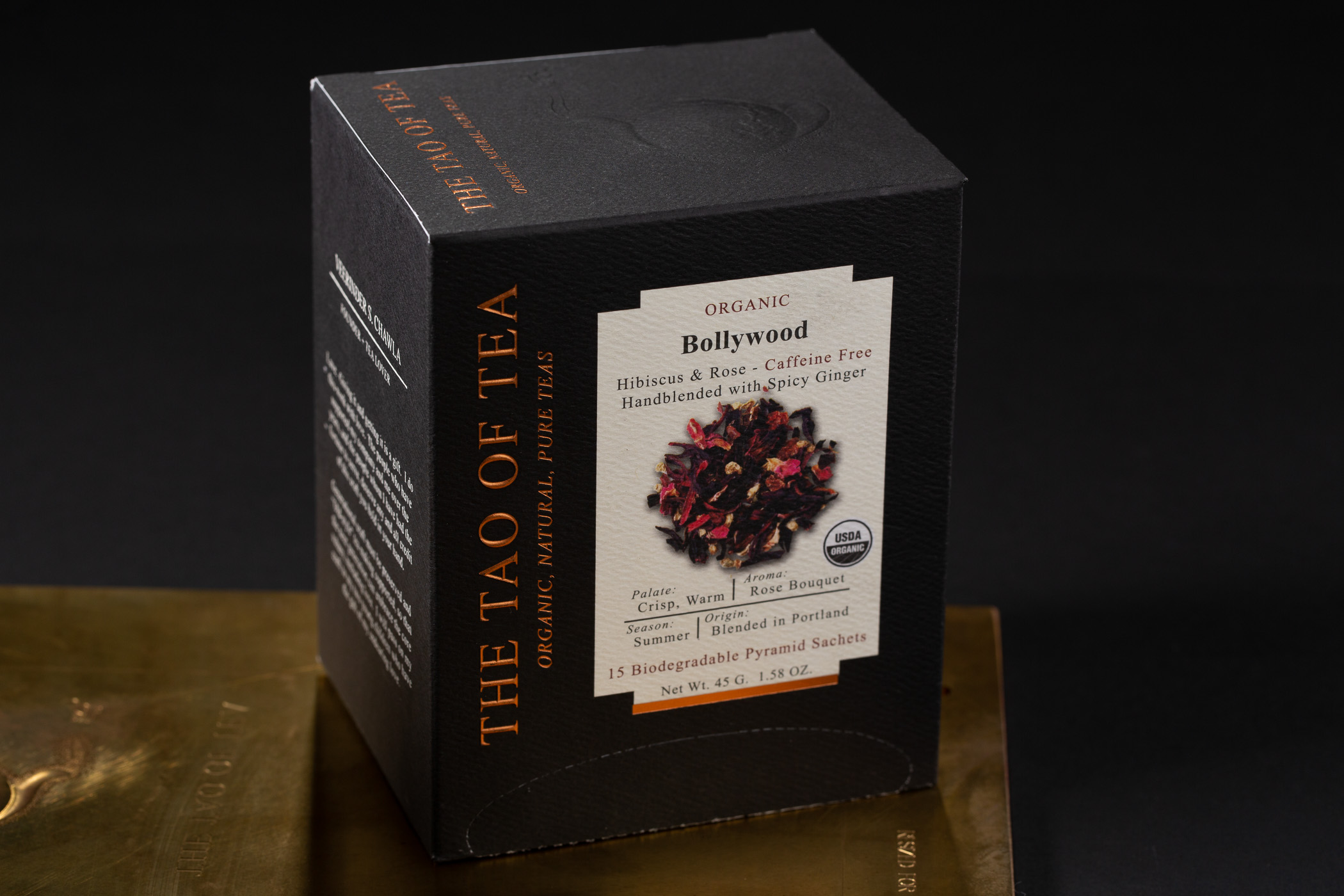
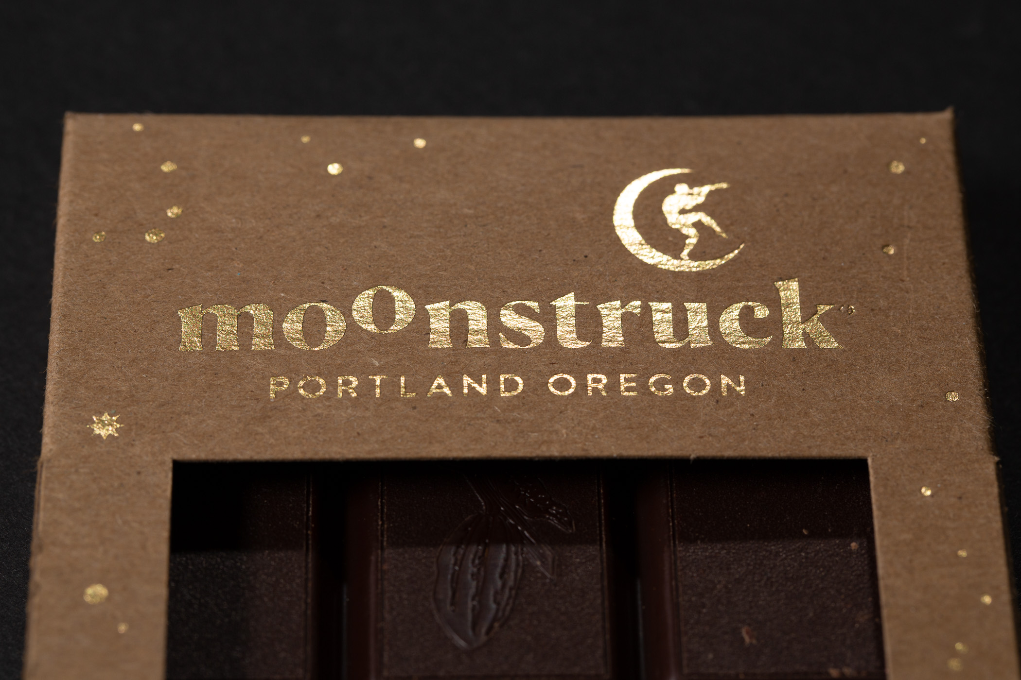
Creative Paper Craft identifies copper foil and embossing on uncoated stock for this tea pack. It is a reference for specifying decoration, not a perfume-box test. Third-party reference; not a Bravo Package project.
PERFUME PACKAGING · METALLIC FINISHES
Define the metallic result
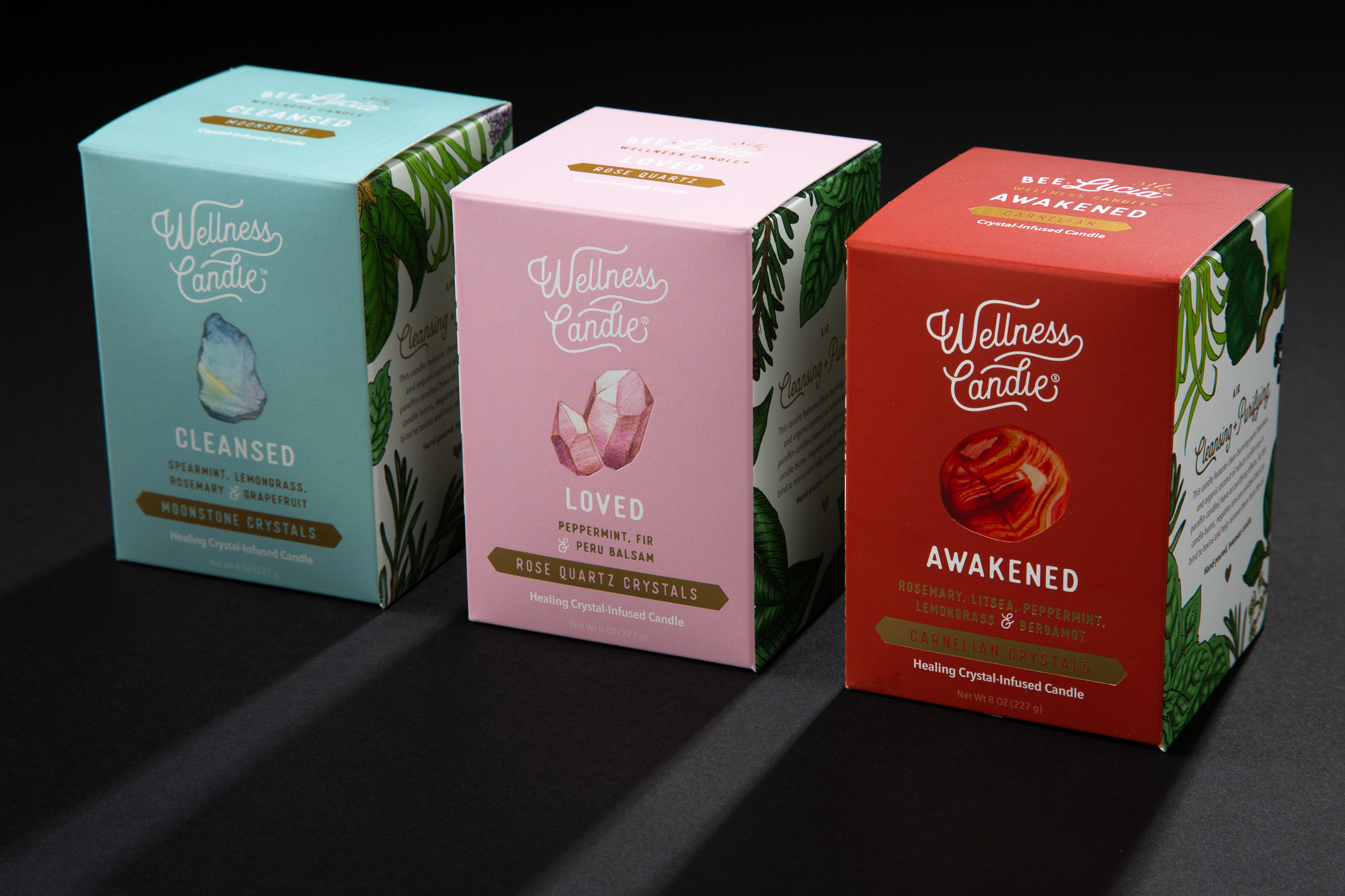
A request for “gold here” is not a production specification for a perfume box. A gold colour simulated with ordinary CMYK ink, a metallic printing ink, a transferred foil decoration and a metallic paper surface are different routes. Identify whether the priority is a logo, fine rule, small wording or a broad background before selecting the process. A photograph communicates direction; it does not establish the process used or approve feel and resistance to handling.
Describe the stock, background, position, coverage and intended reflection. “Subtle gold” might mean a warmer hue, a softer sheen or a detail that becomes visible as the box turns. Do not treat ordinary simulated gold as metallic ink, or assume every hot-stamped effect has a mirror finish.
Specify the two routes separately

Hot foil stamping uses a heated tool and pressure to transfer a decorative layer from a carrier to the substrate. Specify a foil reference and sheen, then confirm compatibility with the actual paper, printed background and surface treatment. If a pronounced raised or recessed result is required, describe embossing or debossing separately, including its relationship to the metallic artwork. Hot stamping is not automatically a relief specification.
Metallic printing inks use effect pigments within an ink system. Ask the printer to identify the proposed printing method, ink and receiving surface. Some digital systems offer metallic colours; ordinary digital colour printing does not automatically do so. If a supplier proposes cold transfer or digital foil instead, identify that route separately in the quotation rather than hiding it under “gold printing”.
Compare on the actual stock and in light

Do not compare a glossy foil swatch with metallic ink on an unrelated paper and use that comparison to rank the processes. Use final artwork on the intended stock, keeping the background, viewing conditions and finished size comparable. Paper colour, texture, absorbency and later coatings or films can influence the result. A small mark on a rough paper cannot approve a broad panel on a smooth stock.
View the samples flat and tilted. Check the desired reflection and whether essential wording remains readable as the angle changes. Keep an identifiable reference for accepted colour, sheen and texture. A screen image or ordinary colour print is not a metallic-effect approval. A result created by a metallic substrate must also be identified as such.
Check detail, coverage and the formed box
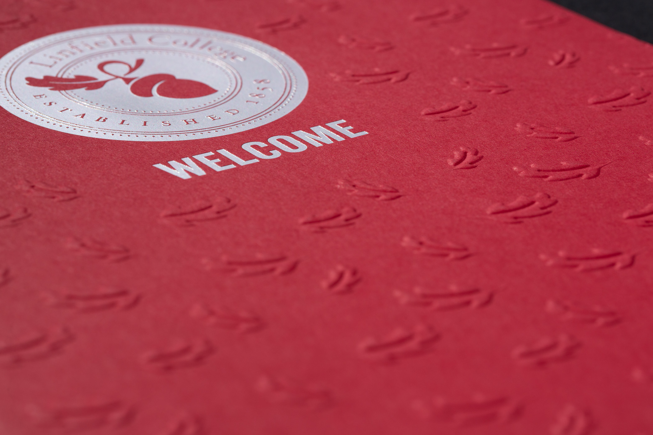

Include the real logo, finest rules, small type, reversed openings and larger solid areas in the proof. Inspect open letter counters, complete boundaries, registration with neighbouring graphics and acceptable coverage. An online minimum line width or type size is not a specification for another paper and process combination. Have the supplier evaluate the actual artwork.
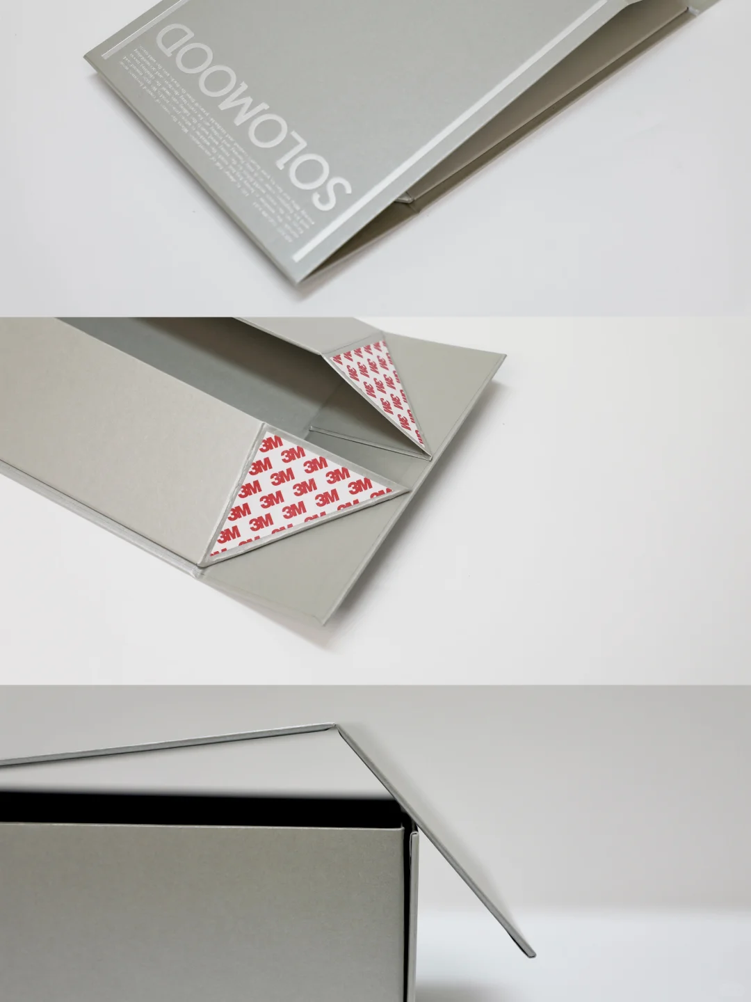
After flat approval, review the converted box: folds, corners, wrapped edges, joints and adjacent components. Where decoration approaches a fold, inspect a formed sample. Consider assembly, insert contact, any sleeve and handling contacts. An attractive flat sample does not establish the durability of the complete pack.
Validate handling and compare complete costs
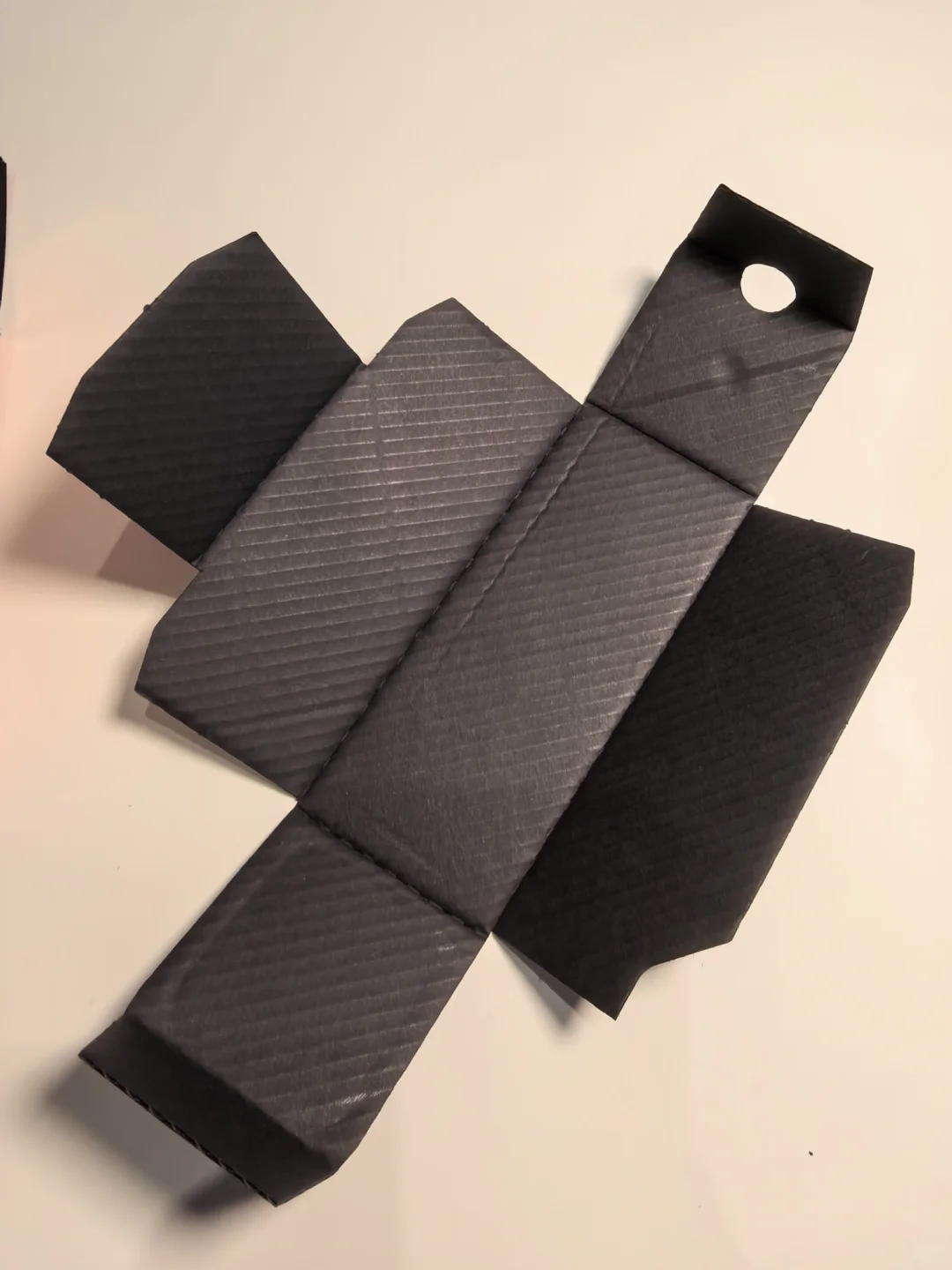
Do not describe foil as scratch-proof or metallic ink as certain to shed or fade. Agree review conditions and acceptable appearance with the supplier for the intended touching, assembly, outer packing, storage and distribution. Keep samples and results traceable. If a protective treatment is proposed, review the metallic appearance and subsequent conversion again; coatings and films are not interchangeable guarantees.
Compare quotations using the same stock, quantity, artwork and approval scope. Identify tooling or setup, decorated area, printing and finishing, allowances and sample work. Confirm how artwork changes and reorders are charged. Metallic ink may deserve a place in a broad-coverage comparison, but that does not make it cheaper at every quantity. Advertised starting prices and hourly turnaround claims are not an order-specific offer.
Approve an identifiable production version
The decision need not impose one metallic process across the whole box. Ask for a local foil logo with ordinary printing elsewhere, or compare a metallic-ink option that fits the intended design. Give each treatment a purpose instead of adding processes for their own sake.
Keep the final dieline and artwork version, decorated areas, paper details, ink or foil references, surface treatment, combined proof and accepted appearance together. Follow the supplier’s requirements for layers, spot-colour naming and registration. A gold-effect screenshot is not a production handover. On reorders, confirm any paper, ink or foil substitution against the approved version before proceeding.
Technical context: Spring metallic ink guidance and KURZ finish options. Confirm the actual substrate and process combination; supplier-specific information is not a universal production guarantee.