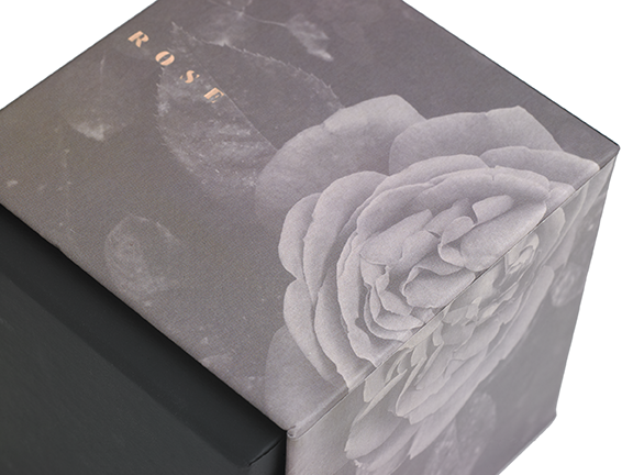
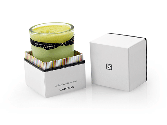
Pusterla US describes duo-tone printing, a soft-touch coating and rose-gold foil for The Joseph Rose Spa candle box. This reference illustrates a coordinated finish brief, not a perfume-box performance test. Third-party reference; not a Bravo Package project.
PERFUME PACKAGING · PAPER AND BOARD
Start a perfume-packaging brief with what the customer should see and feel, then ask the supplier how to achieve it. Print, foil, relief, varnish, film and a paper’s own texture are different decisions. “Premium paper with gold foil” is too vague for comparing quotations. Define the effect, material, position and approval reference before adding processes.
Describe the intended result
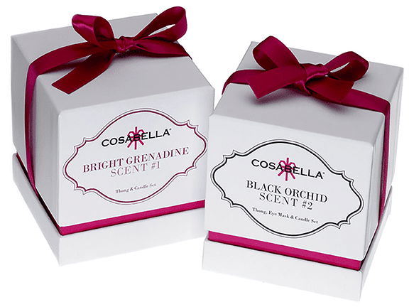
Separate background colour and imagery, the brand name and small text, metallic or non-metallic reflection, local gloss, relief, paper texture and appearance after handling. Reference photographs can communicate direction, but cannot establish feel, adhesion or resistance to scuffing. State which details are essential and where alternatives are welcome.
Identify the faces of the box, sleeve, insert and information card. The same colour can look different on different papers. Minimal artwork is not automatically simple to manufacture. More processes, a brighter surface or a larger metallic area do not provide a universal definition of quality.
Separate print from decoration
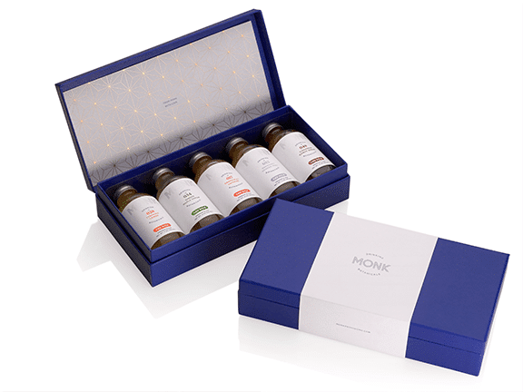
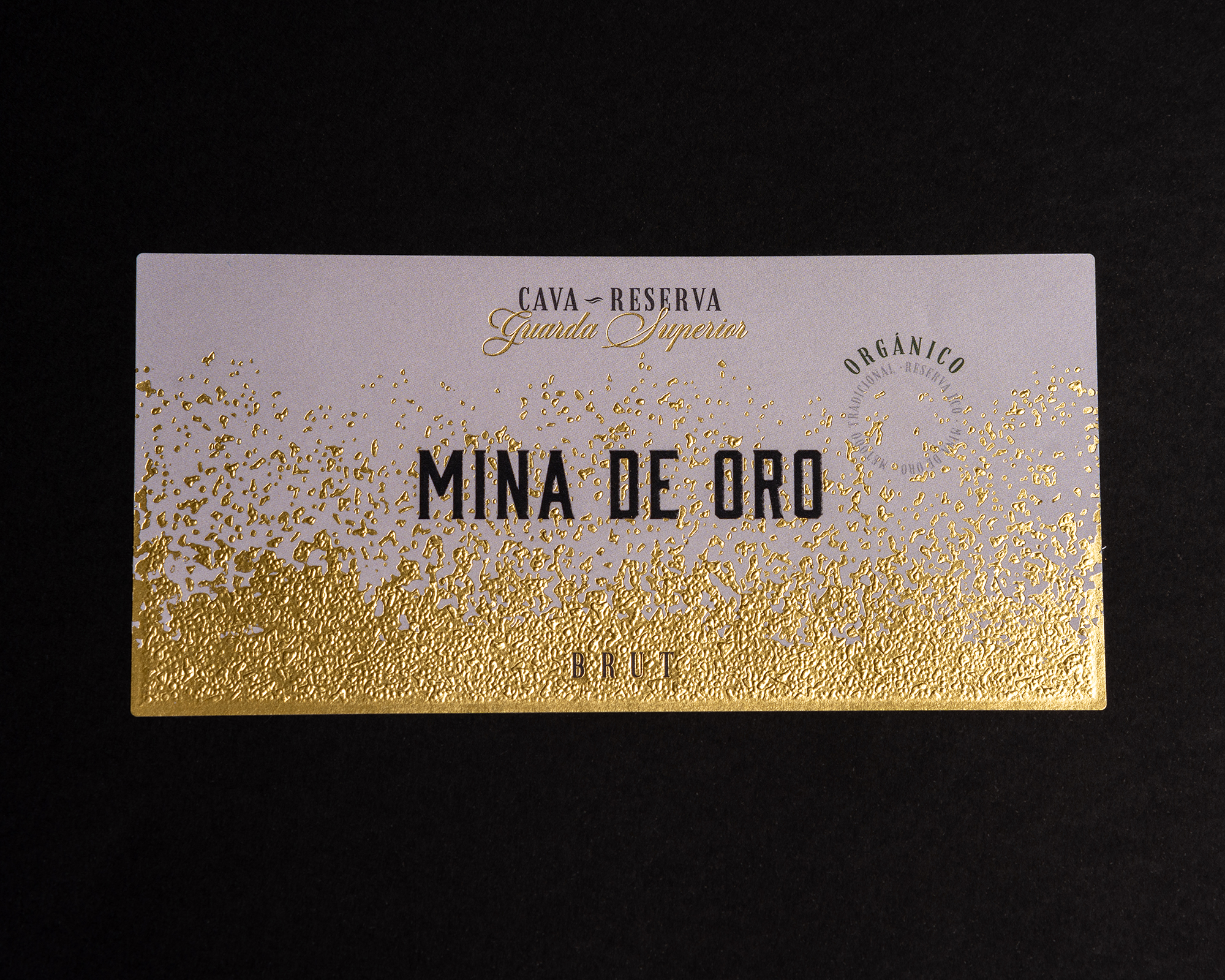
Printing carries colour, images and information. Ask the supplier to identify the proposed process and substrate, including whether the quotation uses four-colour, spot-colour, digital or another route. Give spot colours an identifiable reference. A screen colour does not approve the paper result. Variable codes and versioned information need file and content checks as well as a readable physical proof.
Specify foil colour, sheen and area separately. A metallic appearance in a photograph may come from another material or process. Compare the actual artwork on the selected stock, checking letter openings, fine lines, coverage and position. Avoid adopting a universal minimum type size or machine setting from a reference project.
Distinguish relief, gloss and coverage
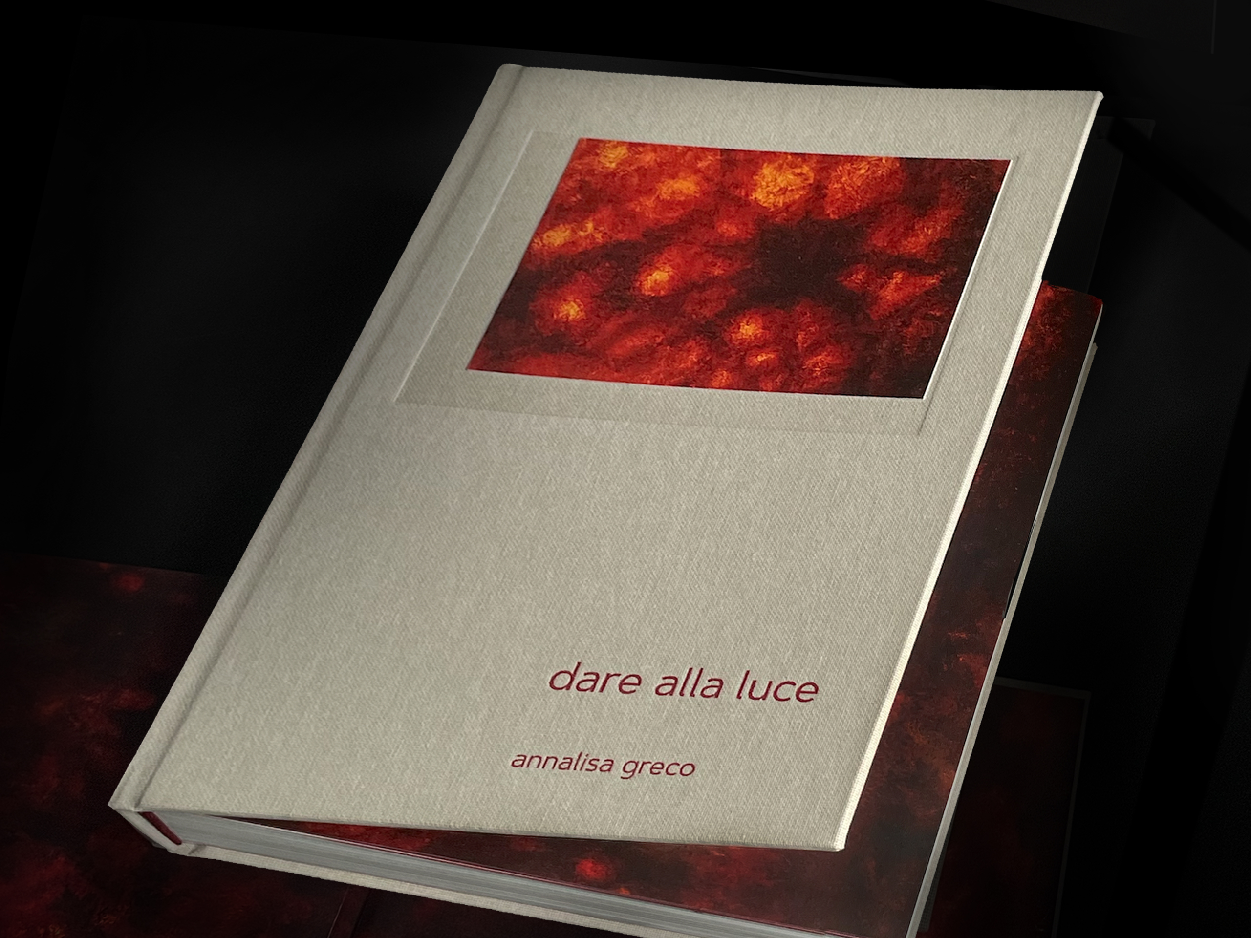
Embossing raises a pattern and debossing indents it. Specify a blind impression when no added ink or foil is intended. If relief aligns with print or foil, review the relative positions and outlines in the combined sample. Board construction, pattern and depth affect feasibility; GSM alone cannot approve an embossing design.
For a spot varnish or UV effect, identify the area, sheen and whether a raised result is required. A process name does not replace a physical sample. Define film, coatings and the paper’s own texture separately. Do not assume that a treatment makes every pack waterproof, fingerprint-proof or scratch-free. Environmental claims need information about the actual material combination, not an inference from a matt appearance.
Prove the combination on the chosen stock
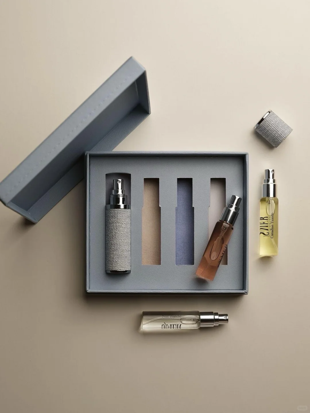
Use final-size artwork containing the brand name, fragrance name, small information, codes, reversed details and finest lines. Check the chosen face, background and decorative layers together. Review openings, coverage, reflections, adjacent areas and corners. Decoration should preserve the readability of essential information.
Have the supplier confirm feasibility, sequencing and registration for the proposed materials. Do not copy a universal foil-before-film rule from an online guide. Review a combined proof when processes interact: an attractive foil swatch cannot approve final alignment. Keep a designer-approved file version for any change to lettering, outlines or position.
Review the formed and handled box
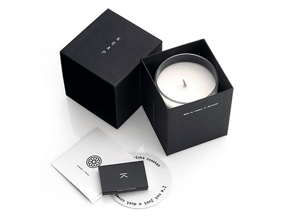
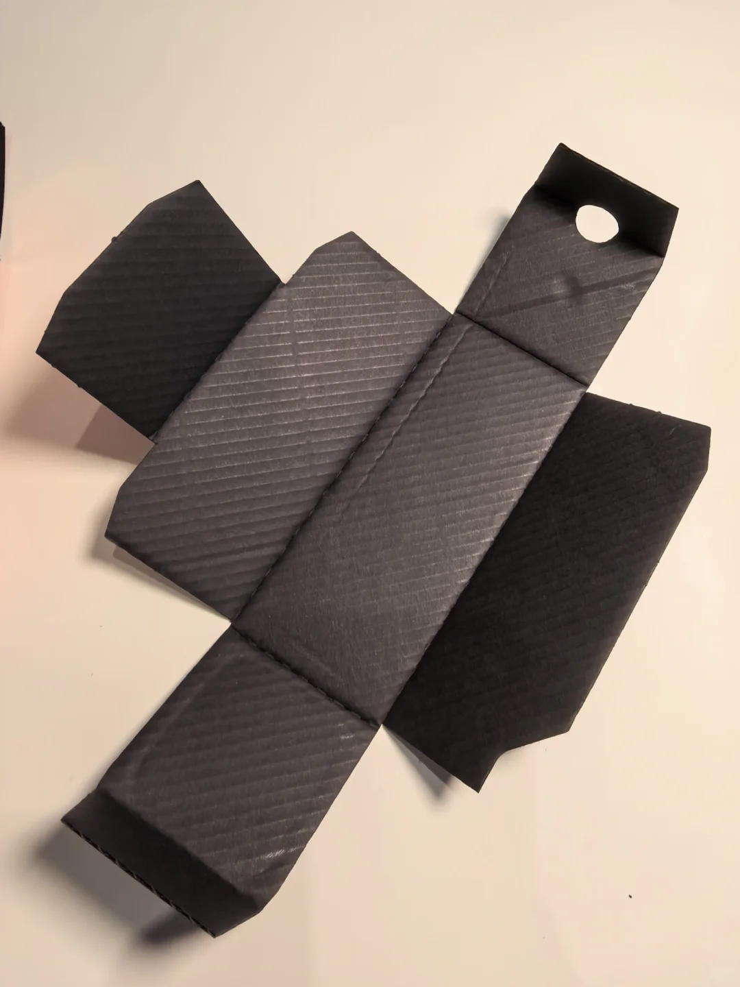
After approving the flat result, inspect a formed, wrapped and loaded sample. Check folds, openings, joints, corners and handling contacts. Where artwork crosses components, review its alignment after assembly. Keep identifiable acceptable and abnormal references rather than dismissing every difference as material character.
Agree review arrangements for the intended handling, outer packing and distribution conditions. Record appearance requirements for scuffs and fingerprints on actual dark, reflective or tactile samples. Do not assume a film always outperforms every coating. Odour, bonding and insert function remain separate approval items; decoration approval does not complete the whole-pack assessment.
Keep quotation, artwork and approval aligned
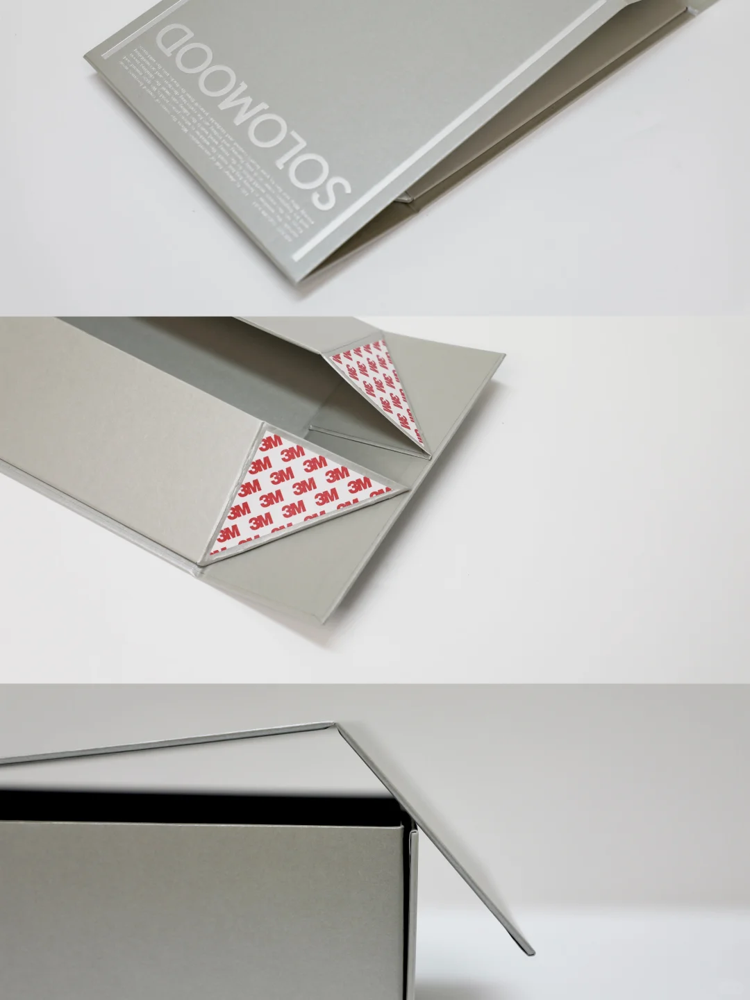
Ask the quotation to identify components, materials, colours, decorated areas, processes, tooling or setup charges, sample scope and quantity. Compare a baseline with purposeful additions, checking the complete cost against the approved result. A supplier’s general equipment or delivery advertisement is not a commitment for your order.
Follow the printer’s production-file requirements for layers, colour naming, process areas and registration. A screenshot is not a production handover. For reorders, confirm substitutions in paper, foil, ink or surface treatment and obtain another proof where needed. The final quotation, artwork, material list and converted approval sample should describe the same version.
Technical context: Holmen Graphics Handbook and KURZ hot stamping. Confirm the actual substrate and process combination; supplier-specific information is not a universal production guarantee.